10 Best Markers for Colorblind-Friendly Maps That Enhance Readability
Creating maps that everyone can read is essential, especially for those with color vision deficiencies. Selecting the right markers can make a world of difference, ensuring clarity and accessibility.
Disclosure: As an Amazon Associate, this site earns from qualifying purchases. Thank you!
High-Contrast Markers
Use markers that feature strong contrast with their backgrounds. For example, black markers on a light background are universally visible.
Patterns and Textures
Incorporate patterns or textures to differentiate between map features. Examples include striped, dotted, or checked designs, which provide visual cues beyond color.
Diverse Color Palettes
Choose color palettes that minimize color overlap for colorblind users. For instance, using shades of blue and orange together can be more distinguishable than traditional red-green combinations.
Symbolic Markers
Opt for shapes and symbols to represent different features. Triangles, circles, and squares can convey information effectively, such as parks, schools, and hospitals.
Legend Clarity
Ensure your legend is straightforward, clearly defining what each marker represents. Use labels in addition to colors for better comprehension.
Key Tools for Implementation
- ArcGIS Online: Offers a range of basemap styles with accessibility features.
- ColorBrewer: Helps select appropriate color schemes based on colorblind-friendly criteria.
- QGIS: Allows for advanced customization of markers, patterns, and legends with ease.
Common Technical Issues
- Marker Overlap: Be cautious of overlapping markers on dense maps. Adjust sizes or apply transparency to enhance visibility.
- Poor Readability: Ensure font sizes and styles in legends are legible. Stick to sans-serif fonts for clarity.
Addressing Data Visualization
- Consider data layering to optimize visibility. This means displaying important features prominently, while less critical information is subdued.
- Implement dynamic adjustments that allow end-users to toggle visibility preferences, enhancing the usability of your maps.
Workflow Frameworks
- Start with data collection, ensuring sources are accurate and relevant.
- Progress to design, implementing the aforementioned markers and styles.
- Conduct a review with colorblind individuals to ensure your map’s accessibility before finalization.
- Engage in peer reviews among cartographers for feedback on design and usability.
- Regularly update your color and pattern libraries to incorporate the latest findings in color accessibility standards.
By integrating these techniques, you’ll create effective, accessible maps that serve a wider audience, promoting inclusivity in mapping practices.
Understanding Colorblindness in Mapping
Colorblindness, or color vision deficiency, impacts how many individuals perceive colors on your maps. To create effective and accessible mapping solutions, it’s essential to understand the types of colorblindness and the importance of your design choices.
Types of Colorblindness
There are several types of colorblindness to consider:
- Red-Green Color Blindness: It’s the most common type, affecting around 8% of men. Conditions like Deuteranomaly and Protanomaly involve reduced sensitivity to green and red light, respectively, leading to challenges in distinguishing these colors.
- Tritanomaly: This rarer form, which affects both genders equally, limits sensitivity to blue light, complicating the differentiation of various colors like blue, green, and yellow.
By recognizing these categories, you can choose markers more thoughtfully, ensuring your maps convey information effectively for all users.
Importance of Colorblind-Friendly Design
Designing colorblind-friendly maps is crucial for inclusivity. Here’s why:
- Accessibility: Over 300 million people globally experience color vision deficiency, so using appropriate colors means reaching a broader audience.
- Clarity: Your markers should communicate clear information. If individuals can’t differentiate colors, they may misinterpret critical data on your maps.
Incorporating high-contrast colors, patterns, and symbols can enhance your map’s readability, making it a valuable tool for every user. By prioritizing colorblind-friendly design, you contribute to equitable access to information.
Features to Look for in Markers
When selecting markers for colorblind-friendly maps, focus on specific features that enhance accessibility and clarity.
High Contrast Colors
You should prioritize high contrast colors to make your markers visible. Aim for a minimum contrast ratio of 11:1 with the background, as seen in Salesforce Maps. Effective color combinations include shades like blue, orange, and black, which are distinguishable across various types of color vision deficiency. This approach ensures that your markers stand out, making it easier for all users to interpret the information presented.
Experience comfortable viewing with reduced blue light emissions and accurate colors thanks to Dell's ComfortView Plus. Enjoy smooth visuals with a 100Hz refresh rate and versatile connectivity with dual HDMI ports.
Distinct Textures and Patterns
You can enhance marker clarity by incorporating distinct textures and patterns. Textured markers not only provide visual clarity but also distinguish between different features, catering to varying types of color blindness. For example, using stripes or dots alongside color can help convey information effectively. Tools like QGIS allow for simple implementation of patterns, increasing readability and ensuring that your map communicates information clearly.
Ergonomic Design and Comfort
You should consider ergonomic design features when choosing markers. Using markers that are comfortable to hold and easy to manipulate can improve user experience during fieldwork or map exploration. Opt for markers with an easy grip and visible design elements, ensuring they are lightweight and portable. With tools like ArcGIS Online, you can customize marker shapes and sizes that enhance usability for both professional mapmakers and end-users alike.
Top Brands Offering Colorblind-Friendly Markers
When selecting markers for colorblind-friendly maps, it’s important to consider brands known for their effective color palettes and design features. Here are some top brands that excel in this area.
Staedtler: Overview and Product Line
Staedtler offers a variety of markers designed with color accessibility in mind. Their Permanent Lumocolor Markers utilize high-contrast colors like blue, orange, and brown, which are less affected by color vision deficiencies. These markers feature ergonomic designs for ease of use and a consistent color output, making them suitable for precise map annotations.
Sharpie: Overview and Product Line
Sharpie provides a range of permanent markers known for their bold colors and durability. The Sharpie Ultra Fine Point Markers are particularly advantageous as they come in a spectrum of visible colors, including non-red shades like green, blue, and black. Their quick-drying ink helps minimize smudging, ensuring clarity in your maps, especially when layering data.
Create bold, lasting marks on various surfaces with these 12 black Sharpie permanent markers featuring quick-drying, fade- and water-resistant ink. The ultra-fine point provides exceptional precision and control for detailed projects.
Crayola: Overview and Product Line
Crayola offers a selection of markers that are not only vivid but also designed to be more colorblind-friendly. The Crayola Super Tip Markers feature a diverse color palette that avoids common color blindness issues by including accessible shades like blues and yellows. The wide tip allows for efficient application, making it easier to create clear, distinguishable features on your maps.
Create vibrant art with this 100-count set of Crayola Super Tips Markers. These washable markers make both thick and thin lines, offering versatile coloring options for artists of all ages.
Best Markers for Colorblind-Friendly Maps: Product Recommendations
When designing maps accessible to all users, selecting the right markers is crucial. Here are some top contenders that combine effective design with user-friendly features.
Salesforce Maps Markers
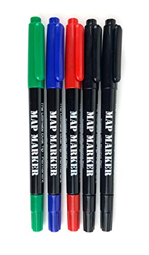
This 5-pack of twin-tip map markers equips you for field use with both fine (0.5mm) and broad (3mm) points. Easily correct mistakes on laminated maps with the erasable ink.
- Double Border: Markers are designed with a double border and a consistent white outline, offering high contrast against backgrounds. This feature exceeds the WCAG 2.1 guidelines with a minimum contrast ratio of 11:1.
- Center Dot: Every marker includes a center dot that switches from white to black, depending on the color of the marker. This change creates a focal point, enhancing visibility for users.
- Color Blind-Friendly Palette: The markers utilize a specific palette of 12 distinguishable colors plus black and white, optimized for those with various forms of color blindness.
Staedtler Permanent Lumocolor Markers
Write on almost any surface with these versatile pens, featuring permanent, quick-dry ink and a durable 0.4mm fine tip. The dry-safe ink prevents drying out, and the pens are refillable for long-lasting use.
- High-Contrast Colors: These markers are made with bold hues that are easily distinguishable, catering to a range of color vision deficiencies.
- Ergonomic Design: Their design ensures comfort during use, making them suitable for prolonged mapping tasks.
- Waterproof and Lightfast: The ink resists fading over time, which is vital for maintaining the clarity of your maps during fieldwork.
- Mess-Free Application: Known for quick-drying ink, these markers minimize smudging and make for clean application on both paper and plastic maps.
- Variety of Colors: They offer a wide range of colors that provide high visibility while avoiding colors that commonly confuse colorblind users.
- Precise Tip: Their fine point enables detailed work, ensuring that you can create clear labels and symbols on your maps.
By incorporating these colorblind-friendly markers, you’ll enhance readability and usability in your maps, making them accessible to everyone.
Tips for Using Markers with Colorblind-Friendly Maps
Creating accessible maps requires thoughtful marker choices. You’ll want to keep the following tips in mind.
Combining Colors and Patterns
Select colors carefully. You should avoid pairing red and green, as many individuals with color vision deficiencies struggle to differentiate between them. Incorporate distinct patterns and textures to enhance visual clarity. For instance, you can use striped markers for one feature and dotted patterns for another. This approach not only aids recognition but also adheres to accessibility standards, enhancing comprehensibility for all users.
Testing for Accessibility
Evaluate your map’s accessibility. Utilize tools such as Color Oracle or Coblis to simulate how your markers appear to individuals with various types of colorblindness. Gather feedback from real users to identify potential challenges. Adjust your markers based on this testing to ensure they effectively communicate information without confusion. Regular testing throughout your design process can significantly enhance usability and clarity, contributing to an inclusive mapping experience.
Conclusion
Creating colorblind-friendly maps is essential for ensuring everyone can access and understand the information presented. By selecting the right markers and employing high-contrast colors along with distinct patterns, you can significantly enhance map readability.
Utilizing tools like QGIS and ColorBrewer will streamline your design process and help you implement effective solutions. Remember to test your maps for accessibility and gather feedback to make necessary adjustments.
Prioritizing inclusivity not only benefits those with color vision deficiencies but also enriches the mapping experience for all users. With thoughtful design choices, you can promote equitable access to information and foster a more inclusive environment.


