
10 Best User-Friendly Maps for Accessibility
Navigating the world can be challenging for colorblind individuals, especially when traditional maps rely heavily on color differentiation. Fortunately, innovative solutions are emerging to create user-friendly maps that cater to diverse visual needs.
Disclosure: As an Amazon Associate, this site earns from qualifying purchases. Thank you!
TomTom Map Styler
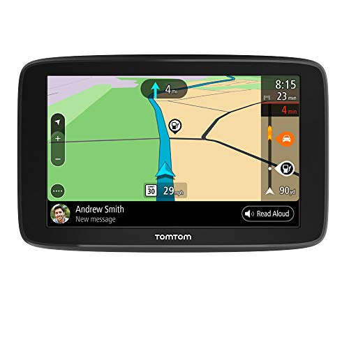
Navigate confidently with the TomTom GO Comfort GPS, featuring real-time traffic updates and free map updates for the USA, Mexico, and Canada. Stay connected with wireless updates and hands-free smartphone message reading.
TomTom Map Styler allows you to customize mapping layers with a variety of high contrast color schemes, catering to multiple color vision ranges. This tool helps ensure that important features stand out clearly, making it easier for colorblind users to navigate with confidence, especially on shaded maps.
Paul Tol’s Qualitative Color Schemes
Paul Tol’s qualitative color schemes are specifically designed for those with color vision deficiency. You can select from 5 to 10 distinct colors varying in darkness, enhancing differentiation on your maps. These schemes help maintain visual clarity across various data sets.
P.S. check out Udemy’s GIS, Mapping & Remote Sensing courses on sale here…
Color Universal Design (CUD) Palette
The Color Universal Design palette by Masataka Okabe and Kei Ito includes 8 colors that are unambiguous for both colorblind and non-colorblind individuals. This palette ensures accessibility for a wider audience, making your maps inclusive without sacrificing aesthetic appeal.
OpenStreetMap with Accessibility Filters
OpenStreetMap provides a collaborative approach to mapping where you can apply accessibility filters to highlight features that matter most to colorblind users. This tool enhances navigation by simplifying complex information and improving map readability.
ArcGIS Online Color Management
ArcGIS Online includes advanced color management tools that support color vision deficiency. You can adjust color gradients and apply patterns to differentiate between elements, promoting effective data visualization while ensuring clarity for all users.
Understanding Colorblindness and Mapping Needs
You need to acknowledge that colorblindness affects approximately 1 in 12 men and 1 in 200 women globally. Designing maps that are inclusive requires a clear understanding of colorblindness and how it impacts navigation. Certain colors may blend into one another, making information difficult to distinguish.
Types of Colorblindness
You should know there are several types of colorblindness, primarily categorized as follows:
- Protanopia: Individuals lack the ability to perceive red light, confusing reds with greens.
- Deuteranopia: Those with this type struggle to differentiate greens, often misinterpreting them as brown or gray.
- Tritanopia: This rare form impairs blue-yellow differentiation, leading to blue shades appearing greenish.
- Atypical Color Vision: Some may not fit strictly into the categories above but still face challenges in color recognition.
Common Mapping Issues for Colorblind Users
You may encounter several specific mapping issues affecting colorblind users, including:
- Color Dependence: Many maps use color alone to convey important information, making it hard for colorblind users to interpret.
- Inadequate Color Contrast: Low-contrast combinations, like red on green, may render elements indistinguishable.
- Overreliance on Color Gradients: Gradients can obscure patterns and information when color perception is limited.
- Non-Textual Labels: Relying on colors for labeling rather than combining text and color can lead to information loss.
By addressing these issues, you can create more effective and user-friendly maps for everyone.
Criteria for Selecting the Best User-Friendly Maps
Accessibility Features
- Incorporate universal design principles. Ensure your maps use clear typography, intuitive layouts, and comprehensive labels that go beyond color.
- Provide alternative formats. Offer tactile maps or audio descriptions to serve different learning styles and needs.
- Follow accessibility guidelines. Adhere to standards like the Web Content Accessibility Guidelines (WCAG) to ensure your maps meet the requirements for inclusivity.
- Utilize high-contrast colors. Select color palettes that maintain distinct separation even when hues are similar, such as blue/orange or blue/brown combinations.
- Implement patterns and textures. Use distinct patterns in addition to color to differentiate map elements. For example, stripes or dots can effectively denote various information types.
- Test color combinations. Regularly utilize tools like Color Oracle or Adobe Color to ensure your color choices are effective for those with color vision deficiency.
Tips for Creating User-Friendly Maps for Colorblind Audiences
Creating maps that cater to colorblind audiences involves thoughtful design choices to ensure clarity and accessibility. You’ll want to consider both textures and color palettes to improve usability effectively.
Consider Using Textures
Utilizing textures can significantly enhance map clarity for colorblind users. Consider these key applications:
- Line Widths and Patterns: Differentiate map elements by employing varying line widths and distinct patterns. For instance, use solid lines for major roads and dashed lines for secondary roads. This reduces reliance on color while enhancing visibility.
- Visual Textures: Incorporate textures to represent various areas. For example, use a stippled pattern for urban settings and a crosshatch pattern for forests. This provides additional cues that support map interpretation without depending solely on color.
Employ Colorblind-Friendly Palettes
Selecting the right color palette is crucial for creating accessible maps. Here are effective strategies:
- High-Contrast Colors: Choose colors that stand out against each other, such as dark blue against light gray. Tools like ColorBrewer can help find suitable palettes that ensure legibility for colorblind users.
- Avoid Certain Color Combinations: Stay away from red-green combinations, which are the most problematic for those with color vision deficiencies. Instead, opt for options like blue-yellow or blue-orange pairings that remain accessible.
- Test Color Combinations: Use software like Vischeck or Coblis to test your color choices effectively. This ensures accessibility for different types of colorblindness, including Protanopia and Deuteranopia.
By implementing these methods, you can significantly enhance the usability of your maps for colorblind audiences, elevating their overall navigational experience.
Conclusion
Creating accessible maps for colorblind audiences is essential for inclusive navigation. By prioritizing high-contrast color schemes and incorporating patterns and textures, you can enhance clarity and usability. The tools and techniques discussed empower cartographers to develop user-friendly maps that cater to diverse visual needs.
As you explore the options available, remember that effective design not only improves navigation for colorblind users but also enriches the experience for everyone. Embracing these principles fosters a more inclusive environment where all individuals can confidently navigate their surroundings. Your commitment to accessibility can make a significant difference in the way maps are experienced and utilized.