Color is more than just aesthetics; it’s a powerful tool for conveying information in maps. The right color choices can enhance understanding and make complex data more accessible. Discover the best map color theory guides that will elevate your visualization skills and help you communicate effectively.
Importance of Color Theory in Mapping
Understanding color theory is essential for effective map-making. The right color choices enhance data comprehension and improve the overall usability of your maps.
Understanding Color Harmony
Color harmony refers to the pleasing arrangement of colors that can enhance visualization. You can achieve this by using complementary colors, which are opposite each other on the color wheel, or analogous colors, which sit next to each other. Tools like Adobe Color can help generate harmonious color palettes for your maps. Additionally, employing a consistent color scheme across your visuals encourages intuitive understanding, allowing users to easily associate certain colors with specific data categories.
Recognizing Color Accessibility
Color accessibility ensures that your maps are usable by everyone, including those with color vision deficiencies. You should consider color combinations that maintain contrast and legibility. Utilize tools like ColorBrewer, which provides color palettes specifically designed for maps. Employ patterns or textures alongside color to convey information effectively, ensuring that your work is inclusive and considerate of diverse user needs. Remember, designing for accessibility not only broadens your audience but also elevates the quality of your mapping products.
Overview of the Best Map Color Theory Guides
When tackling color in mapping, several guides can enhance your skills. Here’s a look at the most effective resources you should consider:
ColorBrewer 2.0
You’ll find ColorBrewer 2.0 invaluable for selecting color schemes. It provides options for qualitative, sequential, and diverging data, ensuring you pick the most appropriate palette. It’s especially useful for creating accessible maps that everyone can interpret.
Jacques Bertin’s Visual Variables
Jacques Bertin’s principles emphasize the manipulation of visual variables: Hue, Saturation, and Lightness. Understanding these dimensions helps in accurately portraying data relationships. Referencing Bertin can refine your approach to color, enhancing clarity and conveying meaning effectively.
Adobe Color
Using Adobe Color can streamline your color palette creation. This tool allows you to generate harmonious color combinations and provides flexibility in adjusting hues based on the desired emotional impact of your map.
Color Accessibility Tools
Addressing color accessibility is critical. Tools like Color Oracle can simulate how your map looks to those with color vision deficiencies. Incorporating textures or patterns alongside colors can enhance readability for all users.
Unlock inner guidance with the Prism Oracle deck. This set includes 45 beautifully designed cards to illuminate your path.
Mapping Standards and Guidelines
Familiarizing yourself with mapping standards like those from the International Cartographic Association will ground your color choices in industry best practices, ensuring your maps meet professional expectations.
By integrating these resources into your workflow, you’ll create more effective visualizations, aligning color theory with practical mapping needs.
Guide 1: The Color Brewer
ColorBrewer is an essential tool for mapmakers aiming to enhance their data visualization through effective color selection. Its user-friendly interface allows you to create appropriate color schemes tailored to your specific mapping needs.
Features of Color Brewer
ColorBrewer provides you with versatile color scheme options:
- Types of Color Schemes: Choose from qualitative, sequential, and diverging schemes, catering to different data types and visual narratives.
- Customization: Specify the number of data classes needed, ensuring each color corresponds precisely to the data it represents.
- Visualization: Preview selected schemes directly on a map and in a legend format, allowing for immediate assessment of visual effectiveness.
How to Use Color Brewer for Effective Visualization
To use ColorBrewer effectively, follow these steps:
- Select Data Type: Identify the nature of your data (categorical, ordered, or diverging) to determine the best color scheme type.
- Adjust Parameters: Set the number of data classes to optimize your color choices.
- Preview Options: Utilize the preview feature to visualize your scheme on a map, checking for clarity and accessibility.
- Implement Feedback: Share your color choices with collaborators to ensure they enhance comprehension.
By following these methods, you can create maps that not only look appealing but also communicate information effectively.
Guide 2: ColorHexa
ColorHexa is a versatile color resource that’s essential for mapmakers looking to enhance their color choices. It provides comprehensive information on color specifications, combines well with design tools, and offers features that streamline color selection for cartography.
Key Functions of ColorHexa
ColorHexa enables you to convert color formats easily, like RGB to HEX or HSL to CMYK. It features a color picker for precise selections and generates complementary colors, which can help you find harmonious color schemes. Additionally, it offers color palettes based on selected hues, allowing for greater customization in your maps.
Benefits of Using ColorHexa for Mapping
Using ColorHexa enhances your mapping projects by allowing for accurate color adjustments. You can visualize how colors work together and ensure accessibility for users with color vision deficiencies. By employing its detailed information on color usage and schemes, you can improve the clarity and appeal of your visualizations.
Guide 3: Adobe Color Wheel
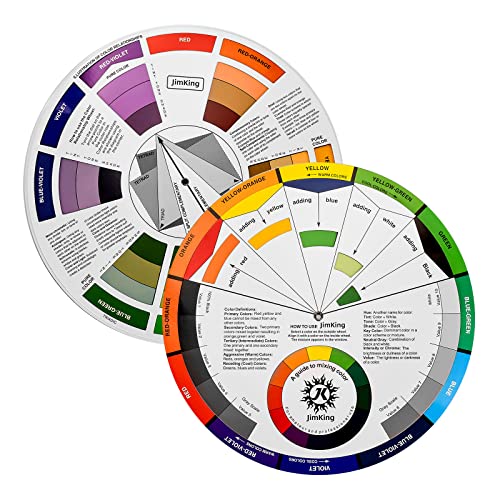
Easily organize and understand color relationships with this rotating color wheel. Ideal for artists and designers, it features a durable, UV-coated design for lasting use and clear color identification.
Adobe Color Wheel is an invaluable tool for creating custom color palettes tailored to your mapping projects. By leveraging its intuitive interface, you can easily explore harmonious color combinations that enhance map readability and data interpretation. You can choose colors based on various schemes—such as complementary, analogous, or triadic—to find the perfect palette that accurately represents your data.
Utilizing Adobe Color Wheel for Custom Palettes
Utilizing Adobe Color Wheel allows you to generate dynamic palettes by adjusting hue, saturation, and lightness. You can start by selecting your base color, then use the wheel to explore variations that maintain visual harmony. For example, if you’re mapping categorical data, you can create a vibrant palette with distinct hues to delineate each category clearly. This ensures that your maps not only look professional but also effectively communicate your intended message.
Integrating Adobe Color with Mapping Tools
Integrating Adobe Color with mapping tools can streamline your workflow significantly. Platforms like ArcGIS and QGIS allow you to import custom color palettes directly from Adobe Color. You can use the exported hex codes to apply your chosen palette to various map layers, ensuring consistent branding and readability across your project. This integration helps in maintaining a cohesive look and feel while adapting your color choices to suit different types of data visualization, whether sequential, qualitative, or diverging.
Guide 4: Color Oracle
Importance of Color Blindness Simulation
When creating maps, it’s essential to consider how color blindness affects interpretation. Approximately 8% of men and 0.5% of women experience some form of color vision deficiency. Ensuring your maps are accessible to this large demographic enhances communication and usability. By simulating how colors appear to those with color blindness, you can identify problematic color combinations and improve your map’s clarity.
Using Color Oracle to Improve Accessibility
Color Oracle is a powerful tool for simulating color blindness. It allows you to view your map design through the lens of different color vision types, including Protanopia, Deuteranopia, and Tritanopia. By applying this tool, you can adjust your color palette accordingly, ensuring your map remains informative and visually accessible. Integrating Color Oracle into your workflow not only adheres to accessibility standards but also improves the overall quality of your mapping products.
Guide 5: Carto’s Color Study
Carto’s Color Study is an essential resource for mapmakers aiming to enhance their visualization techniques. It provides valuable insights into color use, emphasizing the impact of color on data interpretation and user engagement.
Features of Carto’s Color Study
Carto’s Color Study offers a variety of interactive tools designed to optimize color selection. Color palettes are tailored to specific visualization needs, ranging from categorical to quantitative data. You can access pre-defined schemes that enhance readability and ensure accessibility. Additionally, the study covers best practices for applying color with a focus on clarity and user experience, adhering to industry standards.
Applying Carto Techniques for Effective Visualization
You can apply Carto’s techniques to improve your maps significantly. Start by selecting color palettes that fit your data type—using sequential colors for continuous data and categorical colors to distinguish groups. Utilize the Color Study’s interactive features to simulate how different color schemes affect user perception. By adjusting hues and saturation levels, you can ensure your maps convey information effectively, making complex data intuitive and engaging for your audience.
Conclusion
Mastering map color theory is essential for creating effective visualizations. By selecting the right colors you can enhance data comprehension and ensure your maps are accessible to all users. Utilizing tools like ColorBrewer Adobe Color and Color Oracle empowers you to craft harmonious palettes that improve readability and engagement.
Don’t overlook the importance of color accessibility. Incorporating features that accommodate color vision deficiencies not only broadens your audience but also elevates the quality of your mapping products. As you apply these principles and resources you’ll find that thoughtful color choices transform complex data into clear and compelling visual narratives. Embrace these guides and watch your mapping skills flourish.

