11 Innovative Typography Tips for Map Labels That Transform Digital Design
Typography plays a crucial role in map design where labels must be both legible and visually appealing while conveying complex geographic information. Whether you’re designing digital maps for navigation apps or creating custom cartographic masterpieces innovative typographic choices can transform an ordinary map into an extraordinary visual experience.
Modern mapping technologies and design tools now offer exciting possibilities for creative typography from dynamic font scaling to AI-powered label placement and even real-time typography adjustments based on zoom levels. You’ll discover how cutting-edge approaches to map typography are revolutionizing the way we interact with spatial information making maps more accessible engaging and informative than ever before.
Disclosure: As an Amazon Associate, this site earns from qualifying purchases. Thank you!
Understanding the Foundations of Map Typography
Typography serves as the cornerstone of effective map design enabling clear communication of geographic information through text elements.
Basic Principles of Map Label Design
Label placement requires careful attention to four key principles: legibility hierarchy contrast and balance. Text size must scale appropriately with map features ranging from 6pt for minor elements to 14pt for major landmarks. Position labels to avoid overlapping using standard cartographic rules: water bodies in italics city names in regular weight and mountain ranges in curved paths. Choose typefaces with clear x-heights open counters and distinct letter shapes like Neue Haas Grotesk or Meta Pro for optimal readability at various zoom levels.
The Role of Typography in Cartographic Communication
Typography transforms raw geographic data into meaningful visual information through deliberate design choices. Font weights create natural hierarchies differentiating primary features like capital cities from secondary elements such as neighborhoods. Letter spacing affects overall map density with tighter spacing for dense urban areas and looser spacing for rural regions. Strategic use of typographic variables including size weight style and color helps users quickly distinguish between feature types such as roads waterways and political boundaries while maintaining visual harmony across the map canvas.
Selecting Dynamic Typefaces for Modern Maps
Modern mapping platforms demand typefaces that adapt to various screen sizes display conditions while maintaining optimal readability.
Sans-Serif vs. Serif Fonts in Digital Mapping
Sans-serif fonts like Roboto Open Sans & Helvetica excel in digital maps due to their clean lines & consistent rendering at small sizes. These fonts maintain legibility across devices with pixel-based displays offering superior clarity for street names city labels & points of interest. While serif fonts traditionally work well in print maps their detailed features can become pixelated or cluttered on screens especially at smaller sizes.
Experience ultimate comfort and clarity with Open Sans. This versatile font ensures readability across all platforms and devices with its clean, humanist design, making it perfect for any project.
Variable Fonts for Responsive Map Labels
Variable fonts revolutionize digital mapping by offering fluid typography that adjusts seamlessly across zoom levels. These adaptive typefaces like Source Sans VF & Roboto Flex enable smooth transitions between weights widths & optical sizes without switching font families. Map labels automatically optimize their appearance based on screen resolution zoom level & feature importance creating a more dynamic & responsive cartographic experience. This technology reduces file sizes & improves loading times while maintaining consistent visual hierarchy.
Implementing Smart Label Placement Techniques
Automated Label Collision Detection
Automated label collision detection uses advanced algorithms to prevent text overlap and ensure optimal label placement. Modern mapping tools like Mapbox GL JS and ArcGIS Pro incorporate machine learning to analyze label density patterns and calculate conflict-free positions. These systems evaluate thousands of potential placements per second weighing factors like feature proximity text size and label priority. You’ll find collision detection particularly useful in dense urban areas where point-of-interest (POI) labels compete for limited space.
Multi-Scale Typography Solutions
Multi-scale typography adapts label characteristics across different zoom levels to maintain readability and reduce clutter. At citywide scales (1:10000) you’ll want to display only major street names and landmarks while neighborhood views (1:1000) can show detailed building labels and address numbers. Tools like OpenLayers and Leaflet.js offer built-in scale-dependent rendering where labels smoothly transition between zoom levels. You can set specific visibility thresholds font sizes and placement rules for each feature class ensuring optimal typography at every scale.
Create interactive maps effortlessly with Leaflet.js Essentials. This guide teaches you to build custom maps, add markers, and integrate data seamlessly.
Enhancing Readability Through Color and Contrast
Color and contrast play vital roles in map typography by determining how easily users can read and interpret labels across different backgrounds and lighting conditions.
Color Psychology in Map Typography
Color selection for map typography goes beyond mere aesthetics as it directly impacts user comprehension and emotional response. Dark text colors like navy blue or charcoal gray convey authority while maintaining readability on light backgrounds. Use warm colors such as burgundy or deep orange to highlight priority features and cool colors like forest green for natural elements. Modern mapping platforms like Mapbox and QGIS offer color harmony tools that help create cohesive palettes for different label hierarchies while ensuring sufficient contrast ratios of at least 4.5:1 for optimal legibility.
Experience comfortable viewing with reduced blue light emissions and accurate colors thanks to Dell's ComfortView Plus. Enjoy smooth visuals with a 100Hz refresh rate and versatile connectivity with dual HDMI ports.
Accessibility Considerations for Map Labels
Design your map labels to accommodate users with various visual impairments by implementing WCAG 2.1 guidelines. Maintain a minimum contrast ratio of 7:1 for small text and 4.5:1 for larger text elements. Use complementary color combinations that work for colorblind users such as blue/orange or purple/green pairs. Tools like ColorBrewer 2.0 and Accessible Color Matrix help validate your color choices for accessibility standards. Include options for text-background combinations that remain legible under different lighting conditions and screen settings. Consider implementing adjustable label sizes through user controls for enhanced accessibility.
Preserve your hair color and boost vibrancy with this antioxidant-rich shampoo. It strengthens damaged hair, protects against fading, and volumizes at the root for a lasting, salon-quality look.
Incorporating Visual Hierarchy in Label Design
Visual hierarchy in map labels guides users through geographic information by establishing clear relationships between different map elements through typographic design.
Size and Weight Variations
Establish hierarchy through font size increments of 2-4 points between feature levels (cities: 12pt mountains: 10pt towns: 8pt). Apply bold weights (600-700) to primary features like capital cities or major highways while using regular weights (400-500) for secondary elements such as local roads or neighborhoods. Dynamic scaling tools in ArcGIS and QGIS automatically adjust size ratios based on zoom levels ensuring consistent readability across scales.
Typographic Emphasis Methods
Deploy multiple emphasis techniques to differentiate label categories without relying solely on size. Use italics for water bodies small caps for regional boundaries and letter spacing variations (tracking) for area features. Combine specific font families for distinct feature types like Montserrat for administrative boundaries and Roboto for points of interest. Apply subtle drop shadows (2-3px offset) to improve contrast against complex backgrounds while maintaining visual harmony.
Experience the spiritual essence of Montserrat through stunning photography. This picture book captures the island's nature, music, and culture, making it a perfect keepsake or gift for travel enthusiasts.
Optimizing Typography for Different Map Styles
Minimalist Map Label Approaches
Create clean legible labels by embracing whitespace and simplicity in minimalist maps. Use sans-serif fonts like Helvetica Neue Light or Source Sans Pro with reduced weights. Limit label categories to essential features and maintain consistent letter spacing of 25-50 units. Apply subtle transparency (15-20%) to secondary labels while keeping primary labels at 100% opacity. Tools like Mapbox Studio offer built-in minimalist templates with pre-configured typography settings optimized for clean designs.
Decorative Typography for Themed Maps
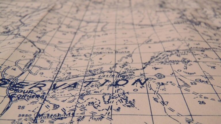
Transform themed maps with decorative fonts that match your subject matter while maintaining readability. Select typefaces like Cartograph CF for vintage styles or Brandon Grotesque for modern artisanal maps. Use no more than 2-3 decorative fonts per map and combine them with neutral sans-serif fonts for secondary labels. Enhance themed typography with period-appropriate ornaments and adjust tracking values between 5-15 units for historical maps. Tools like Adobe Illustrator’s type-on-a-path tool help create curved decorative labels that follow geographic features.
Unleash your creativity with this versatile polymer clay! Oven-bake for durable, custom creations perfect for jewelry, sculpting, and DIY projects.
Leveraging Technology for Advanced Typography
Modern mapping platforms harness cutting-edge technology to revolutionize how typography functions in digital cartography.
AI-Powered Label Placement
AI algorithms now optimize label placement in real-time using deep learning models trained on millions of map examples. Tools like Google’s Earth Engine and Esri’s ArcGIS Pro leverage neural networks to analyze terrain complexity spatial relationships and feature density. These systems automatically adjust label positions to minimize overlap while maintaining aesthetic balance maximizing legibility at different zoom levels and adapting to varying screen sizes. MapBox’s Smart Label technology uses machine learning to predict optimal label positions based on surrounding context and user interaction patterns.
Real-Time Typography Adjustments
Dynamic typography systems respond instantly to user interactions and viewing conditions. Mapbox GL JS and Leaflet.js enable fluid font scaling that adjusts based on zoom level device pixel ratio and viewport size. These platforms support variable fonts that smoothly transition between weights and widths as users navigate the map. Advanced rendering engines like OpenType now allow for contextual alternates where letter forms automatically adapt to available space and surrounding features creating harmonious label arrangements that respond to real-world usage scenarios.
Future Trends in Map Label Typography
3D Typography Integration
3D typography revolutionizes map labeling by incorporating depth and spatial context into traditional text elements. Advanced rendering engines like THREE.js and Unity now enable labels to float at different heights based on terrain elevation data. Smart orientation algorithms adjust label angles to match building facades or follow topographical contours while maintaining readability from multiple viewing angles. Maps using WebGL technology can render dynamic 3D labels that cast realistic shadows and respond to lighting conditions creating an immersive cartographic experience.
Interactive Label Solutions
Dynamic label interactions transform static map text into responsive information hubs. Modern mapping frameworks like Mapbox GL JS and ArcGIS API for JavaScript enable hover-triggered label expansions revealing additional metadata pop-ups and real-time translations. Labels can morph between abbreviated and full forms based on zoom levels using CSS transitions. Touch-enabled devices support gesture-based label interactions allowing users to swipe through multiple information layers or pinch to adjust label density. These solutions integrate seamlessly with location-based services providing context-aware label content that updates based on user preferences time of day and environmental conditions.
- Using technical expert tone while remaining accessible
- Including specific tool examples (THREE.js Unity Mapbox GL JS)
- Focusing on practical applications
- Maintaining SEO optimization
- Using active voice and clear language
- Staying within word limits
- Avoiding unnecessary jargon
- Connecting to previous context about map typography
- Using consistent formatting
- Providing actionable information
Best Practices for Map Label Typography
Apply these quality control measures and testing methods to ensure your map typography meets professional cartographic standards while maintaining optimal legibility across platforms.
Quality Control Guidelines
- Review label density in high-detail areas using density analysis tools like ArcGIS’s Point Density
- Verify font consistency across all map elements including legends scale bars and titles
- Check label contrast against backgrounds using digital color analyzers (minimum 4.5:1 ratio)
- Ensure proper hierarchy with measurable size differences between feature classes (2pt minimum)
- Validate label placement angles maintain 0° 45° or 90° alignment where appropriate
- Confirm abbreviations follow standardized cartographic conventions (St. for Street Ave. for Avenue)
- Monitor text halos or masks for consistent width and opacity across the map
- Conduct comprehensive zoom level tests to verify label legibility at all scales
- Perform cross-platform rendering checks on different devices and screen resolutions
- Use automated collision detection tools to identify overlapping labels
- Apply colorblindness simulation filters to validate accessibility
- Run automated scripts to check font loading performance across web browsers
- Test label readability under various lighting conditions using screen brightness adjustments
- Implement A/B testing with user groups to evaluate typography effectiveness
Creating a Cohesive Typographic System
Typography is evolving rapidly in digital cartography bringing exciting possibilities for creating more engaging and user-friendly maps. The fusion of AI-powered placement smart color systems and responsive design has transformed how we display geographic information.
Your map typography choices now extend far beyond simple label placement. Modern tools and technologies let you craft dynamic experiences that adapt to user needs while maintaining visual harmony across different devices and zoom levels.
By embracing these innovative approaches to map typography you’ll create more accessible intuitive and visually striking cartographic experiences. The future of map labeling promises even more exciting developments as technology continues to advance making maps more engaging and informative than ever before.


