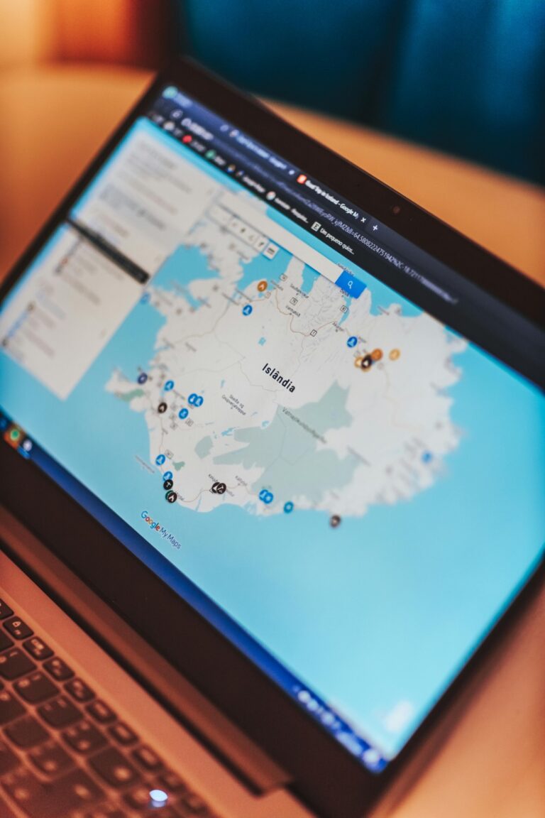
11 Visual Storytelling in Cartography Tips That Transform Digital Maps
Visual storytelling transforms ordinary maps into powerful narratives that capture the imagination and convey complex information with striking clarity. Through thoughtful design choices color schemes and data visualization techniques you’ll discover how modern cartographers blend art and science to create maps that do more than just show locations.
Modern mapping goes beyond traditional cartography by incorporating interactive elements data-driven insights and compelling visual narratives that help viewers understand spatial relationships and patterns in ways that weren’t possible before. Whether you’re a professional cartographer data scientist or someone who’s passionate about maps learning the principles of visual storytelling will elevate your map-making skills to new heights.
Disclosure: As an Amazon Associate, this site earns from qualifying purchases. Thank you!
Understanding the Art of Visual Storytelling in Cartography
Choose Your Narrative Focus
Select a clear central message for your map that connects with your audience’s needs. Consider highlighting geographic patterns demographic shifts or environmental changes that tell a compelling story through spatial data.
Layer Your Information Strategically
Build your map’s visual hierarchy using 3-4 distinct data layers. Start with a simple base layer then add thematic layers that support your narrative without overwhelming the viewer. For example combine population density with transportation networks to show urban development patterns.
Apply Visual Hierarchy Principles
Structure your map elements using size color and contrast to guide viewer attention. Make primary information stand out with bold colors while using subtle tones for supporting details. Key features should command 60% of visual weight while context layers take 40%.
Include Interactive Elements
Add tooltips popups or clickable features that reveal deeper insights. Integrate hover states that display detailed statistics or temporal data allowing users to explore changes across different time periods or categories.
Maintain Clear Design Standards
Follow consistent styling rules throughout your visualization:
- Use a maximum of 5 colors in your palette
- Keep font families limited to 2 types
- Maintain uniform symbol sizes for similar features
- Apply standardized spacing between map elements
Incorporate Supporting Graphics
Enhance your map’s story with complementary charts or diagrams. Add small multiples side-by-side maps or data visualizations that reinforce your narrative without cluttering the main display.
Creating Emotional Connections Through Map Design
Map design goes beyond presenting data – it’s about creating an emotional resonance that draws viewers into the geographical narrative and enhances their understanding of place-based stories.
Color Psychology in Map Making
Color choices in maps trigger specific emotional responses that shape how viewers interpret spatial information. Use warm colors like red and orange to highlight urgent or important areas while cool blues and greens create calm feelings for background elements. Consider cultural color associations – red signifies danger in Western cultures but prosperity in Eastern ones. For data visualization choose colorblind-safe palettes with appropriate contrast ratios. Limit your color scheme to 5-7 hues to prevent visual overwhelm while maintaining clarity.
Typography and Visual Hierarchy
Strategic typography guides viewers through different map elements while establishing information hierarchy. Select sans-serif fonts like Helvetica or Open Sans for labels requiring quick readability at various scales. Use size contrast to distinguish between primary features (14pt+) secondary elements (10-12pt) and supplementary information (8-9pt). Maintain consistent font families throughout your map while varying weights and sizes to create clear visual organization. Consider letter spacing in dense urban areas to prevent text overlap.
Incorporating Narrative Elements in Maps
Maps become powerful storytelling tools when they guide viewers through information in a deliberate sequence while using meaningful symbols to represent data.
Sequential Information Flow
Design your maps to lead viewers through information in a logical progression from start to finish. Begin with base layers that provide essential context like boundaries or terrain. Add subsequent data layers that build upon each other to reveal patterns or relationships. Use visual cues like arrows directional flow lines or numbered markers to indicate the intended viewing sequence. Structure complex information into digestible chunks by incorporating hover states or click-through features that reveal additional details at each step.
Using Symbols and Icons
Select symbols and icons that instantly communicate meaning without requiring legend consultation. Use standardized mapping symbols like north arrows scale bars and coordinate grids to maintain professional conventions. Create custom icons that match your map’s visual style while ensuring they remain clear at different zoom levels. Keep symbols consistent in size color and style throughout the map to establish visual harmony. Use icon hierarchies to distinguish between primary secondary and supplementary information points.
Balancing Data Visualization With Aesthetic Appeal
Creating effective maps requires striking the perfect balance between presenting accurate data and maintaining visual appeal.
Minimalism vs. Detail
Choose a minimalist approach when communicating simple spatial relationships or broad patterns. Strip away non-essential elements like decorative borders grid lines and unnecessary labels. For complex data sets incorporate strategic detail by using graduated symbols proportional circles or choropleth techniques. Limit your color palette to 3-5 carefully selected hues that enhance data comprehension rather than simply decorating the map. Remember that every visual element should serve a clear purpose in conveying your map’s message.
Interactive Elements and User Experience
Design interactive features that enhance data exploration without overwhelming users. Include zoom controls pan functions and hover tooltips to reveal detailed information on demand. Add clickable layers that let users toggle between different data views or time periods. Keep interface controls intuitive and consistently placed using familiar icons like magnifying glasses for search or eye symbols for layer visibility. Ensure load times remain quick by optimizing data delivery and implementing progressive loading for complex visualizations.
Leveraging Technology in Modern Map Storytelling
Modern mapping technology has revolutionized how we create and share geographic narratives through interactive digital platforms.
Digital Mapping Tools
Today’s cartographers leverage powerful GIS platforms like QGIS Esri’s ArcGIS and Mapbox to create dynamic visualizations. These tools offer extensive libraries of basemaps templates and plugins that streamline the mapping process. Cloud-based platforms like Carto and Flourish enable real-time collaboration data updates and seamless sharing across devices. Web mapping frameworks like Leaflet and OpenLayers provide developers with flexible options to build custom interactive mapping applications.
Animation and Dynamic Elements
Interactive maps now incorporate motion graphics time-sliders and animated symbology to show change over time. Platforms like Mapbox GL JS and Deck.gl enable smooth transitions between map states zoom levels and data layers. Key animation techniques include:
- Temporal animations showing historical patterns
- Fly-to transitions between locations
- Progressive data loading for large datasets
- Animated symbology for real-time updates
- Interactive legends that trigger layer animations
The integration of these dynamic elements transforms static maps into engaging story-driven experiences while maintaining clear navigation and purpose.
Implementing Cultural Context in Map Design
Cultural context transforms maps from mere geographic representations into meaningful storytelling tools that resonate with diverse audiences.
Historical Significance
Integrate historical landmarks symbols icons and place names that reflect an area’s heritage development through time. Use traditional cartographic elements like compass roses historical boundaries and period-appropriate typography to honor cultural mapping conventions. Consider including historical overlays that show urban development settlement patterns and significant events through time-series visualizations. Maintain careful documentation of historical sources to ensure accuracy while representing culturally significant sites.
Regional Sensitivities
Adapt map designs to reflect local cultural preferences naming conventions and symbolic representations. Use culturally appropriate colors (avoiding those with negative connotations in specific regions) and incorporate indigenous place names alongside current designations. Consider regional reading patterns left-to-right versus right-to-left when designing legend placements and information flow. Display disputed territories boundaries and place names according to international cartographic standards while acknowledging multiple perspectives through thoughtful labeling.
Ensuring Accessibility in Map Communication
Creating accessible maps ensures that spatial information reaches all users regardless of their abilities or technological constraints.
Universal Design Principles
Design your maps with clear visual hierarchies using high contrast ratios of at least 4.5:1 for text elements. Implement consistent symbol sizes starting at 12 pixels minimum for digital displays. Choose colorblind-safe palettes that distinguish between data categories using tools like ColorBrewer 2.0. Structure your legend elements with logical groupings and include alternative text descriptions for all symbolic elements. Test your maps with screen readers to verify that all interactive elements are keyboard-navigable.
Multi-Format Delivery
Export your maps in multiple formats including vector PDFs for print scalability SVGs for web integration and GeoJSON for data portability. Provide downloadable versions in both high and low-resolution options to accommodate different bandwidth constraints. Create responsive layouts that adapt to various screen sizes from mobile devices to large displays. Include text-based data tables as alternatives to visual representations and optimize file sizes to under 5MB for quick loading on slower connections.
Building Compelling Geographic Narratives
Building effective geographic narratives requires strategic organization of spatial information and careful consideration of how viewers process map elements.
Layered Information Display
Start with a clear base layer that establishes geographic context through essential features like boundaries coastlines or major landmarks. Add thematic layers progressively using transparency levels of 30-70% to maintain visibility of underlying elements. Implement an intuitive toggle system for interactive maps allowing users to control layer visibility based on their interests. Use consistent visual hierarchy with darker colors for primary data and lighter shades for supporting information.
Spatial Relationship Visualization
Highlight geographic connections using flow lines arrows or graduated symbols to show movement patterns relationships or hierarchies. Apply visual variables like size color and shape to encode quantitative differences maintaining a 3:1 minimum contrast ratio. Create focal points through strategic placement of key elements using the rule of thirds. Incorporate scale-dependent rendering to reveal different levels of detail as users zoom changing symbol sizes from 12-24 pixels for optimal visibility.
Measuring Impact and Engagement
Understanding how your maps resonate with audiences requires systematic measurement and analysis of user interactions and feedback.
User Feedback Integration
Track user interactions through embedded feedback tools like thumbs up/down buttons heat maps and comment sections. Deploy short surveys using tools like Typeform or Google Forms to gather specific insights about map usability clarity and emotional impact. Create A/B tests to compare different design approaches measuring which versions generate better engagement rates. Monitor social media mentions and shares to gauge your maps’ broader impact across platforms.
| Metric Type | Key Measurements |
|---|---|
| User Engagement | Click-through rates zoom frequency hover interactions |
| Technical Performance | Load time response speed error rates |
| Content Impact | Share counts downloads citations |
| Audience Reach | Unique visitors geographic distribution device types |
Moving Forward: The Future of Cartographic Storytelling
Visual storytelling in cartography has evolved from simple map-making into a powerful medium that combines art data and technology. You’ll find that mastering these techniques opens up endless possibilities for creating compelling geographic narratives that resonate with your audience.
As mapping technologies continue to advance you’ll have even more tools at your disposal to craft engaging visual stories. By embracing accessibility maintaining cultural sensitivity and measuring user engagement you’re not just creating maps – you’re building bridges between data and human understanding.
Remember that effective visual storytelling in cartography isn’t just about presenting information – it’s about creating meaningful connections that inspire action and deepen understanding. Your commitment to thoughtful design choices and user-centered approaches will shape the future of how we share and interpret spatial stories.


