9 Creative Alternatives to Standard Color Ramps That Transform Data Stories
Color ramps don’t have to follow the predictable rainbow spectrum you’re used to seeing in data visualizations and designs. Whether you’re creating infographics, digital art, or UI elements there’s a whole world of innovative color combinations waiting to be explored beyond the traditional Roy G. Biv approach.
Breaking free from standard color gradients can transform your work from ordinary to extraordinary while keeping your audience engaged through unexpected yet harmonious color transitions. You’ll discover how nature-inspired palettes, emotional color progressions and non-linear color sequences can breathe new life into your visual storytelling while maintaining clarity and accessibility for your viewers.
Understanding Color Ramps and Their Traditional Uses
Color ramps serve as essential tools in visual communication establishing predictable progressions of color to represent data ranges information hierarchies.
Basic Definition of Color Ramps
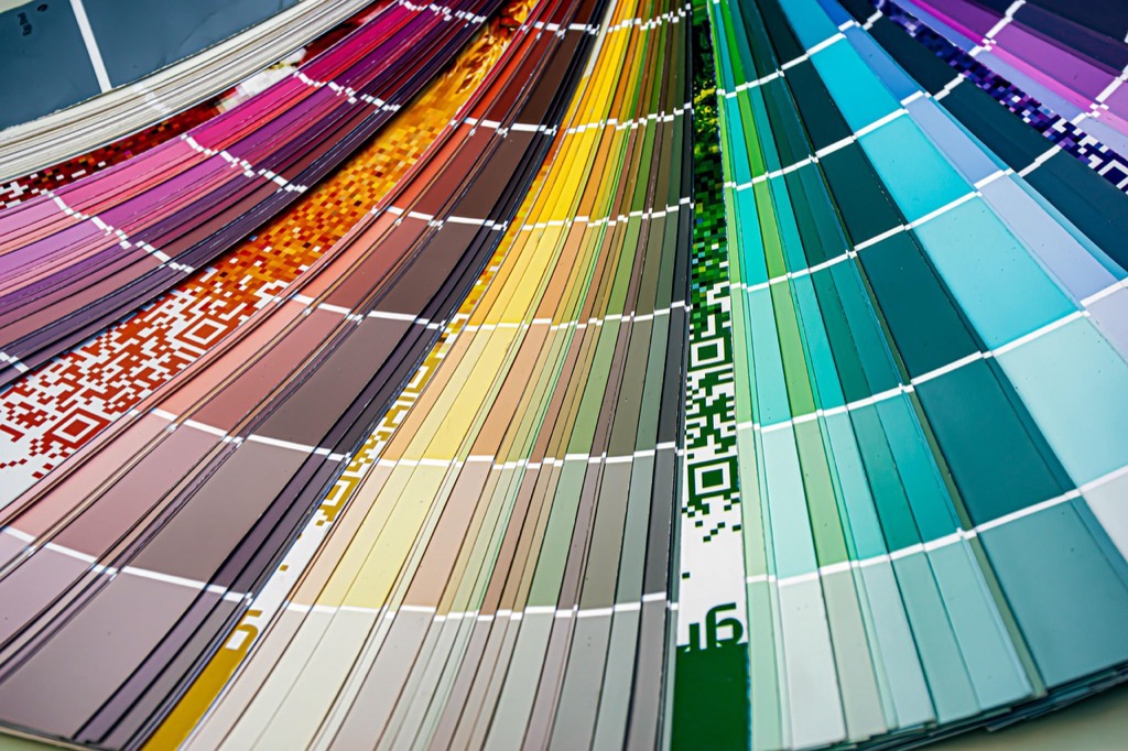
A color ramp is a sequential arrangement of colors that transition smoothly from one hue value or intensity to another. These gradients typically follow specific patterns like light to dark single-color progressions divergent schemes or rainbow sequences. Color ramps create visual relationships between data points allowing viewers to quickly interpret values relationships or categories in data visualizations charts and maps.
Common Applications in Design
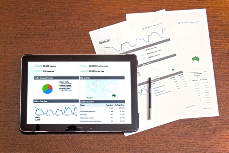
Color ramps appear extensively in data visualization weather maps infographics and digital interfaces. They help display quantitative data like temperature ranges elevation changes population density and financial metrics. In user interface design color ramps guide attention through interfaces indicate system status and create visual hierarchies. Common examples include progress bars heat maps choropleth maps and gradient overlays in data dashboards.
Exploring Non-Linear Color Progressions
Non-linear color progressions offer innovative ways to represent data and create visual interest beyond traditional sequential arrangements.
Spiral Color Arrangements
Spiral color arrangements create dynamic visual patterns by mapping hues along a curved path rather than a straight line. You’ll find these arrangements particularly effective in circular infographics data wheels and radial visualizations. The spiral approach allows for continuous color flow while maintaining distinct value steps creating natural rhythm in your design. Tools like Adobe Color or Coolors help generate spiral palettes by selecting key points along the curve and interpolating intermediate values.
Radial Color Transitions
Radial color transitions expand outward from a central point creating concentric rings of color variation. You can use this technique to highlight focal points in data visualizations or create depth in interface elements. Popular applications include heat maps geographical data displays and interactive dashboards where the center represents peak values. Programs like Figma and Sketch offer built-in radial gradient tools that let you place color stops at specific distances from the center point.
Incorporating Multiple Hue Shifts
Multiple hue shifts create dynamic color transitions that add depth and visual interest to your designs while maintaining data clarity.
Split-Complementary Transitions
Transform your color ramps by incorporating split-complementary hues that shift between three harmonious colors. Start with a base color then transition to two colors adjacent to its complement on the color wheel. For example pair blue with yellow-orange and red-orange or green with red-purple and blue-purple. This approach creates vibrant contrasts while maintaining visual balance in data visualizations temperature maps and interface gradients.
Triadic Color Progressions
Create bold visual narratives using triadic color schemes that shift between three evenly spaced hues on the color wheel. Combine colors like red yellow-green and blue-purple or orange green and violet to develop eye-catching progressions. This technique works exceptionally well for categorical data visualization infographic elements and interactive UI components where distinct color steps need to remain visually connected.
Rainbow Bridge Effects
Build smooth transitions between contrasting hues using intermediate bridge colors that guide the eye naturally across your visualization. Connect distant colors like red and blue by incorporating purple tones or link yellow and blue through green stepping stones. This method helps avoid jarring color jumps in heat maps topographic visualizations and gradient overlays while preserving the dramatic impact of contrasting endpoints.
Leveraging Texture-Based Color Variations
Texture-based color variations add depth and visual interest to color ramps while maintaining data clarity and enhancing user engagement.
Gradient Patterns with Texture Overlays
Transform standard color transitions by incorporating subtle texture patterns into your gradients. Apply noise masks wood grain or fabric textures with 10-30% opacity to create organic depth without compromising legibility. Tools like Adobe Photoshop’s Pattern Overlay or Figma’s Blend Modes let you mix textures with color stops strategically. Popular options include canvas ripples dotted matrices and linear striations that follow your gradient direction.
Color Noise and Grain Effects
Integrate digital noise patterns to break up monotonous color transitions and add visual depth. Use monochromatic grain at 5-15% intensity to create subtle texture variations or apply colored noise to introduce micro-contrast between hue shifts. Tools like Procreate’s Noise Brush or CSS noise() function enable precise control over grain density. This technique works especially well in dark-to-light transitions heat maps and atmospheric visualization overlays.
Implementing Dynamic Color Relationships
Dynamic color relationships transform static color ramps into responsive visual experiences that adapt to user interaction and data changes.
Interactive Color Transitions
Implement hover-triggered color shifts using CSS transitions or JavaScript libraries like GreenSock (GSAP). Create smooth interpolations between color states by defining transition timing functions in your code:
.element {

background: #2196F3;

transition: background-color 0.3s ease-in-out;

}
.element:hover {

background: #FF4081;

}
Tools like Framer Motion and React Spring enable complex interactive color animations that respond to clicks drags and scrolls while maintaining performance through GPU acceleration.
Motion-Based Color Changes
Design color transitions that respond to scroll position device orientation or cursor movement. Use intersection observers or scroll-triggered animations to shift colors based on viewport position:
const observer = new IntersectionObserver(entries => {

entries.forEach(entry => {

if (entry.isIntersecting) {

entry.target.style.backgroundColor = getColorFromScroll();

}

});

});
Popular libraries like ScrollTrigger and Lottie help create fluid motion-based color transitions that enhance user engagement through natural movement patterns and gestural interactions.
Using Geometric Patterns for Color Distribution
Geometric patterns offer structured frameworks for distributing colors in creative and mathematically pleasing ways.
Tessellated Color Arrangements
Transform your color schemes using repeating geometric shapes like hexagons triangles or squares to create systematic color distributions. Tessellation patterns let you assign colors to individual tiles based on their position relationships or data values. Tools like Adobe Illustrator and Sketch enable precise control over tessellated arrangements through grid systems and shape tools. This approach works especially well for displaying categorical data clusters geographic regions and modular interface designs.
Fractal-Based Color Progressions
Apply color variations using fractal mathematics to create self-similar patterns that maintain visual interest across multiple scales. The Mandelbrot set and Julia sets provide frameworks for distributing colors in naturally recurring patterns. Tools like Processing and TouchDesigner let you generate fractal-based color sequences that work well for data visualization hierarchies interactive backgrounds and generative art. These progressions create engaging depth while maintaining mathematical precision in color distribution.
Experimenting with Emotional Color Mapping
Mood-Based Color Transitions
Map your color transitions to reflect specific emotional states by linking hue progressions with psychological responses. Create gradual shifts from anxious reds to calming blues or energetic yellows to contemplative purples using tools like Emotion Color Wheels. Implement these transitions in UI elements data visualizations and interactive dashboards to enhance user engagement through emotional resonance. Consider using color temperature changes to reinforce emotional shifts such as warm oranges transitioning to cool teals for stress-to-relaxation narratives.
Psychology-Driven Color Schemes
Build color ramps based on established color psychology principles to trigger specific cognitive responses. Start with core emotional anchors like confidence (deep blue) trust (green) or excitement (bright orange) then develop transitions that maintain psychological consistency. Use tools like Adobe Color’s Emotion Wheel to create schemes that align with target emotional states. Apply these psychology-backed transitions in user interfaces product packaging and data storytelling to create more impactful visual experiences that resonate with viewer perceptions.
Adopting Nature-Inspired Color Sequences
Nature offers an endless palette of harmonious color combinations that can transform standard data visualization into captivating visual stories.
Biophilic Color Progressions
Transform your visualizations using color sequences found in natural phenomena like autumn leaves or desert sunsets. Create smooth transitions from deep forest greens to vibrant yellows mimicking seasonal changes or blend rich earth tones inspired by geological formations. Tools like Adobe Color’s Capture feature let you extract color sequences directly from nature photos while ColorBrewer helps adapt these palettes for data visualization. Popular combinations include forest canopy progressions (dark green to yellow-green) and ocean depth gradients (teal to deep blue).
Environmental Color Gradients
Leverage real-world environmental transitions to design intuitive color sequences that resonate with viewers. Map temperature data using dawn-to-dusk sky colors or represent elevation changes with vegetation-based gradients from grasslands to alpine zones. Natural gradient examples include arctic ice formations (white to crystal blue) and desert landscapes (terracotta to sand). Use tools like Chroma.js to generate precise color stops that match these environmental transitions while maintaining data readability across the entire sequence.
Integrating Digital Color Technologies
Modern technology enables dynamic approaches to color manipulation through artificial intelligence machine learning and data-driven systems.
AI-Generated Color Transitions
AI algorithms now create sophisticated color transitions by analyzing millions of design examples. Tools like Adobe Sensei and Nvidia’s StyleGAN generate unique color combinations based on contextual parameters mood settings and brand guidelines. These systems learn from vast datasets of successful designs to suggest unexpected yet harmonious color progressions. Machine learning models can also adapt color transitions based on user preferences accessibility requirements and cultural considerations delivering personalized color experiences that evolve with use.
Data-Driven Color Mapping
Transform your datasets into dynamic color schemes using algorithmic mapping techniques. Tools like D3.js and Chroma.js automatically generate color scales based on data distributions statistical patterns and quantitative relationships. These systems can adjust color intensity saturation and hue based on real-time metrics user behavior or environmental data. Popular frameworks like Mapbox and Tableau offer built-in color mapping functions that respond to data changes creating fluid transitions between different data states. Connect APIs to enable live color updates based on external data sources such as weather patterns social media trends or market indicators.
Building Sustainable Color Systems
Breaking free from conventional color ramps opens up endless possibilities for creative expression in your designs. By embracing innovative approaches like texture-based variations geometric patterns and nature-inspired sequences you’ll create more engaging and meaningful visual experiences.
Remember that the most effective color systems aren’t just visually appealing – they’re purposeful accessible and aligned with your project goals. Whether you’re working with AI-generated transitions or emotional color mapping you now have the tools to build dynamic color relationships that resonate with your audience.
Take these creative alternatives and make them your own. Start experimenting with different combinations and don’t be afraid to push boundaries. Your next visualization could inspire others to think differently about color in design.
