9 Best Map Design Tips for Visual Impact
Mixed media map design blends traditional cartography with modern digital elements to create visually stunning and information-rich maps that captivate your audience. By combining hand-drawn illustrations watercolors photographs and digital overlays you’ll transform ordinary maps into compelling visual stories that engage viewers on multiple levels.
Whether you’re a cartographer graphic designer or creative professional looking to enhance your map-making skills mastering mixed media techniques will open up endless possibilities for creating unique and memorable geographic representations that stand out in today’s digital landscape.
Disclosure: As an Amazon Associate, this site earns from qualifying purchases. Thank you!
Understanding Mixed Media Elements in Modern Map Design
Modern map design combines diverse media elements to create visually compelling and informative cartographic presentations.
P.S. check out Udemy’s GIS, Mapping & Remote Sensing courses on sale here…
Traditional vs Digital Media Components
Traditional mapping elements include hand-drawn illustrations watercolors sketches pastels charcoal markings and physical textures. These tactile components bring warmth personality and artistic flair to maps. Digital elements encompass vector graphics raster overlays 3D renderings satellite imagery and interactive features. The fusion of these elements creates depth dimension and functionality while maintaining precise geographic accuracy. Modern mapping software like ArcGIS QGIS and Adobe Creative Suite enables seamless integration of both traditional and digital components into cohesive map designs.
Get Photoshop, Illustrator, Premiere Pro, and more with Creative Cloud All Apps for students and teachers. Access 20+ pro creativity apps with generative AI, plus tutorials and templates to elevate any project.
- Layer blending: Combine traditional artwork with digital overlays using multiply dodge and overlay effects
- Texture mapping: Apply scanned traditional textures to digital terrain models
- Digital trace enhancement: Use tablets to refine hand-drawn elements with vector tools
- Hybrid symbolization: Mix hand-crafted icons with digital markers for point features
- Smart masking: Create organic boundaries between traditional and digital elements
- Selective digitization: Convert key hand-drawn elements to vector formats while preserving artistic qualities
- Composite rendering: Build depth through strategic layering of physical and digital media
Selecting the Right Materials for Mixed Media Maps
The success of a mixed media map depends heavily on choosing materials that complement each other while maintaining cartographic accuracy.
Paper and Physical Materials
Select acid-free watercolor paper (140lb or heavier) for hand-drawn elements to prevent deterioration over time. Consider textured papers like cold-press for traditional media techniques including pen and ink watercolor or colored pencils. Essential physical supplies include:
- Archival-quality drawing pens (0.1mm to 0.8mm)
- Professional-grade watercolors with lightfast ratings
- Heavy-weight tracing paper for transfers
- Drafting tape and precision cutting tools
Digital Tools and Software
Incorporate industry-standard software that supports both vector and raster elements:
- Adobe Creative Suite (Photoshop Illustrator InDesign)
- Geographic Information Systems (QGIS ArcGIS)
- Digital drawing tablets with pressure sensitivity
- High-resolution scanners (minimum 600 DPI)
Focus on tools that offer layer management export flexibility and georeferencing capabilities for seamless integration with traditional elements.
Hybrid Design Elements
Blend physical and digital components through strategic layering techniques:
- Scanned hand-drawn textures for terrain features
- Digital vector overlays for precise boundaries
- Custom pattern swatches combining traditional and digital marks
- Photographed material textures for unique fill patterns
Use adjustment layers and masks to maintain control over the integration process while preserving the authenticity of traditional elements.
Incorporating Hand-Drawn Elements into Digital Maps
Hand-drawn elements add unique character and artistic flair to digital maps while maintaining geographic accuracy and functionality.
Sketching Techniques for Map Features
Master basic sketching techniques by using fine-liner pens (0.1-0.5mm) for precise map elements like coastlines buildings and topographic features. Start with light pencil guidelines to establish scale then layer detailed ink work focusing on varied line weights for visual hierarchy. Create custom map symbols using quick gestural strokes for elements like trees mountains or urban features. Practice crosshatching and stippling techniques to add texture and depth to terrain features without overwhelming the map’s clarity.
Scanning and Digital Integration Methods
Scan hand-drawn elements at 300-600 DPI using a high-quality scanner with color calibration. Process sketches in Adobe Photoshop using levels and curves adjustments to enhance contrast and remove background noise. Convert linework to vectors using Image Trace in Adobe Illustrator maintaining clean edges for seamless integration. Import processed artwork into GIS software as georeferenced layers aligning hand-drawn elements with digital map features using control points and spatial adjustment tools.
Master ArcGIS Pro 3.2 with this comprehensive guide. Learn essential GIS workflows and data management techniques for effective spatial analysis.
Adding Texture and Depth Through Mixed Media
Transform flat map designs into rich visual experiences by layering different media types strategically. Each technique adds unique dimensional qualities while maintaining geographic accuracy.
Watercolor and Paint Effects
Create atmospheric depth by applying watercolor washes to define terrain features like mountains valleys or water bodies. Use wet-on-wet techniques for soft transitions between regions and wet-on-dry for crisp boundary lines. Apply masking fluid to preserve important text areas before painting. Consider Daniel Smith or Winsor & Newton professional watercolors for their lightfast qualities and consistent flow characteristics when working with map elements.
Collage and Paper Art Integration
Layer different paper types to build physical depth in your maps. Use textured handmade papers for landmasses specialty metallic papers for water bodies and vellum overlays for administrative boundaries. Cut precise shapes with an X-acto knife or craft cutter to maintain geographic accuracy. Secure elements with archival-quality adhesives like PVA glue to prevent yellowing or deterioration over time.
Get precise cuts with this durable blade featuring a zirconium nitride coating for enhanced strength. Its lightweight aluminum handle ensures comfortable, controlled use.
Digital Texture Overlays
Enhance digital maps with custom texture layers in Adobe Photoshop or QGIS. Apply subtle paper grain effects at 15-25% opacity to simulate traditional materials. Use displacement maps to create realistic terrain shadows. Import scanned natural textures like watercolor washes or hand-drawn patterns then blend them using multiply or overlay modes. Maintain a 300 DPI resolution for print-quality results.
Blending Photography with Cartographic Elements
Aerial Photography Integration
Incorporate aerial photographs into your maps by georeferencing high-resolution imagery from sources like USGS or commercial satellite providers. Use transparency tools in GIS software to blend aerial photos with vector layers creating depth while maintaining visibility of essential map features. Adjust contrast and brightness levels to ensure aerial imagery complements rather than overwhelms cartographic elements. Match photo color temperatures across different image sources to maintain visual consistency.
Custom Photo Overlays
Create custom photo overlays by masking specific areas of your map with relevant ground-level photography. Use Adobe Photoshop’s layer masks to seamlessly blend photograph edges into your base map while preserving critical cartographic information. Apply selective colorization techniques to highlight key features in photographs that align with your map’s symbology. Position overlays strategically to enhance understanding of terrain features landmarks or urban developments.
Managing Image Resolution
Set appropriate resolution parameters based on your final output medium: 300 DPI for print maps 72-150 DPI for digital displays. Compress large image files using lossless formats like PNG for areas requiring precise detail or JPEG for larger photo overlays. Balance file size with quality by using Smart Objects in Adobe Photoshop to maintain resolution flexibility. Store high-resolution master files separately from working versions to preserve original image quality for future edits.
Working with Typography in Mixed Media Maps
Typography plays a crucial role in mixed media map design by combining traditional lettering arts with modern digital fonts to create visually harmonious and legible cartographic compositions.
Hand-Lettering Techniques
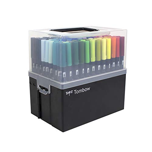
Master hand-lettering for maps by using calligraphy pens with varying nib sizes to create distinctive place names and labels. Practice basic strokes on grid paper to maintain consistent letter heights and spacing for map features. Consider using brush pens like Tombow Dual Brush markers for larger text elements and Micron pens for delicate details. Add personality to your maps through decorative flourishes calligraphic terminals or custom monoline styles that complement your mixed media approach.
Organize and protect your Tombow Dual Brush Pens with this convenient carrying case! It holds 108 pens and features odorless, water-based ink ideal for various art projects.
Digital Font Integration
Select fonts that complement your hand-drawn elements while maintaining readability at various scales. Use sans-serif fonts like Helvetica Neue for technical information and feature labels while reserving serif fonts like Minion Pro for place names. Import custom fonts through Adobe Creative Cloud libraries to ensure consistency across different software platforms. Apply character spacing adjustments of 10-15 units to improve legibility when overlaying text on textured backgrounds.
Get a comfortable and secure grip with the Wilson Minions Pro Overgrip 3-pack. Featuring a thin, elastic felt material and fun Minion designs, this durable overgrip includes finishing tape for easy application.
Creating Typography Hierarchy
Establish a clear visual hierarchy using size weight and color variations in your typography. Structure your type system with primary labels at 12-14pt secondary at 9-11pt and tertiary information at 7-8pt. Implement distinct typographic treatments for different feature categories: bold sans-serif for major cities italic serif for water bodies and light weight fonts for minor features. Use color opacity settings between 80-100% to control visual prominence while maintaining readability.
Balancing Digital and Analog Elements
Successfully merging digital and traditional map elements requires careful attention to visual harmony weight and technical precision.
Color Harmony Across Mediums
Create consistent color palettes by matching traditional media colors to digital RGB/CMYK values. Scan physical elements like watercolors at 600 DPI then color-match in Adobe Photoshop using the eyedropper tool. Build a unified palette of 4-6 core colors that work across both digital interfaces and print materials. Test color combinations in different lighting conditions to ensure readability. Use color management tools like Pantone guides to maintain consistency between screen displays and physical prints.
Maintaining Visual Consistency
Establish a clear style guide that defines line weights texture density and symbol sizes for both analog and digital elements. Match hand-drawn line thicknesses to vector stroke widths using calibrated drawing pens like Micron 0.25-0.5mm. Create standardized texture patterns by scanning hand-drawn elements at high resolution then converting them to vector brushes. Apply consistent scale ratios between physical and digital elements to maintain proportional relationships across the entire map.
Layer Management Strategies
Organize mixed media elements in discrete layers using descriptive names and logical groupings. Keep hand-drawn components on separate scanning layers at 600+ DPI resolution. Group digital vector elements by feature type (roads water bodies labels). Use adjustment layers in Photoshop to fine-tune opacity and blending modes between analog and digital components. Create clipping masks to control texture overlays and maintain clean edges between different media types.
Preserving and Digitizing Mixed Media Maps
Proper preservation and digitization ensure your mixed media maps remain accessible for future generations while maintaining their artistic integrity.
Documentation Methods
Document your mixed media maps using high-resolution photography with a minimum of 600 DPI for detailed elements. Create detailed metadata records including materials used dimensions media types and creation dates. Set up a structured naming system for files incorporating project codes dates and version numbers. Use RAW format for master images and maintain separate files for each layer including hand-drawn elements textures and digital components.
Digital Archive Standards
Follow FADGI (Federal Agencies Digital Guidelines Initiative) standards when digitizing mixed media maps. Store master files in uncompressed TIFF format at 16-bit color depth for maximum quality retention. Create multiple backup copies using the 3-2-1 rule: three copies two different storage types one off-site location. Implement checksums to verify file integrity and use standardized ICC color profiles to maintain color accuracy across different viewing platforms.
Print Production Considerations
Calibrate your output devices to ensure color accuracy between digital files and printed maps. Use archival-quality papers with neutral pH levels (6.5-8.5) for long-term preservation. Select pigment-based inks that resist fading and maintain color stability over time. Test print small sections before final production to verify texture details color matching and fine line reproduction. Consider paper weight and coating options based on your mixed media elements.
Case Studies in Mixed Media Cartography
Let’s explore how contemporary artists and commercial entities successfully blend traditional and digital techniques in their map designs.
Contemporary Map Artists
Ed Fairburn transforms vintage maps into intricate portraits by integrating human features with topographic patterns. Paula Scher creates large-scale typographic maps that merge hand-painted text with geographic data displaying cities countries and cultural references. Matthew Cusick repurposes old maps into stunning collages forming landscapes and portraits while Justine Smith incorporates currency into political map art. These artists demonstrate how mixed media cartography bridges the gap between geographic information and artistic expression.
Successful Commercial Applications
National Geographic combines satellite imagery hand-drawn illustrations and digital overlays in their signature wall maps. The New York Times uses custom watercolor effects with data visualization in their interactive digital maps. Stamen Design creates distinctive map styles for clients by blending traditional textures with modern mapping APIs. Design studio IDEO developed hybrid retail maps for shopping centers mixing 3D renders with hand-sketched elements to enhance user navigation. These commercial successes showcase how mixed media mapping delivers both functionality and visual appeal.
Creating a Cohesive Final Product
Mixed media map design offers endless possibilities to create unique and engaging cartographic masterpieces. By combining traditional artistic techniques with modern digital tools you’ll develop distinctive maps that stand out in today’s visual landscape.
Remember that successful mixed media maps require careful planning thoughtful material selection and meticulous attention to detail. Whether you’re working with watercolors hand lettering or digital overlays maintaining geographic accuracy while expressing artistic creativity is key.
Take time to experiment with different combinations of techniques and materials. You’ll find that each project presents new opportunities to push the boundaries of traditional cartography while creating visually stunning and informative maps that captivate your audience.
