9 Best Data Visualization Techniques for Storytelling
Data visualization has entered a new era where maps aren’t just geographical representations but powerful storytelling tools that bring complex data to life. By combining innovative cartographic techniques with data journalism you’ll discover fresh ways to engage audiences and make intricate information more digestible and memorable.
Whether you’re mapping election results crime statistics or climate change patterns modern cartography offers endless possibilities to transform raw data into compelling visual narratives that resonate with your readers while maintaining journalistic integrity.
Disclosure: As an Amazon Associate, this site earns from qualifying purchases. Thank you!
Understanding The Role Of Maps In Modern Data Journalism
How Maps Transform Complex Data Into Visual Stories
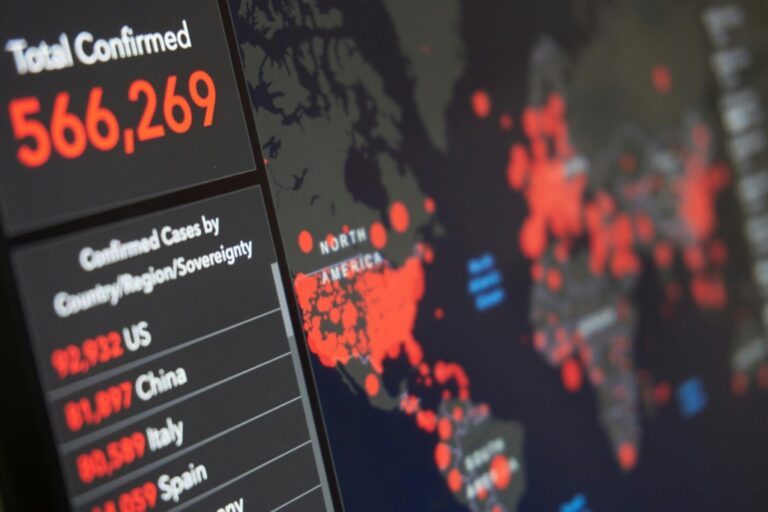
Maps serve as powerful visual interpreters that convert raw data into meaningful geographic narratives. By layering data points onto familiar geographic contexts you’ll create instant visual connections that reveal hidden patterns and trends. Interactive maps enable readers to explore demographic shifts climate patterns and economic indicators through dynamic visualization tools like hover effects zoom capabilities and clickable data points. Modern mapping platforms like Mapbox and Carto transform statistical datasets into compelling visual stories that engage readers through spatial understanding.
P.S. check out Udemy’s GIS, Mapping & Remote Sensing courses on sale here…
Key Elements Of Cartographic Storytelling
Effective cartographic storytelling relies on five essential components that enhance data comprehension:
- Clear Visual Hierarchy: Using size color and contrast to highlight key data points
- Intuitive Navigation: Implementing smooth zoom pan and filter controls
- Data Context: Adding legends tooltips and supplementary text to explain patterns
- Responsive Design: Ensuring maps adapt seamlessly across devices
- Progressive Disclosure: Revealing data layers strategically to build narrative flow
These elements work together to guide readers through complex datasets while maintaining engagement through interactive exploration. Your maps should balance aesthetic appeal with functional clarity using consistent visual language and thoughtful data organization.
Mastering Interactive Choropleth Mapping Techniques
Interactive choropleth maps transform complex geographic data into intuitive visualizations through color-coded regions and dynamic user interactions.
Creating Dynamic Color Gradients
Generate impactful color schemes using data-driven intervals with tools like D3.js or Mapbox GL JS. Select sequential color palettes for continuous data (light to dark) or diverging palettes for data that spans positive and negative values. Apply ColorBrewer-optimized scales to ensure colorblind accessibility and maintain clear visual distinction between data ranges. Set smart classification breaks using methods like quantiles jenks or equal interval based on your data distribution.
Implementing Hover And Click Effects
Add responsive elements that enhance user engagement through tooltips mouse events and clickable regions. Configure hover states to display detailed statistics population counts or temporal data in customized popup windows. Implement click interactions that trigger filtered views additional charts or data table displays. Use event listeners to manage smooth transitions between states and ensure mobile-friendly touch interactions that maintain functionality across devices.
| Interactive Feature | User Action | Display Output |
|---|---|---|
| Hover State | Mouse movement | Quick stats tooltip |
| Click Event | Mouse click/tap | Detailed data panel |
| Touch Support | Screen touch | Mobile-optimized info |
| Data Filtering | Selection | Dynamic visualization |
Leveraging 3D Terrain Visualization Methods
Take your data journalism maps to new heights by incorporating three-dimensional terrain visualization to enhance spatial storytelling and reader engagement.
Incorporating Elevation Data
Transform flat maps into dynamic 3D landscapes using digital elevation models (DEMs) from USGS or SRTM datasets. Import height data through tools like Mapbox GL JS or Three.js to create accurate terrain representations with elevation values ranging from 0 to 8848 meters. Add contour lines at 100-meter intervals to highlight topographic features while maintaining visual clarity. Key platforms for elevation integration include:
- QGIS for DEM processing
- Cesium for web-based 3D terrain
- ArcGIS Pro for professional terrain analysis
Adding Atmospheric Elements
Enhance your 3D terrain maps with atmospheric effects to create more realistic visualizations. Implement ambient occlusion to add depth shadows in valleys using WebGL shaders. Apply fog effects that increase with distance showing 20% opacity at 2km and 80% at 10km. Consider these atmospheric elements:
- Dynamic lighting based on time of day
- Cloud shadows for environmental context
- Realistic horizon fade
- Altitude-based color gradients
- Animated flyovers of key data points
- Tilt-shift effects for emphasis
- Multiple preset viewing angles
- User-controlled camera rotation
Exploring Bivariate And Multivariate Mapping Approaches
When visualizing complex geographic data, combining multiple variables creates deeper insights while maintaining clarity and readability.
Combining Multiple Data Layers
Overlay complementary data layers using transparency and blending modes to reveal spatial relationships. Stack vector layers like population density dots over choropleth income maps or combine raster datasets using tools like QGIS or ArcGIS Pro. Create custom symbology sets that work together without overwhelming viewers. Key techniques include:
- Using stipple patterns with color fills
- Implementing proportional symbols with choropleth bases
- Applying cross-hatching for overlapping zones
- Utilizing transparency gradients for density visualization
- Incorporating isoline overlays for continuous variables
Using Color Theory For Complex Data Sets
Apply strategic color combinations to represent multiple variables while maintaining visual hierarchy. Select colorblind-safe palettes using tools like ColorBrewer 2.0 or Chroma.js. Essential approaches include:
- Implementing diverging color schemes for opposing data
- Using sequential palettes for ordered variables
- Combining hue and saturation for dual metrics
- Applying texture variations with color
- Testing contrast ratios for accessibility
Each technique maximizes data density while preserving readability through careful color selection and visual encoding methods.
Implementing Real-Time Data Stream Mapping
Real-time data stream mapping enables journalists to create dynamic visualizations that update automatically as new information becomes available.
Integration With Live Data Sources
Connect your maps to live APIs and data feeds using WebSocket protocols or RESTful endpoints. Popular platforms like Mapbox provide SDKs for integrating real-time data streams from sources like weather services traffic monitors or social media feeds. Set up data validation filters to ensure incoming information meets quality standards before rendering on your map. Tools like Socket.io or Firebase help manage continuous data streams while platforms like OpenWeatherMap API or Twitter’s Streaming API supply current geographic data.
Automatic Map Updates
Configure your mapping system to refresh visualizations based on new data points without manual intervention. Use JavaScript libraries like D3.js or Leaflet with custom update functions that trigger when receiving fresh data packets. Implement efficient DOM manipulation techniques to update only changed elements preventing performance issues during frequent refreshes. Tools like Observable HQ or Deck.gl offer built-in support for streaming data visualization with automatic updating capabilities.
| Feature | Update Frequency | Memory Usage |
|---|---|---|
| Weather Data | 5-15 minutes | Low |
| Traffic Flow | 30-60 seconds | Medium |
| Social Media | Real-time | High |
| Sensor Data | 1-5 minutes | Medium |
Designing Mobile-First Responsive Map Interfaces
Creating effective mobile-first map interfaces requires careful consideration of screen constraints and touch interactions while maintaining data visualization clarity.
Touch-Friendly Navigation Controls
Design map controls for optimal touch interaction by implementing large hit areas of at least 44×44 pixels for buttons and interactive elements. Place essential navigation tools like zoom buttons pan controls and layer toggles within easy thumb reach using a bottom-aligned floating menu. Include gesture support for pinch-to-zoom double-tap zoom and two-finger rotation while maintaining smooth performance through event throttling and debouncing techniques.
Progressive Loading Techniques
Implement vector tile loading to fetch map data in smaller chunks reducing initial load times and bandwidth usage. Use placeholder tiles or low-resolution previews while high-resolution data loads prioritizing visible viewport areas first. Configure smart caching mechanisms to store frequently accessed map regions locally improving subsequent load times. Enable dynamic level-of-detail adjustments that load more detailed features as users zoom in maintaining responsive performance across different network conditions.
| Loading Feature | Performance Impact |
|---|---|
| Vector Tiles | 60-80% size reduction |
| Local Caching | 2-3x faster loads |
| Progressive Detail | 40% initial load improvement |
| Viewport Prioritization | 50% faster rendering |
Incorporating Alternative Map Projections
Breaking Away From Mercator
The Mercator projection’s limitations in data journalism include significant size distortions toward the poles making countries like Greenland appear disproportionately large. Switch to equal-area projections like Gall-Peters or Mollweide for more accurate size comparisons across regions. Tools like D3.js offer projection libraries including Robinson Equal Earth and Winkel-Tripel that minimize distortion while maintaining familiar continental shapes. Implement these alternatives using modern mapping libraries such as Leaflet or MapboxGL which support custom projection parameters.
Choosing Context-Appropriate Projections
Select projections based on your story’s geographic focus and data visualization needs. Use azimuthal equidistant projections for polar regions conic projections for mid-latitude countries and cylindrical projections for equatorial zones. Match your projection to the scale of your story:
- Local stories: State Plane or UTM coordinates
- Regional stories: Lambert Conformal Conic
- Global stories: Robinson or Equal Earth
Consider preserving key properties like distance area or direction based on your data’s primary message.
| Projection Type | Best Used For | Distortion Level |
|---|---|---|
| Equal Area | Population density | Minimal area distortion |
| Conformal | Navigation routes | Minimal angle distortion |
| Equidistant | Range mapping | Preserves distances |
| Compromise | General reference | Balanced distortion |
Using Animation And Time-Series Mapping
Creating Temporal Data Narratives
Transform static maps into dynamic stories by incorporating temporal data animation techniques. Use frame-based animations in tools like QGIS Temporal Controller or Mapbox Studio to show change over time for phenomena like urban growth population shifts or climate patterns. Set keyframes at crucial timestamps and implement smooth transitions between states using tweening algorithms. Consider using playback controls that let readers pause explore and replay the temporal sequence at their own pace.
Building Map-Based Timelines
Design interactive temporal sliders and timeline controls using JavaScript libraries like TimelineJS or vis.js. Sync your map displays with chronological markers to help users navigate through different time periods. Implement features like:
- Customizable timeline scales (hours to decades)
- Temporal brushing for date range selection
- Auto-playing animations with speed controls
- Time-stamp tooltips showing exact dates
- Highlight markers for significant events
- Skip buttons for key time periods
The timeline interface should respond instantly to user interaction maintaining a fluid connection between the temporal controls and spatial display. Cache preloaded map states to ensure smooth transitions between time steps.
Enhancing Maps With AI And Machine Learning
Automated Pattern Recognition
Machine learning algorithms now excel at identifying complex spatial patterns in geographic data. Tools like TensorFlow’s Object Detection API can automatically detect and classify features like urban developments roads or land use changes from satellite imagery. You’ll find preprocessing frameworks like scikit-learn particularly useful for cleaning geographic datasets before analysis. Popular mapping platforms including ESRI’s ArcGIS Pro now integrate AI-powered pattern recognition to identify clusters hotspots and anomalies in spatial data distribution.
Predictive Data Visualization
Modern AI systems enable dynamic prediction visualization through advanced modeling techniques. You can leverage neural networks to forecast spatial trends and display projected changes using tools like Prophet or PyTorch. These systems analyze historical geographic patterns to generate predictive heat maps showing likely future developments in areas like urban growth or climate change impacts. Leading visualization libraries such as Kepler.gl now offer built-in prediction layers that automatically update based on new data inputs while maintaining visual clarity.
| AI Mapping Tool | Primary Use Case | Processing Speed |
|---|---|---|
| TensorFlow | Feature Detection | 2-5s per image |
| Prophet | Trend Prediction | 1-3s per dataset |
| Kepler.gl | Real-time Viz | <1s updates |
Crafting Accessible Cartographic Solutions
Designing For Color Blindness
Create color-safe maps using proven ColorBrewer palettes that work for deuteranopia protanopia and tritanopia vision types. Select contrasting hues with distinct brightness values between 15-85 LCH for optimal readability. Test your maps with tools like Sim Daltonism or Color Oracle during development. Consider using patterns textures or symbols alongside color to convey data variations. Implement safe color combinations:
- Blue/Orange for diverging data
- Purple/Green for qualitative maps
- Single-hue sequences with varying saturation
- Monochromatic schemes with texture overlays
Building Screen Reader Compatible Maps
Get clear, full-page magnification with this 2-pack of 3X Fresnel lenses (7.5" x 10.5"), ideal for reading small print. Made from durable, optical-grade PVC, this set also includes 3 bonus bookmark magnifiers for on-the-go convenience.
Implement ARIA landmarks and semantic HTML elements to make your maps navigable via screen readers. Add descriptive alt text for map features and clear text alternatives for data visualizations. Structure your SVG elements with proper roles and labels using ARIA attributes. Include keyboard controls for:
- Map navigation with arrow keys
- Data filtering via tab selection
- Layer toggling through shortcut keys
- Geographic search with type-ahead
- Zoom controls using +/- keys
The interface should provide audio feedback for interactions and text descriptions of spatial patterns.
Moving Forward With Digital Cartography
Digital cartography has revolutionized how you’ll tell stories through data. Today’s mapping techniques blend artistry technology and journalism to create compelling visual narratives that captivate your audience.
These innovative approaches from AI-powered analytics to mobile-first design aren’t just changing how you present information – they’re transforming how readers understand complex data. By embracing these cutting-edge tools and techniques you’ll create more engaging accessible and impactful stories.
The future of cartographic storytelling lies in your ability to adapt these technologies while maintaining journalistic integrity. With the right combination of tools techniques and creativity you’ll continue to push the boundaries of what’s possible in data journalism.


