8 Unconventional Map Projections That Transform Art & Design
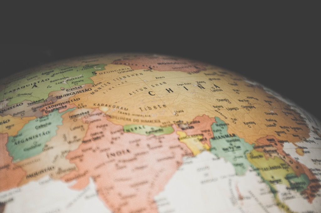
Maps aren’t just tools for navigation – they’re powerful canvases for artistic expression when you break free from traditional projections. While most people know the standard Mercator or Robinson projections we see in atlases and GPS devices designers and artists are discovering exciting ways to distort and reimagine geographic data.
From polar-centric views that make Earth look like a blooming flower to interrupted projections that slice continents into fascinating new shapes you’ll find endless possibilities for turning cartography into compelling artwork. These unconventional map projections don’t just challenge our perception of geography – they transform familiar landmasses into striking visual compositions that blur the line between science and art.
Disclosure: As an Amazon Associate, this site earns from qualifying purchases. Thank you!
Understanding Traditional Map Projections and Their Limitations
How Standard Map Projections Work
Traditional map projections transform our spherical Earth onto flat surfaces using mathematical formulas. The Mercator projection stretches polar regions while maintaining compass directions for navigation. The Robinson projection creates a compromise between size accuracy and visual appeal by reducing distortion at high latitudes. The Equirectangular projection maps meridians and parallels to straight vertical and horizontal lines creating a simple grid pattern.
Why Artists Seek Alternative Approaches
Artists challenge standard projections because these traditional methods prioritize mathematical accuracy over creative expression. The rigid rules of conventional cartography limit artistic freedom in three key ways:
- Geographic precision restricts visual storytelling possibilities
- Standardized color schemes constrain creative palettes
- Fixed orientation requirements prevent dynamic perspectives
Standard projections also struggle to represent:
- Emotional connections to places
- Cultural perspectives on space
- Personal geographic experiences
- Abstract spatial relationships
This technical rigidity drives artists to explore unconventional projections that break free from traditional mapping constraints.
Exploring the Dymaxion Map for Dynamic Compositions
Fuller’s Revolutionary Design Concept
Buckminster Fuller’s Dymaxion map revolutionized cartographic design in 1943 by transforming Earth’s continents into a 20-sided icosahedron. The projection displays landmasses with minimal distortion by unfolding the planet’s surface onto triangular segments. Unlike traditional rectangular projections the Dymaxion map eliminates the standard north-up orientation allowing viewers to rotate and reposition the map in endless configurations. This flexibility creates unique perspectives that highlight different geographical relationships spatial patterns and continental connections.
Creating Abstract Art With Triangular Elements
The Dymaxion map‘s triangular framework offers artists exciting possibilities for abstract geometric compositions. You can isolate individual triangles rearrange segments or layer multiple projections to create dynamic visual effects. Try experimenting with color gradients pattern overlays and texture treatments across the triangular faces. Digital artists often manipulate the projection’s vertices in design software to create flowing transitions between segments while maintaining recognizable landforms. The modular nature of the triangles enables creative reconfigurations that transform familiar geography into striking abstract art.
Transforming Space With the Waterman Butterfly Projection
Butterfly-Inspired Geographic Layout
The Waterman Butterfly projection unfolds Earth’s surface into a striking arrangement of 12 connected lobes that resemble butterfly wings. Created by Steve Waterman in 1996 this unique octahedral projection preserves continental shapes while minimizing area distortion. The projection’s symmetrical design places Antarctica at the center with six pairs of “wings” extending outward creating natural visual breaks between major landmasses. Unlike traditional rectangular maps the butterfly layout encourages viewers to explore geographic relationships from multiple angles.
Using Negative Space in Map Art
The Waterman projection’s distinctive wing-like segments create dramatic white spaces between continental forms perfect for artistic experimentation. Artists can emphasize these gaps by filling them with contrasting colors textures or patterns to create visual rhythm. The natural breaks between lobes allow for creative typography placement data visualization overlays or decorative elements without compromising geographic accuracy. Digital artists often manipulate these negative spaces to create depth using shadows gradients or layered effects that enhance the butterfly’s three-dimensional qualities.
Incorporating the Peirce Quincuncial Projection Into Artwork
Square-Based Design Possibilities
The Peirce Quincuncial projection’s square format offers unique artistic opportunities for graphic design integration. You can leverage its perfect square shape to create modular compositions like pixel art mosaics grid layouts or album covers. Transform the projection’s distinctive corner connections into flowing patterns by adjusting line weights edge treatments or color gradients. The projection’s natural division into five parts (four triangular corners plus center) creates opportunities for dynamic focal points layered designs or interactive elements in digital artwork.
Symmetrical Pattern Applications
The Peirce projection’s inherent symmetry provides a foundation for creating kaleidoscopic patterns and tessellated designs. You can mirror rotate or duplicate the projection to generate intricate mandala-like compositions that maintain geographic accuracy. Apply contrasting colors to opposite quadrants emphasizing the natural balance between land and ocean forms. The projection’s repeating elements allow for seamless tiling effects perfect for textile designs wallpapers or large-scale installations. Digital artists often exploit these symmetrical properties to create animated transitions between multiple projection orientations.
Working With the Cahill Butterfly Projection
Organic Flow in Cartographic Art
Bernard Cahill’s Butterfly projection transforms Earth’s continents into eight elegant lobes that radiate from a central point creating natural flowing lines. The projection’s organic curves guide viewers through geographic relationships while offering unique artistic possibilities. Artists can emphasize these natural pathways by adding gradient flows between continental segments placing visual focus on ocean currents migration patterns or cultural connections. Digital artists often manipulate the projection’s inherent curves to create dynamic movement incorporating motion graphics that follow the map’s natural flow patterns.
- Split-complementary palettes for dramatic contrast
- Temperature gradients to show climate data
- Monochromatic variations within each lobe
- Opacity shifts to layer multiple data sets
Experimenting With the Gott-Mugnolo Projection
The Gott-Mugnolo projection offers a unique approach to cartographic art by mapping Earth onto two separate circular disks representing both hemispheres.
Double-Sided Map Aesthetics
Create striking visual compositions by using the projection’s dual-disk format to highlight geographic relationships. Each disk presents a complete hemisphere view that’s perfect for exploring color contrasts between northern and southern regions. You’ll find natural opportunities for artistic expression in the projection’s circular frames where you can add decorative borders gradients or geometric patterns. The clean separation between hemispheres lets you experiment with different artistic treatments for each disk such as contrasting textures materials or lighting effects.
Three-Dimensional Art Applications
Transform the Gott-Mugnolo projection’s twin circles into sculptural installations by mounting the disks on opposite sides of transparent materials. You can layer multiple projections at different depths to create 3D cartographic artwork that changes based on viewing angle. The projection’s symmetrical nature works perfectly for creating hanging mobiles digital animations or interactive displays where viewers can explore both hemispheres simultaneously. Use LED backlighting between layers to emphasize the depth and separation of geographic features.
Leveraging the Authagraph World Map Design
The Authagraph projection, developed by Japanese architect Hajime Narukawa, offers a fresh perspective on Earth’s geography by maintaining relative sizes of continents while creating visually striking compositions.
Modern Minimalist Approaches
Transform the Authagraph’s tetrahedral design into sleek minimalist artwork by reducing continental shapes to essential geometric forms. Strip away traditional map elements like borders graticules and labels to create clean negative spaces. Use monochromatic color schemes with subtle tonal variations to emphasize the projection’s flowing lines. Experiment with high-contrast black and white treatments that highlight the natural divisions between land and water while maintaining the projection’s innovative equal-area properties.
Digital Art Integration
Convert Authagraph’s unique geometry into dynamic digital compositions using vector graphics software. Layer multiple semi-transparent iterations to create depth and movement while preserving geographic accuracy. Apply gradient meshes that follow the tetrahedral fold lines to produce subtle lighting effects. Incorporate animated transitions between different orientations of the projection using keyframe morphing techniques. Add interactive elements that allow viewers to explore the map’s multiple correct orientations each revealing new geographic relationships.
Creating Abstract Art With the Spilhaus Projection
The Spilhaus projection offers a radical reimagining of Earth’s geography by placing oceans at the center of the map instead of continents creating unique opportunities for artistic expression.
Ocean-Centric Perspectives
Transform traditional land-based map views by highlighting Earth’s massive water bodies using the Spilhaus projection‘s distinctive arrangement. This projection places the world’s oceans in a continuous form displaying the Pacific Atlantic Indian Southern oceans as one interconnected body. Create striking visual compositions by applying bold colors to ocean depths gradients while reducing continents to minimal outlines. The projection’s fluid curves and organic shapes naturally draw viewers’ eyes through the composition emphasizing Earth’s water-dominated nature.
Fluid Design Elements
Enhance the Spilhaus projection‘s flowing aesthetic by incorporating wave-like patterns ripple effects and oceanic textures. Use layered transparency effects to suggest water depth creating dynamic dimensional artwork. Add geometric patterns that follow ocean currents or incorporate maritime navigation lines to create rhythm throughout the composition. Experiment with watercolor techniques digital gradients or abstract data visualization elements that complement the projection’s natural curves while maintaining geographical accuracy.
Combining Multiple Projections for Mixed Media Art
Layering Different Map Views
Create depth in your artwork by overlaying contrasting map projections like the Dymaxion and Waterman Butterfly. Start with a base projection printed on heavyweight paper then layer transparent materials such as vellum or acetate sheets with additional projections. Use registration marks to align key geographic features while purposefully offsetting others to create visual tension. Experiment with varying opacities digitally scanned projections printed at 15-35% transparency to maintain legibility between layers.
Texture and Depth Techniques
Add tactile elements to your layered projections using mixed media techniques. Apply embossing to coastlines using a scoring tool or press continental shapes with textured materials like sandpaper. Create raised relief by building up layers of gel medium on mountain ranges or ocean trenches. Incorporate actual topographic textures by pressing natural materials like sand or crushed stone into wet media for continental surfaces. Use metallic leafing on major waterways to catch light across different projection planes.
Conclusion: The Future of Artistic Map Projections
Unconventional map projections offer endless possibilities for artistic expression while challenging our traditional views of Earth’s geography. These innovative approaches prove that cartography isn’t limited to scientific accuracy – it’s a vibrant medium for creative exploration.
Your artistic journey with map projections can transform geographic data into compelling visual narratives. Whether you’re drawn to the geometric elegance of the Dymaxion map or the fluid symmetry of the Waterman Butterfly projection you’ll find unique ways to express your creative vision.
As digital tools evolve and artistic techniques advance these alternative projections will continue to push the boundaries between science and art. You’re now equipped to explore this fascinating intersection of geography and creativity making your mark in the evolving landscape of cartographic art.
