10 Best Digital Assets for Enhancing Map Aesthetics That Captivate Users
In a world where visuals capture attention, enhancing map aesthetics is crucial for effective communication. You can transform ordinary maps into stunning visual narratives using the right digital assets. Discover how to elevate your mapping projects with tools and resources that make your maps not just informative but also visually captivating.
Best Digital Assets for Enhancing Map Aesthetics
You often face the challenge of making your maps not just functional but visually appealing. To tackle this, several digital assets can elevate your mapping projects.
- High-Quality Base Maps: Utilize platforms like CartoDB or Mapbox for stunning base maps. These tools provide customizable styles that enhance your map’s look and feel.
- Icon Libraries: Incorporate free resources such as the Noun Project or Font Awesome for icons. Choosing the right icons adds clarity and catches the viewer’s eye.
- Color Palettes: Leverage tools like Adobe Color or ColorBrewer to choose appropriate color schemes. These palettes ensure good contrast and legibility, even at smaller sizes.
- Typography: Use Google Fonts or Typekit for appealing fonts. Selecting the right typeface can convey essential information and improve readability.
- Data Visualization Libraries: Explore libraries like D3.js or Chart.js for dynamic visual elements. These can help in presenting data trends effectively on your map.
- Map Overlays: Consider adding overlays with tools like QGIS or ArcGIS Online. Overlays can show additional data layers while keeping your main map clean and focused.
- Texture and Patterns: Try using textures from websites like Subtle Patterns or TextureMate. Textured backgrounds provide depth, setting your map apart from standard flat designs.
By integrating these digital assets into your mapping workflow, you can vastly improve aesthetics, ensuring your maps are both functional and visually captivating.
Best Color Palettes for Maps
Choosing the right color palette is essential for creating effective and visually appealing maps. Here are two excellent approaches to consider.
Earthy Color Schemes
Earthy color schemes provide a natural feel, enhancing the representation of landscapes and regions. You can use muted greens, browns, and tans to depict various terrains accurately. For example, using a light green for forests and a soft brown for deserts helps differentiate land types intuitively. Tools like Adobe Color enable you to create unique earthy palettes by exploring color wheel adjustments. Incorporating these tones ensures your map resonates with environmental themes and communicates data effectively.
Vibrant Color Combinations
Vibrant color combinations enhance map engagement and can draw attention to key features. Using bold colors like bright blues, oranges, and yellows can make important data stand out. For instance, a vibrant blue can indicate water bodies, while a bright yellow could highlight urban areas. Platforms such as ColorBrewer offer pre-designed vibrant palettes tailored for distinct categorical data, ensuring clarity and appeal. By applying these combinations, you not only boost readability but also create maps that captivate your audience’s attention.
Best Typography Choices for Maps
Choosing the right typography is essential for enhancing the aesthetics and usability of your maps. Typography impacts readability, establishes visual hierarchy, and aligns with your map’s communication goals.
Serif Fonts
Serif fonts are an excellent choice for hydrologic features and natural elements on maps. They offer enhanced readability, especially at smaller sizes, due to their distinctive letterforms. Fonts like Georgia and Merriweather work well for body text and labels, providing a classic look that complements physical geography. You’ll find that using serif fonts for overlay text can improve legibility against complex backgrounds, ensuring vital information stands out.
Discover the captivating story of Marjorie Post in this historical fiction novel. Explore her extraordinary life of wealth, philanthropy, and ambition during the 20th century.
Delve into the life of iconic artist Georgia O'Keeffe. This novel explores her passions, struggles, and artistic journey through the landscapes that inspired her.
Sans-Serif Fonts
Sans-serif fonts provide a clean and modern aesthetic for your maps. They are particularly effective for urban features, labels, and data-driven elements. Fonts like Arial and Helvetica deliver clarity, making them suitable for a variety of map contexts. Their simple lines reduce visual clutter, ensuring that your map remains accessible. Pairing sans-serif fonts with bold styles can emphasize key features, ensuring that your map effectively communicates its intended message.
Best Icon Sets for Map Features
When enhancing map aesthetics, selecting the right icons is pivotal. Icon sets can improve clarity and convey information effectively. Here are some outstanding options for location and thematic icons.
Location Icons
- Free Location Icon Set: You can explore this versatile collection from Speckyboy. It includes 40 beautifully designed map marker icons in SVG and PNG formats. These icons come in three distinct styles (line, colored line, and flat), perfect for various design aesthetics. You can use them freely for both personal and commercial projects without restrictions.
- Jawg Maps Icon Sets: You’ll find several customized sets from Jawg Lab that enhance map readability and aesthetics. Options like
maki-dark,maki-light,maki-colorful, andmaki-circleare tailored for different themes, allowing you to match icons with your map’s design.
- Noun Project Icons: You can access an extensive library of icons at the Noun Project, featuring symbols for diverse themes. Whether your map focuses on urban planning or nature reserves, you’ll find icons that reflect your project’s needs.
- Font Awesome: You can utilize Font Awesome for a wide variety of icons. With a web-based library and responsive design, these icons are easily integrated into digital maps, ensuring compatibility across platforms. The range includes options that cater to specific mapping needs, like transportation and landmarks.
By employing these icon sets, you’ll significantly enhance the visual appeal and function of your maps, ensuring effective communication of information.
Best Textures and Patterns for Map Backgrounds
Selecting the right textures and patterns can significantly enhance your map’s visual appeal and richness. Here are two key options for improving your map backgrounds.
Vintage Textures
Vintage textures are perfect for achieving a nostalgic or historical feel in your maps. You can utilize:
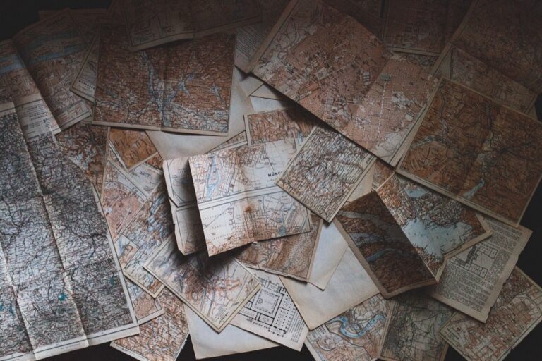
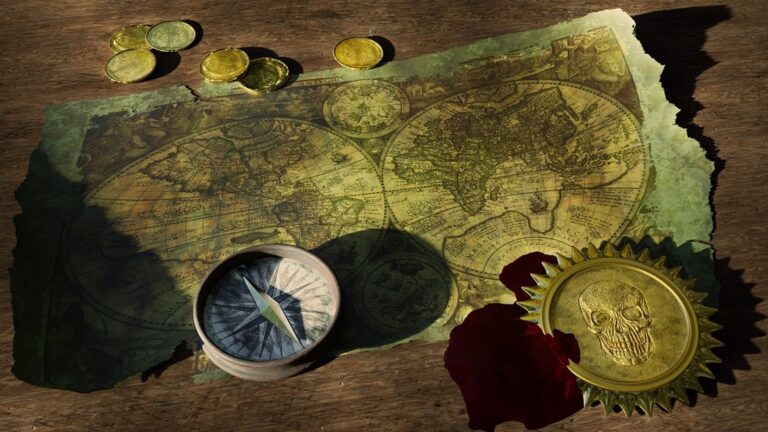
- Old Map Textures: Websites like Freepik offer a wide variety of old map textures, including vintage paper and grunge finishes. You can easily overlay these textures to give your maps an authentic, aged look that resonates with viewers.
- Public Domain Maps: The Library of Congress provides thousands of vintage maps that you can download for free. You can incorporate these as background elements, enriching your designs while ensuring authenticity and historical relevance.
Modern Patterns
Modern patterns can bring a fresh, dynamic look to your maps. Consider using:
- Geometric Patterns: Tools like Subtle Patterns or TextureMate feature an array of geometric designs you can incorporate. These patterns can add depth and clarity, making it easier for viewers to interpret geographical features at a glance.
- Abstract Textures: Platforms like Adobe Stock provide abstract texture options that can enhance the visual interest of your maps. By integrating these contemporary designs, you can create engaging maps that appeal to modern aesthetics while maintaining functionality.
Best Software Tools for Map Design
When enhancing maps, the right software tools can make a world of difference. You’ll find that various applications cater to different needs, from accessible interfaces to advanced design capabilities.
User-Friendly Applications
Mapme offers a straightforward mapping solution that enables you to create beautiful maps without any coding requirements. With features like custom icons, color regions, and multimedia integration, it’s perfect for various projects such as internal maps and data analysis. You can also utilize its three-tiered access system to manage user roles efficiently.
ZeeMaps provides another accessible option for customizable maps, allowing integration of custom icons and color regions. With both free and paid versions, you can tackle anything from group projects to personal mapping ideas. This flexibility makes it suitable for a broad audience looking for efficient map-making solutions.
Advanced Design Software
ArcGIS Pro serves as a robust platform for professional cartographers requiring advanced mapping capabilities. Its extensive toolkit allows you to create intricate visualizations, perform spatial analysis, and manage large datasets. With tools for 3D mapping and real-time data integration, it’s ideal for projects demanding high precision.
QGIS is another powerful software option, favored for its open-source nature and versatility. You can customize QGIS with plugins to extend functionality, enabling detailed inspections of geographic data. You also benefit from compatibility with various data formats, making it a favorite among the mapping community.
Using the right software can help you not only create aesthetically pleasing maps but also ensure they effectively communicate the intended message.
Conclusion
Enhancing map aesthetics isn’t just about making things look pretty; it’s about effective communication and storytelling. By leveraging the right digital assets you can transform your maps into powerful visual tools that engage and inform your audience.
From selecting the perfect color palette to incorporating dynamic typography and appealing icons, every detail contributes to the overall impact. Don’t underestimate the power of textures and patterns either—they can add depth and character to your maps.
With the right software tools at your disposal you can bring your creative vision to life. Embrace these resources and watch your mapping projects evolve into captivating narratives that resonate with viewers.


