11 Cartographic Representations of Climate Change That Reveal Hidden Patterns
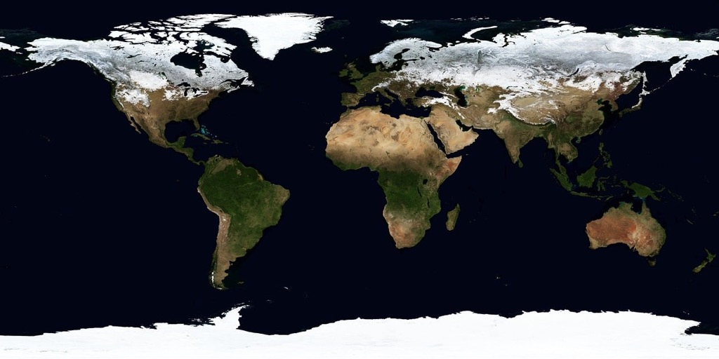
Climate change maps have revolutionized how we understand and visualize the environmental challenges facing our planet. These powerful cartographic tools transform complex climate data into accessible visual stories that help you grasp the scope of rising temperatures sea levels and extreme weather patterns.
You’ll discover how modern mapping techniques combine satellite imagery atmospheric data and predictive modeling to create compelling visual narratives about our changing world – from interactive heat maps showing temperature variations to detailed coastal flooding projections that illuminate the future impact of melting ice caps.
Disclosure: As an Amazon Associate, this site earns from qualifying purchases. Thank you!
Understanding The Role Of Maps In Climate Change Communication
The Power Of Visual Data Representation
Maps transform complex climate data into compelling visual narratives that drive action and understanding. They help you grasp large-scale environmental changes through intuitive spatial relationships color gradients and pattern recognition. Modern mapping tools convert statistics about temperature shifts sea level rise and carbon emissions into interactive visualizations that reveal critical trends hotspots and vulnerability zones. These visual representations make abstract climate concepts tangible enabling policymakers scientists and the public to identify patterns predict outcomes and plan interventions.
Key Cartographic Elements And Principles
Effective climate change maps rely on essential cartographic elements to convey their message accurately. Color schemes use reds and oranges to represent warming trends while blues indicate cooling or baseline conditions. Scale bars and legends help you interpret data ranges while projection choices maintain geographic accuracy across different regions. Data layers combine multiple variables like temperature precipitation and sea level measurements to create comprehensive climate stories. Temporal controls let you track changes across different time periods revealing the progression of environmental impacts over decades or centuries.
Mapping Rising Global Temperatures
Temperature mapping reveals the dramatic shifts in global climate patterns through sophisticated visualization techniques and data analysis.
Historical Temperature Data Visualization
Modern temperature maps combine data from weather stations ground sensors satellite observations and ocean buoys to create comprehensive visualizations of Earth’s changing climate. These maps use color gradients ranging from cool blues to warm reds to show temperature variations across regions. Notable examples include NASA’s GISTEMP maps which display temperature anomalies since 1880 using a five-year running average. The maps incorporate data from over 26000 weather stations creating a detailed picture of temperature changes across land and ocean surfaces.
Future Temperature Projections And Models
Advanced climate models generate detailed temperature projection maps using complex algorithms and multiple emission scenarios. These visualizations typically display potential temperature changes for 2050 2075 and 2100 based on different carbon emission pathways. Key mapping tools like the IPCC’s Interactive Atlas and NOAA’s Climate Explorer allow users to explore various warming scenarios. The maps integrate multiple datasets including atmospheric circulation patterns ocean temperatures and greenhouse gas concentrations to predict regional temperature variations with increasing accuracy.
Tracking Sea Level Rise Through Cartography
Cartographic tools have evolved to capture and visualize the dramatic impacts of rising sea levels on coastal regions worldwide. Modern mapping techniques combine satellite data with tide gauge measurements to create detailed projections of coastal changes.
Coastal Impact Visualizations
Advanced GIS mapping reveals vulnerable coastal areas through high-resolution Digital Elevation Models (DEMs) and bathymetric data. NOAA’s Sea Level Rise Viewer overlays projected water levels onto coastal topography showing potential inundation zones at different scenarios. These maps highlight critical infrastructure at risk including ports hospitals roads and power plants using standardized color schemes to indicate flood depths. The National Geographic’s Coastal Risk Screening Tool demonstrates how a 1-meter rise affects 230 million people in coastal zones through dynamic visualization.
Island Nations At Risk
Interactive maps showcase the existential threat to low-lying island nations like Tuvalu Kiribati and the Maldives where the average elevation is less than 2 meters above sea level. The World Bank’s Pacific Catastrophe Risk Assessment maps display projected land loss scenarios for 15 Pacific island countries. These visualizations incorporate wave dynamics storm surge patterns and erosion data to model how rising seas will reshape coastlines. Digital elevation maps highlight that 40% of the Maldives’ 1200 islands could become uninhabitable by 2100 with a 0.5-meter rise.
Visualizing Changes In Precipitation Patterns
Modern cartographic tools enable detailed tracking and visualization of shifting precipitation patterns caused by climate change through advanced satellite data and ground-based measurements.
Drought And Rainfall Distribution Maps
Advanced drought monitoring systems like the U.S. Drought Monitor combine multiple data sources to create detailed precipitation maps. These visualizations use color gradients to show rainfall anomalies with browns indicating drought conditions and blues showing excess precipitation. Tools like NOAA’s Climate.gov rainfall mapper overlay historical averages with current measurements to highlight changing patterns across regions. The maps integrate data from weather stations rain gauges and satellite observations to track monthly seasonal and annual precipitation trends.
Extreme Weather Event Mapping
Interactive storm tracking maps now visualize the increasing frequency and intensity of extreme weather events. Tools like NOAA’s Weather and Climate Toolkit display historical storm paths hurricane intensities and flood extent maps. These systems use radar data satellite imagery and ground observations to create multi-layered visualizations of severe weather patterns. Modern mapping platforms can animate storm development over time showing precipitation intensity wind patterns and potential impact zones while incorporating predictive modeling for early warning systems.
Mapping Arctic And Antarctic Ice Loss
Glacier Retreat Visualization
Modern satellite mapping reveals dramatic glacier retreat in polar regions through time-series visualization techniques. NASA’s Operation IceBridge uses LiDAR technology to create detailed 3D maps of glacier volumes showing mass loss over decades. Dynamic web maps from NSIDC’s Global Land Ice Measurements from Space (GLIMS) database track changes in over 100,000 glaciers using false-color composites to highlight ice edge positions. These visualizations combine historical aerial photography thermal imagery and radar data to quantify ice thickness changes at scales ranging from individual glaciers to entire ice sheets.
Sea Ice Extent Changes
Interactive sea ice maps track the shrinking Arctic and Antarctic sea ice coverage through daily satellite observations. NSIDC’s Sea Ice Index provides standardized visualizations using passive microwave data to map sea ice concentration and extent since 1979. Color-ramped bathymetric maps showcase minimum ice extent records while animated timelapses demonstrate seasonal fluctuations and long-term declining trends. Key visualization tools include NASA Worldview and ESA’s CryoSat Explorer which render multi-year ice loss through striking before-and-after comparisons of polar ice coverage.
Illustrating Carbon Emissions And Air Quality
Modern mapping techniques transform complex emissions data into compelling visualizations that reveal the global impact of human activities on our atmosphere.
Global Carbon Footprint Maps
NASA’s Carbon Monitoring System creates detailed maps showing CO2 emissions through satellite data and ground measurements. These maps use color gradients from green to red to display emission intensity with darker reds indicating higher concentrations. The Global Carbon Atlas platform offers interactive visualizations of carbon flows across countries displaying annual emissions in metric tons through proportional symbols. Tools like WRI’s Climate Watch Data combine historical records with real-time monitoring to track emission changes across industrial sectors energy production and transportation networks.
Urban Air Pollution Patterns
Advanced air quality mapping systems like EPA’s AirNow utilize networks of sensors to create real-time pollution heat maps of cities. These visualizations layer PM2.5 NO2 and ozone data using distinct color schemes to represent different pollutant levels. Street-level mapping through mobile sensors mounted on Google Street View cars provides block-by-block air quality readings. Tools like Plume Labs’ Air Report generate hourly pollution forecasts through machine learning models displaying predicted AQI values through intuitive color-coded maps that highlight pollution hotspots and clean air zones.
Representing Ecosystem And Biodiversity Changes
Modern cartographic techniques transform complex ecological data into visual narratives that reveal the devastating impacts of climate change on global ecosystems and biodiversity.
Habitat Loss Visualization
Advanced satellite imagery and GIS tools create detailed maps showing habitat fragmentation and loss. Tools like Global Forest Watch use time-series mapping to track deforestation patterns with 30-meter resolution while the UN’s Biodiversity Lab platform generates habitat connectivity maps. These visualizations employ color gradients to highlight intact ecosystems in green contrasting with degraded areas in red showing critical zones requiring conservation efforts.
Species Migration Patterns
Interactive range-shift maps demonstrate how climate change forces species to relocate. The eBird Status and Trends platform visualizes bird migration changes using millions of citizen science observations while IUCN’s Red List maps track shifting territories of endangered species. These tools create animated visualizations showing historical versus current species distributions using arrows flow lines and heat maps to illustrate population movements across landscapes.
Interactive And Digital Climate Change Maps
Web-Based Climate Data Tools
Modern web platforms transform complex climate data into accessible interactive maps. The World Bank’s Climate Change Knowledge Portal offers customizable visualizations of temperature projections seasonal variations and extreme weather patterns across different regions. Google’s Environmental Insights Explorer provides city-level emissions data through intuitive map interfaces while Climate Central’s Surging Seas Risk Finder creates detailed flood risk maps using the latest sea-level data. These tools integrate multiple data sources including satellite imagery weather station records and climate model projections.
Real-Time Climate Monitoring Systems
Advanced monitoring systems deliver near-instantaneous climate tracking through interactive map interfaces. NASA’s FIRMS (Fire Information for Resource Management System) displays active wildfires globally using thermal satellite data. The Copernicus Atmosphere Monitoring Service generates hourly air quality maps with detailed pollution levels across continents. NOAA’s Global Real-Time Ocean Forecast System creates dynamic ocean temperature and current maps updated every six hours integrating data from buoys satellites and ocean-based sensors. These platforms use color-coded overlays animation features and time-series graphics to display changing conditions.
The Future Of Climate Change Cartography
Emerging Technologies In Climate Mapping
Artificial intelligence and machine learning algorithms now power next-generation climate mapping tools that process vast datasets with unprecedented speed. Advanced technologies like quantum computing enable complex climate simulations while digital twins create virtual replicas of Earth’s systems for enhanced modeling. Tools like Microsoft’s AI for Earth and Google’s Earth Engine incorporate neural networks to detect subtle environmental changes across satellite imagery. Real-time sensor networks combined with edge computing deliver instant updates on temperature flood risks and air quality through interactive dashboards.
Improving Data Accuracy And Accessibility
High-resolution satellite constellations and improved ground sensors now capture climate data at sub-meter accuracy. Cloud-based platforms like Climate Engine democratize access to petabytes of Earth observation data through user-friendly interfaces. Advanced interpolation methods and bias correction algorithms enhance the reliability of climate projections. Standardized data formats and APIs enable seamless integration across mapping platforms while distributed ledger technology ensures data integrity. Open-source initiatives like ClimateScope provide free access to verified climate datasets complete with documentation and analysis tools.
Conclusion: The Impact Of Climate Change Maps On Policy And Action
Climate change maps have revolutionized how we understand and respond to environmental challenges. Through innovative cartographic techniques you can now visualize complex climate data in ways that drive meaningful action and policy changes.
These powerful visual tools help you grasp the full scope of climate change impacts from rising temperatures and sea levels to shifting weather patterns and ecosystem disruptions. Modern mapping technologies continue to evolve with AI machine learning and quantum computing advancing our ability to predict and prepare for future climate scenarios.
By transforming abstract data into compelling visual stories these maps don’t just inform – they inspire action. Whether you’re a policymaker scientist or concerned citizen you now have unprecedented access to climate insights that can help shape a more sustainable future.


