12 Art & Science Intersections in Cartography That Transform Modern Maps
Maps tell stories through an intricate dance of artistic expression and scientific precision. Where mathematics meets aesthetics cartographers transform complex geographical data into visually stunning representations of our world that captivate and inform. You’ll discover how modern mapmaking blends cutting-edge technology with timeless design principles to create powerful tools that shape our understanding of space and place.
The marriage of art and science in cartography has evolved from ancient hand-drawn maps to today’s sophisticated digital visualizations. As geographic information systems (GIS) and satellite imagery advance the creative challenge lies in making these technical tools serve both functionality and visual appeal. When you explore the intersection of these disciplines you’ll see how cartographers must balance accurate data representation with intuitive design choices that make maps accessible and meaningful to their audiences.
Disclosure: As an Amazon Associate, this site earns from qualifying purchases. Thank you!
Understanding the Dual Nature of Cartographic Design
Cartographic design operates at the intersection of precise data representation and creative visual storytelling requiring mastery of both technical and artistic skills.
The Scientific Foundation of Map Making
Modern cartography relies on data-driven methodologies that ensure accuracy and reliability. Geographic Information Systems (GIS) process spatial data through mathematical algorithms to calculate precise coordinates distances and scales. Satellite imagery remote sensing and geodetic surveys provide foundational data that demands rigorous scientific protocols. Cartographers apply statistical analysis to validate data integrity while incorporating mathematical projections to transform Earth’s curved surface onto flat planes.
Artistic Elements in Cartographic Expression
The artistic side of cartography transforms raw geographic data into visually compelling narratives. Color theory guides the selection of intuitive palettes that convey information hierarchy and emotional resonance. Typography choices balance readability with aesthetic appeal while negative space directs viewer attention. Visual hierarchy through symbology size contrast and placement creates maps that guide viewers through complex spatial relationships. Cartographers employ principles of composition and design psychology to craft maps that resonate with their intended audience.
Exploring the Evolution of Map Aesthetics Through History
Ancient Decorative Mapping Techniques
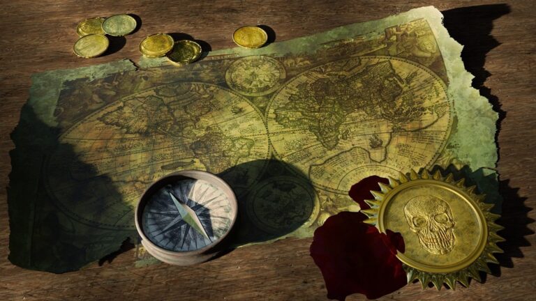
Early cartographers treated maps as artistic masterpieces blending function with elaborate decoration. Medieval European mapmakers adorned their works with intricate illuminated manuscripts featuring mythical creatures sea monsters & ornate compass roses. Islamic cartographers of the 12th-15th centuries developed distinctive geometric patterns & calligraphy incorporating mathematical precision with artistic flair. Chinese mapping traditions emphasized landscapes using traditional brush painting techniques to depict mountains rivers & settlements with symbolic meaning.
Modern Minimalist Approaches
Contemporary cartography embraces clean design principles focused on clarity & user experience. Digital mapping tools enable selective data display with crisp typography sans-serif fonts & restrained color palettes. Modern minimalist maps strip away decorative elements to highlight essential geographic information using negative space & subtle visual hierarchies. Leading digital platforms like Google Maps & Apple Maps demonstrate this approach with simplified symbology standardized icons & adaptive designs that scale across devices.
Enjoy safer driving with this portable CarPlay/Android Auto screen. Wirelessly connect your smartphone for hands-free calls, navigation, and music, and mount easily on your dash or windshield.
Mastering Color Theory in Geographic Visualization
Color theory plays a crucial role in creating maps that are both scientifically accurate and visually engaging.
Scientific Color Mapping Principles
Color schemes in cartography must follow specific scientific principles to ensure data accuracy and readability. Use sequential color schemes (light to dark) for continuous data like elevation or population density. Apply diverging color schemes for data with a meaningful midpoint such as temperature variations. Choose colorblind-safe palettes that maintain data distinction for all viewers. Tools like ColorBrewer 2.0 provide scientifically tested color schemes optimized for cartographic visualization.
Artistic Color Choices for Emotional Impact
Strategic color selection can evoke specific emotional responses and enhance map storytelling. Cool blues and greens convey water bodies and vegetation while creating a calm viewing experience. Warm reds and oranges highlight urgent or important features drawing immediate attention. Use complementary colors to create visual contrast between different map elements. Consider cultural color associations when designing maps for specific audiences as colors carry different meanings across regions.
Balancing Accuracy and Visual Appeal in Map Symbols
Map symbols form the visual language of cartography requiring careful consideration of both scientific precision and aesthetic impact.
Technical Requirements for Symbol Design
Symbol design must adhere to strict technical specifications to maintain map accuracy and readability. Each symbol requires precise scaling properties enabling visibility at multiple zoom levels while preserving geographical accuracy. Key technical considerations include:
- Minimum size requirements of 0.5mm for printed maps
- Consistent line weights ranging from 0.1 to 1.0 points
- Standard symbol sizes scaling from 6 to 24 pixels
- Clear figure-ground relationships with 60% contrast ratio
- Vector-based designs for resolution independence
Creative Approaches to Cartographic Symbolization
Innovative symbol design combines artistic elements with functional requirements to create intuitive map representations. Modern approaches incorporate:
- Abstract geometric shapes for point features
- Variable line styles for different road classifications
- Custom pictographs for tourist attractions
- Gradient fills for elevation changes
- Simplified icons for universal recognition
- Color harmonies that enhance visual hierarchy
The creative process focuses on developing symbols that communicate spatial information while maintaining visual appeal across different cultural contexts and user needs.
Incorporating Typography as Both Art and Information
Typography in cartography serves as a crucial bridge between scientific accuracy and artistic design combining readability with visual appeal.
Scientific Principles of Map Typography
Typography in maps follows strict scientific guidelines to ensure optimal legibility and information hierarchy. Font size must scale proportionally with viewing distance following the minimum legibility threshold of 0.2mm at final reproduction size. Text placement requires precise positioning to avoid feature overlap using automated algorithms that calculate optimal label positions. Standard typefaces like Helvetica and Arial maintain consistent stroke widths of 0.1-0.3mm ensuring readability across different display mediums.
Artistic Expression Through Lettering Styles
Creative typography transforms maps into visually distinctive works while maintaining clarity. Custom letterforms can reflect regional character through stylized serifs for historical areas or clean sans-serifs for modern districts. Variable weights create visual hierarchies with bold fonts at 0.3mm for primary features and light weights at 0.1mm for secondary elements. Typographic treatments like curved text following coastlines or architectural lettering for urban areas add artistic flair while preserving geographic accuracy.
Utilizing Digital Tools in Modern Cartography
Modern cartography thrives at the intersection of technical precision and creative design through digital tools that enable both scientific accuracy and artistic expression.
Technical Mapping Software Capabilities
Geographic Information Systems (GIS) platforms like ArcGIS and QGIS offer powerful spatial analysis tools including raster processing satellite imagery analysis topological modeling. These systems support high-precision coordinate systems layer management and advanced data manipulation through Python scripting. Essential capabilities include automated generalization tools spatial statistics functions and database connectivity that process complex geographic datasets with scientific rigor. Modern GIS platforms also incorporate real-time data integration machine learning algorithms and 3D terrain modeling.
Creative Digital Design Applications
Adobe Illustrator and Mapbox Studio empower cartographers to enhance technical maps with artistic elements while maintaining geographic accuracy. These tools provide advanced typography control custom symbol creation and sophisticated color management systems. Designers can craft unique map styles using layer effects texture overlays and custom patterns. Digital illustration tools enable the creation of hand-drawn effects hillshading techniques and artistic terrain representations while preserving the underlying spatial data integrity. Integration with vector editing software allows for seamless export between technical and creative platforms.
Understanding Map Projections as Mathematical Art
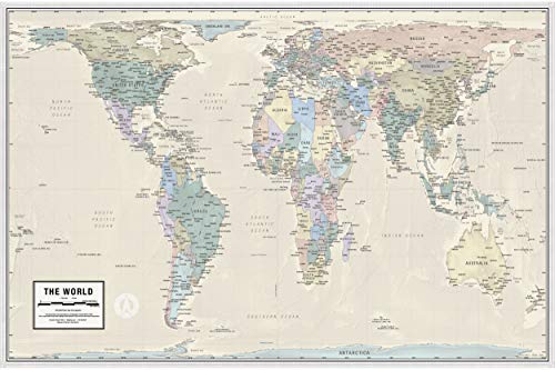
See the world accurately with this map showing countries in their true size and proportion. It's printed on high-quality, laminated paper and shipped rolled for optimal teaching and display.
The transformation of our spherical Earth onto a flat surface represents a unique fusion of mathematical precision and artistic decision-making, where cartographers must balance accuracy with visual appeal.
Scientific Basis of Map Projections
Map projections rely on complex mathematical formulas that transform spherical coordinates into planar representations. Each projection type preserves specific spatial properties: equal-area projections maintain accurate surface areas, conformal projections preserve local angles, and equidistant projections keep true distances from the center point. The mathematics behind these transformations involves differential geometry and calculus, using equations that account for the Earth’s ellipsoidal shape. Common projections like Mercator use cylindrical equations, while azimuthal projections employ polar coordinate systems.
Aesthetic Considerations in Projection Selection
Choosing the right projection involves evaluating visual impact alongside mathematical accuracy. The Mercator projection creates visually appealing straight lines for navigation but dramatically distorts polar regions. Robinson and Natural Earth projections offer pleasing curved parallels that minimize visual distortion while sacrificing some mathematical precision. Color gradients and shading techniques can help mask distortion patterns where landmasses stretch or compress. Strategic use of interrupted projections can preserve continental shapes while creating artistic negative spaces in oceanic regions.
Integrating Data Visualization with Artistic Expression
Modern cartography demands a seamless blend of data accuracy and visual appeal, transforming complex spatial information into engaging visual narratives.
Scientific Methods of Data Representation
Data visualization in cartography relies on established scientific principles to ensure accuracy and clarity. Choropleth maps use standardized color gradients to represent statistical values while proportional symbol maps scale markers according to quantitative data. Geographic Information Systems (GIS) implement algorithms for spatial analysis displaying population density heat maps kernel density estimation. Industry-standard tools like ArcGIS and QGIS offer built-in statistical visualization methods including natural breaks classification Standard Deviation maps and quantile distributions.
Creative Approaches to Data Storytelling
Innovative cartographers enhance data visualization through artistic techniques that maintain scientific integrity. Interactive maps incorporate hover effects animated transitions and timeline sliders to reveal temporal patterns. Custom-designed icons and symbols replace traditional markers adding visual interest while preserving data accuracy. Progressive web mapping platforms like Mapbox and D3.js enable dynamic data styling with gradient overlays texture patterns and responsive design elements. These creative approaches transform complex datasets into intuitive visual narratives that engage viewers while communicating spatial relationships effectively.
Crafting the Future of Cartographic Design
Digital innovation and artistic vision converge to shape tomorrow’s mapping landscape through groundbreaking technologies and creative expression.
Emerging Technologies in Map Making
Artificial intelligence and machine learning now power automated map generation with unprecedented accuracy. Advanced neural networks analyze satellite imagery to detect changes in real-time while augmented reality platforms transform static maps into interactive 3D experiences. Tools like MapBox GL JS enable web-based vector rendering with dynamic styling while quantum computing promises to revolutionize complex spatial calculations. Cloud-based collaborative mapping platforms facilitate real-time data updates across global teams working on shared cartographic projects.
New Frontiers in Artistic Map Expression
Digital art tools enable cartographers to blend traditional techniques with contemporary aesthetics in innovative ways. Procedural generation creates unique map styles through algorithmic art while generative adversarial networks produce stunning terrain visualizations. Custom shaders and WebGL effects add depth through dynamic lighting and shadows. Modern artists experiment with abstract topographies glitch art and data-driven animations to challenge conventional map representation while maintaining geographic accuracy. Interactive elements respond to user engagement creating personalized cartographic experiences.
Conclusion: Harmonizing Science and Creativity in Modern Cartography
The relationship between art and science in cartography continues to evolve through technological innovation and creative expression. Modern mapping combines rigorous data analysis with compelling visual storytelling to create powerful geographic narratives.
Today’s cartographers blend scientific precision with artistic vision using advanced digital tools and traditional design principles. This fusion enables the creation of maps that aren’t just accurate but also visually engaging and accessible to diverse audiences.
As technology advances the field of cartography shows us that art and science aren’t opposing forces but complementary elements that work together to enhance our understanding of the world. Your maps can now be both technically precise and aesthetically pleasing creating experiences that inform educate and inspire.

