11 Ways to Transform GIS into Stunning Map Art: A Visual Journey
Geographic Information Systems (GIS) have revolutionized how we create and interpret maps by transforming raw data into stunning visual masterpieces. You’ll discover that GIS technology isn’t just for scientific analysis – it’s becoming an innovative tool for artists who want to blend data visualization with creative expression.
When you combine the precision of GIS mapping with artistic interpretation you’ll unlock endless possibilities for creating unique map-based artwork that tells compelling stories about our world. Whether you’re a seasoned cartographer or an artist exploring new mediums GIS offers powerful tools to transform geographic data into visually striking pieces that bridge the gap between science and art.
Disclosure: As an Amazon Associate, this site earns from qualifying purchases. Thank you!
Understanding the Intersection of GIS and Artistic Expression
GIS technology merges with artistic creativity to create unique visual interpretations of geographic data that transcend traditional mapping boundaries.
P.S. check out Udemy’s GIS, Mapping & Remote Sensing courses on sale here…
Defining GIS in Creative Contexts
GIS transforms into a digital canvas where layers of geographic data become artistic elements. Artists utilize spatial databases terrain models remote sensing data and demographic information as raw materials for creative expression. The system’s ability to manipulate color patterns textures and symbology enables artists to craft visually striking interpretations of place and space. Modern GIS platforms like ArcGIS and QGIS offer sophisticated styling tools that let creators blend technical precision with aesthetic vision.
The Evolution of Digital Map Art
Digital map art has evolved from basic computer-generated cartography to sophisticated artistic expression through GIS platforms. The 1990s saw early experiments with digital elevation models while the 2000s introduced satellite imagery manipulation. Today’s artists leverage advanced GIS features like 3D visualization machine learning algorithms and real-time data integration. Popular techniques include elevation tinting custom symbology vector art manipulation and data-driven color schemes. Tools like Mapbox Carto and ArcGIS Pro enable artists to create immersive map experiences that combine scientific accuracy with artistic vision.
Selecting the Right GIS Tools for Artistic Projects
When creating artistic map interpretations you’ll need specific tools that balance technical capabilities with creative flexibility.
Essential Software Platforms
Start with ArcGIS Pro or QGIS as your primary mapping software for their robust artistic capabilities. ArcGIS offers advanced symbolization tools perfect for creating custom map styles while QGIS provides free access to similar features plus an extensive plugin library. Include Adobe Illustrator or Inkscape for final touch-ups as they excel at refining map aesthetics. For 3D visualizations consider using Blender with GIS plugins to transform flat maps into dimensional artworks. These platforms work together to form a comprehensive digital art toolkit.
Learn Inkscape quickly with this complete 2024 guide. Master vector graphics through step-by-step instructions, from basic concepts to advanced techniques.
Hardware Requirements for Digital Map Creation
Your computer needs at least 16GB RAM and a dedicated graphics card with 6GB VRAM to handle complex map rendering. An Intel i7 or AMD Ryzen 7 processor ensures smooth performance when working with large datasets. Use a color-calibrated 4K monitor for accurate color representation and detailed editing. A drawing tablet like Wacom Intuos improves precision when creating custom map elements. Storage requirements include a 500GB SSD for software and active projects plus external drives for data archives.
Creating Custom Color Palettes and Map Styles
Transform your GIS maps into artistic masterpieces by mastering custom color schemes and unique styling techniques.
Working With Color Theory in GIS
Apply fundamental color theory principles to enhance your map’s visual impact. Start by selecting base colors that align with your data’s message using traditional color wheels and harmony rules. Create custom color ramps in ArcGIS Pro or QGIS by adjusting hue saturation value (HSV) settings for seamless gradients. Consider colorblind-friendly palettes using tools like ColorBrewer 2.0 to ensure accessibility while maintaining artistic appeal.
Developing Unique Cartographic Signatures
Craft distinctive map styles that set your work apart through personalized symbology. Combine multiple layer styles with custom markers symbols textures and patterns in your GIS software. Design signature elements like specialized north arrows scale bars and legend formats that reflect your artistic vision. Export these custom styles as template files to maintain consistency across your map portfolio.
Master ArcGIS Pro 3.2 with this comprehensive guide. Learn essential GIS workflows and data management techniques for effective spatial analysis.
Implementing Artistic Filters and Effects
Transform standard GIS outputs into artistic compositions using advanced rendering techniques. Apply hillshade effects with custom light angles and transparency settings to create dramatic terrain visualization. Experiment with blending modes in ArcGIS Pro’s Layout View or QGIS’s Print Composer to achieve watercolor paper or vintage map effects. Utilize raster functions to add artistic noise grain or texture overlays that enhance visual interest.
Transforming Geographic Data Into Visual Stories
Transform raw geographic data into compelling visual narratives through strategic manipulation of GIS elements and artistic techniques.
Manipulating Elevation Data for 3D Effects
Create dramatic terrain visualizations by adjusting Digital Elevation Model (DEM) parameters in your GIS software. Use vertical exaggeration settings between 1.5x and 3x to emphasize topographic features without distortion. Apply multi-directional hillshading with 315° and 45° light angles to generate depth perception. Combine elevation tinting with transparency values of 30-50% to maintain detail visibility while adding artistic dimension to your terrain representation.
Incorporating Historical Map Elements
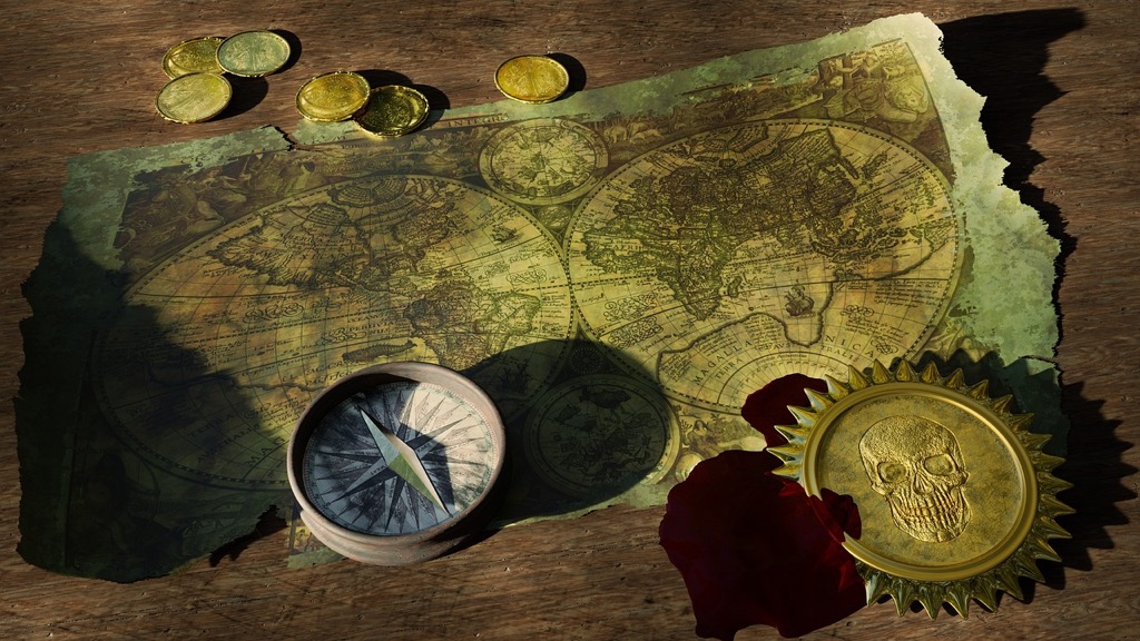
Blend contemporary GIS data with historical map elements to create unique temporal narratives. Import digitized historical maps as georeferenced overlays with 40-60% opacity to showcase traditional cartographic styles. Add vintage-inspired textures like parchment patterns or weathered effects through raster symbolization. Include historical landmarks markers compass roses and graticules styled with period-appropriate design elements to enhance authenticity.
Adding Artistic Annotations and Labels
Enhance your map’s storytelling power through creative labeling techniques. Design custom typography using curved text paths to follow natural features like rivers or coastlines. Apply artistic effects to labels including drop shadows watercolor brushstrokes or hand-drawn styles. Place annotations strategically using leader lines with varying weights and styles to direct attention while maintaining visual hierarchy. Mix font families to differentiate between feature types while ensuring readability at multiple scales.
Experimenting With Different Map Projections
Map projections serve as powerful artistic tools that can dramatically alter the visual impact of your geographic data. Each projection choice creates unique opportunities for creative expression through spatial distortion.
Understanding Projection Distortions
Every map projection inherently distorts the Earth’s surface when translating it from a sphere to a flat plane. The Mercator projection stretches polar regions while the Robinson projection creates subtle curves at the edges. These distortions can be leveraged artistically by emphasizing specific geographic features like coastlines or mountain ranges. Tools like Flex Projector let you visualize and manipulate these distortions to create compelling visual effects.
Enjoy entertainment anywhere with this portable mini projector. Project up to a 130" display with easy keystone correction and connect seamlessly via HDMI, USB, or Bluetooth.
Choosing Projections for Artistic Impact
Select projections based on your artistic goals and the story you want to tell. The Dymaxion projection creates dramatic triangular segments perfect for abstract interpretations while the Polar Stereographic projection produces striking circular compositions centered on the poles. Experiment with lesser-known projections like the Waterman Butterfly or the Hobo-Dyer to achieve unique visual perspectives. Consider using multiple projections in a single piece to highlight different aspects of your geographic data.
Integrating Mixed Media Elements
Blending different artistic mediums with GIS data creates unique cartographic expressions that bridge digital precision and artistic creativity.
Combining Traditional Art With GIS
Print your GIS base maps on specialized art papers to integrate traditional media like watercolors pastels or ink. Use transparency settings in your GIS software to create lighter base prints that serve as guidelines for hand-drawn elements. Import scanned artwork back into GIS platforms through georeferencing tools to maintain spatial accuracy. Layer hand-drawn textures contours and symbolic elements over digital data using tools like ArcGIS Pro’s overlay features or QGIS’s compositing options.
Adding Digital Textures and Patterns
Import custom texture libraries into your GIS workspace to enhance map features with natural patterns rock formations or vegetation effects. Apply procedural textures through tools like MapBox’s terrain styling or ArcGIS Vector Tile Style Editor. Create seamless pattern fills using vector repeats for water bodies urban areas or topographic elements. Blend multiple texture layers using opacity controls and blending modes to achieve depth and visual interest without compromising data legibility.
Exploring Data Visualization Techniques
Transform your GIS data into compelling visual narratives through innovative visualization methods and artistic interpretation.
Creating Abstract Geographic Art
Abstract geographic art emerges from manipulating raw GIS data through unconventional visualization techniques. Start by isolating specific data layers like elevation contours population density or land use patterns. Apply artistic filters such as point clustering fractals or voronoi diagrams to create non-traditional representations. Experiment with data classification breaks color gradients and transparency levels to develop unique abstract patterns. Tools like ArcGIS Pro’s raster functions or QGIS processing algorithms help transform standard geographic data into striking abstract compositions.
Designing Thematic Map Collections
Design cohesive map collections by unifying visual elements across multiple geographic datasets. Select a consistent color palette symbology and typography that reflects your theme while maintaining data accuracy. Create visual hierarchies using size contrast and arrangement to guide viewers through related maps. Implement standardized layouts grids and marginalia to maintain professional consistency. Use tools like ArcGIS Pro’s layout templates or QGIS Atlas features to streamline production while ensuring each map contributes to the broader narrative of your collection.
Publishing and Sharing Artistic GIS Projects
Transform your GIS artwork into accessible digital and physical formats that showcase your creative vision while maintaining quality and technical integrity.
Digital Exhibition Platforms
Create an impactful online presence for your GIS artwork through specialized mapping platforms like ArcGIS Online Story Maps MapBox Studio or Carto. Share interactive versions of your work on dedicated art platforms such as Behance DeviantArt or ArtStation using high-resolution exports. Leverage social media platforms including Instagram and Pinterest to reach wider audiences by posting process videos map details and final pieces. Consider creating a dedicated portfolio website using platforms like WordPress or Squarespace with embedded map viewers to display your GIS artwork professionally.
Print Production Guidelines
Prepare your GIS artwork for print by setting up your document at 300 DPI with CMYK color space. Export vector elements separately from raster data to maintain crisp lines and text at any scale. Use ICC color profiles to ensure consistent color reproduction across different printing methods and paper types. Set up proper bleed areas (0.125 inches) and safe zones for critical map elements. Choose appropriate paper stock based on your artwork style:
- Matte paper for detailed data visualization
- Semi-gloss for balanced presentation
- Fine art paper for artistic interpretations
- Canvas for textured display pieces
These carefully selected approaches ensure your GIS artwork maintains its visual impact whether viewed digitally or in print.
Conclusion
GIS technology has redefined the boundaries between cartography and art creating endless possibilities for creative expression. You now have the tools to transform geographic data into compelling visual narratives that combine scientific precision with artistic vision.
Whether you’re working with 3D visualizations custom projections or mixed media elements GIS provides a versatile platform for your artistic explorations. The combination of traditional artistic techniques with digital innovation opens new horizons for map-based creativity.
Your journey into GIS artistry doesn’t end here. As technology evolves you’ll discover more ways to push creative boundaries and tell unique stories through maps. By mastering these tools and techniques you’re well-equipped to create distinctive map art that speaks to both the mind and heart.
