8 Ways of Creating Maps That Evoke Emotion: Design Secrets Revealed
Maps do more than just show us where to go – they can stir powerful emotions and create lasting connections with places we’ve never visited. When you blend artistic elements with geographic data you’ll transform ordinary cartography into compelling visual stories that resonate deeply with viewers.
By mastering the art of emotional mapmaking you’re not just creating reference tools but crafting experiences that help people form meaningful relationships with locations through color psychology visual hierarchy and thoughtful design choices. Whether you’re designing for tourism conservation or cultural storytelling emotional maps have the power to move inspire and educate in ways traditional cartography simply can’t match.
Disclosure: As an Amazon Associate, this site earns from qualifying purchases. Thank you!
Understanding The Power Of Emotional Cartography
How Maps Shape Our Perception
Maps shape our understanding of the world through their unique ability to translate complex spatial relationships into visual narratives. They influence how we view distances distances neighborhoods regions countries and entire continents. A map’s projection choice can make Alaska appear larger than Brazil while color schemes can transform ordinary topography into emotionally charged landscapes. Strategic design elements like line weight font selection and shading create subtle yet powerful impacts on how viewers interpret geographic relationships. These visual decisions guide viewers toward specific emotional responses whether it’s feeling connected to a local community or experiencing awe at vast mountain ranges.
P.S. check out Udemy’s GIS, Mapping & Remote Sensing courses on sale here…
The Psychology Behind Map Design
Color psychology plays a central role in emotional cartography with warm tones evoking comfort and cool colors suggesting distance or detachment. Visual hierarchy techniques direct attention to key map elements through size contrast and placement creating an emotional journey across the mapped space. Research shows that viewers spend 60% more time engaging with maps that incorporate meaningful design elements like custom icons personalized landmarks and thoughtful typography. Maps trigger specific neural pathways associated with spatial memory making them powerful tools for emotional storytelling. Strategic use of negative space texture and symbolism can transform raw geographic data into compelling visual narratives that resonate with viewers on both conscious and subconscious levels.
| Map Design Element | Emotional Impact |
|---|---|
| Warm Colors | Comfort & Connection |
| Cool Colors | Distance & Objectivity |
| Custom Icons | Personal Relevance |
| Line Weight | Emphasis & Importance |
| Negative Space | Focus & Clarity |
Choosing Colors That Trigger Emotional Responses
Color selection plays a vital role in creating emotionally resonant maps by influencing viewers’ psychological responses and interpretations of spatial data.
Working With Color Psychology
Colors directly impact human emotions through established psychological associations. Red triggers urgency alertness or danger while blue evokes trust calmness or depth. Yellow sparks optimism energy or caution and green represents growth nature or safety. When designing maps consider these emotional triggers: use warm colors (red orange yellow) to highlight important areas draw attention or indicate intensity. Apply cool colors (blue green purple) to create depth show water features or represent calm stable regions. Test color combinations with sample audiences to validate emotional responses match your intended message.
Creating Meaningful Color Palettes
Build cohesive color schemes that reinforce your map’s emotional narrative. Start with a dominant color that matches your primary message then select complementary or analogous colors to create harmony. For environmental maps use earth tones greens and blues to reflect natural elements. Choose high-contrast colors for crisis or risk maps to emphasize urgency. Implement color gradients to show progression intensity or change over time. Consider colorblind-friendly palettes using tools like ColorBrewer to ensure accessibility. Maintain consistent saturation levels within your chosen palette to preserve visual hierarchy.
Incorporating Meaningful Symbolism And Iconography
Symbols and icons serve as powerful visual shorthand in maps, instantly communicating meaning while deepening emotional connections. Thoughtful symbolism transforms functional maps into compelling narrative tools.
Designing Custom Map Markers
Create unique markers that reflect your map’s theme and emotional intent rather than using generic pins or dots. Design icons with distinct silhouettes that remain recognizable at different scales while maintaining visual consistency. Use simplified shapes that reference real-world objects like landmarks buildings or natural features. Consider line weight variation texture and negative space to add visual interest without sacrificing clarity. Match your marker style to your map’s overall aesthetic using complementary colors shapes and proportions.
Using Cultural And Historical References
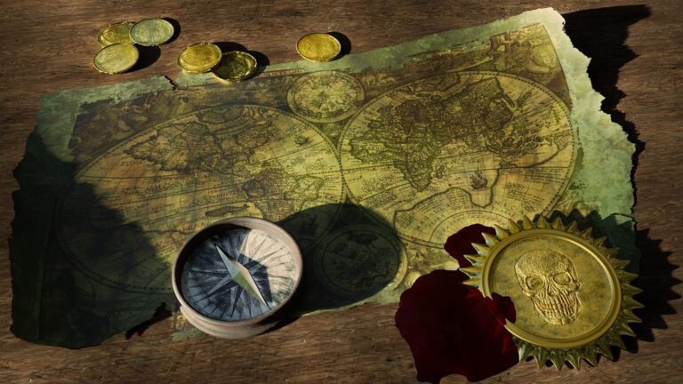
Incorporate culturally significant symbols and historical imagery that resonate with your map’s context and audience. Draw from traditional cartographic elements like compass roses sea monsters or decorative borders but reimagine them in contemporary ways. Research local art patterns motifs and meaningful symbols from the mapped region’s heritage. Consider using period-appropriate design elements when mapping historical events or places. Ensure cultural references are respectful accurate and enhance rather than detract from the map’s functionality.
Balancing Detail And Simplicity In Map Design
Effective map design requires careful consideration of what to include and what to omit to create emotional impact without overwhelming viewers.
Determining Essential Elements
Start by identifying your map’s core message and emotional purpose. Include only elements that directly support your narrative such as key landmarks terrain features or data points. Remove visual clutter like unnecessary labels minor roads or decorative elements that don’t serve the emotional intent. Focus on elements that create meaningful connections such as historical sites cultural markers or significant natural features that resonate with your audience.
Creating Visual Hierarchy
Establish a clear visual hierarchy using size color and contrast to guide viewers’ attention. Make emotionally significant elements stand out through larger sizes bolder colors or stronger contrast. Use subtle variations in opacity and scale to create depth allowing secondary information to support without competing with primary elements. Apply the rule of thirds to position key features where they’ll create maximum emotional impact while maintaining visual balance across the map’s composition.
Adding Personal Stories Through Map Annotations
Personal annotations transform ordinary maps into meaningful narratives that connect with viewers on an emotional level.
Integrating Text And Narratives
Weave personal stories into your maps using carefully placed text annotations that highlight meaningful moments locations and experiences. Choose fonts that match your map’s emotional tone ranging from elegant serif typefaces for historical narratives to modern sans-serif fonts for contemporary stories. Layer your text strategically starting with brief location markers then adding deeper story elements through callouts quotes and descriptive passages. Use text boxes with varying opacity to create depth while maintaining readability of the underlying map features.
Placing Strategic Labels And Descriptions
Position your labels to create a natural visual flow that guides viewers through your narrative journey. Place primary story elements at eye-catching intersection points using the rule of thirds. Incorporate short compelling descriptions near significant locations using a mix of sizes to establish hierarchy. Maintain consistent spacing between labels and ensure text contrasts well with the background. Use leader lines and text frames sparingly to connect descriptions to specific map features without cluttering the design.
Utilizing Typography To Convey Mood
Typography plays a crucial role in shaping the emotional impact of maps through careful font selection and thoughtful text arrangement.
Selecting Appropriate Fonts
Choose fonts that align with your map’s emotional message and historical context. Serif fonts like Garamond or Baskerville convey tradition and formality perfect for historical maps while sans-serif options like Futura or Helvetica create a modern clean feel. Match font weights to emphasize hierarchy with bolder typefaces for primary locations and lighter weights for supporting details. Limit your selection to 2-3 complementary fonts to maintain visual harmony and readability.
Arranging Text Elements
Position text elements strategically to create visual flow and emotional emphasis. Place primary labels at natural focal points using the rule of thirds and align secondary text along map features to guide the viewer’s journey. Vary text sizes between 8-14 points for optimal readability while maintaining proper contrast with the background. Use curved text paths to follow geographic features and create organic movement across the map surface.
Creating Depth Through Texture And Pattern
Textures and patterns add dimensionality to maps transforming flat surfaces into rich visual experiences that engage viewers on multiple levels.
Implementing Natural Elements
Create realistic terrain representations by incorporating organic textures that mirror natural landscapes. Use stippling effects for sandy regions cross-hatching for mountainous areas and flowing lines for water bodies. Apply subtle grain textures to land masses mimicking topographical variations. Layer these elements strategically using 30-40% opacity to maintain readability while adding visual interest. Include recognizable patterns like tree canopy textures for forests or ripple effects for lakes that instantly communicate terrain types to viewers.
Adding Atmospheric Effects
Enhance depth perception by implementing atmospheric perspective techniques. Add subtle gradient overlays that transition from clear to misty as distance increases. Use semi-transparent white layers at 15-20% opacity to simulate fog in valley regions. Create depth through shadow effects that suggest elevation changes particularly in mountainous areas. Apply gentle vignetting around map edges to draw focus inward and establish a sense of atmosphere. These effects should remain subtle enough to support rather than overwhelm the map’s core information.
Designing For Different Emotional Objectives
Different mapping objectives require distinct design approaches to evoke specific emotional responses in viewers.
Maps That Inspire Wonder
Create awe-inspiring maps by highlighting extraordinary features through dramatic elevation profiles dynamic color gradients and intricate detail work. Use perspective views to showcase dramatic landscapes like mountain ranges or deep ocean trenches. Incorporate hand-drawn elements starbursts or glowing effects around remarkable locations. Amplify natural patterns in terrain through strategic shading and emphasize the scale of geographic features by including relatable size comparisons.
Maps That Create Connection
Design maps that foster emotional bonds by emphasizing shared experiences and human elements. Include markers for community gathering spots cultural landmarks and historical sites that hold collective meaning. Layer personal stories through carefully placed annotations that highlight local traditions festivals or neighborhood character. Use warm inviting colors and incorporate elements that reflect the community’s unique identity such as traditional patterns or architectural styles.
Maps That Provoke Thought
Develop maps that challenge perspectives by visualizing data in unexpected ways. Highlight social environmental or historical patterns through creative symbolism and deliberate color choices. Use visual contrasts to emphasize disparities or changes over time. Include thought-provoking statistics directly on the map and implement innovative projections that question standard geographic assumptions. Layer multiple data sets to reveal hidden connections and encourage deeper analysis.
Testing And Refining Emotional Impact
Gathering User Feedback
Collect direct feedback from diverse test users to evaluate your map’s emotional impact. Create structured surveys focusing on specific emotional responses like “Did this area evoke a sense of mystery?” or “Rate the feeling of excitement in this region from 1-5.” Organize small focus groups of 5-7 people to observe their initial reactions track eye movements and document verbal responses. Use heat mapping tools to identify which areas draw the most attention and emotional engagement.
Making Iterative Improvements
Apply user feedback systematically to enhance your map’s emotional resonance. Adjust color intensity saturation levels and typography based on consistent feedback patterns. Test multiple versions with subtle variations in texture patterns symbol placement and narrative elements. Document each iteration’s changes and corresponding user responses in a tracking sheet. Implement A/B testing to compare different design approaches focusing on one element at a time such as label placement or color schemes.
Moving Forward With Emotional Map Design
Creating emotionally resonant maps is an art that blends technical precision with creative storytelling. By thoughtfully applying color psychology typography visual hierarchy and personal narratives you’ll transform ordinary geographic data into compelling visual experiences that deeply connect with your audience.
Remember that every design choice from font selection to texture placement plays a vital role in shaping how viewers perceive and interact with your maps. Your maps have the power to inspire wonder provoke thought and foster meaningful connections.
Take these principles and make them your own. Test different approaches gather feedback and refine your designs. You’ll discover that emotional mapmaking isn’t just about conveying information – it’s about creating lasting impressions that resonate with viewers long after they’ve looked away from the map.


