9 Creative Methods for Incorporating Typography in Maps That Transform Design
Typography transforms ordinary maps into compelling visual stories where every letter and symbol plays a crucial role in communicating spatial information. Whether you’re designing for digital platforms or print media you’ll discover that creative typography can elevate your cartographic work from functional to extraordinary.
By mastering innovative typographic techniques you’ll learn to balance readability with artistic expression while maintaining geographic accuracy and user engagement. From dynamic label placements to custom typefaces that reflect regional character you’ll find endless possibilities to make your maps stand out in today’s design-conscious world.
Understanding the Fundamentals of Map Typography
Typography transforms geographic data into clear spatial narratives through intentional text design choices.
Basic Principles of Cartographic Text Design
Follow these essential principles when designing map typography:
- Use hierarchical text sizing to show feature importance (cities: 12pt, towns: 10pt)
- Maintain consistent letter spacing of 1.15-1.25 for optimal readability
- Position labels parallel to parallels for standard orientation
- Apply appropriate contrast between text and background (minimum 4.5:1 ratio)
- Implement selective emphasis through weight variations
- Avoid text overlaps by maintaining minimum 2pt spacing between elements
- Tracking: Uniform spacing between characters in map labels
- Leading: Vertical space between lines of text
- X-height: Height of lowercase letters relative to baseline
- Cap height: Height of capital letters from baseline
- Kerning: Specific spacing between character pairs
- Type weight: Thickness variation in letter strokes
- Baseline: Invisible line where letters rest
- Serif/Sans-serif: Letter ending style choices
Selecting the Right Typefaces for Your Map
Choosing appropriate typefaces is crucial for creating maps that are both visually appealing and functionally effective.
Serif vs. Sans Serif in Cartography
Serif typefaces feature decorative strokes at letter edges making them ideal for printed maps and traditional cartographic styles. Sans serif fonts offer clean modern aesthetics perfect for digital maps and mobile displays. Consider using serif fonts like Minion Pro or Palatino for physical terrain maps while opting for sans serif options like Helvetica or Open Sans for interactive web maps. Your choice should align with both the map’s medium and intended use.
Experience ultimate comfort and clarity with Open Sans. This versatile font ensures readability across all platforms and devices with its clean, humanist design, making it perfect for any project.
Enjoy crisp, clear text with Palatino, a versatile font perfect for readability in books and documents. Its elegant design ensures a professional and timeless look across all your projects.
Get a comfortable and secure grip with the Wilson Minions Pro Overgrip 3-pack. Featuring a thin, elastic felt material and fun Minion designs, this durable overgrip includes finishing tape for easy application.
Choosing Fonts That Enhance Map Readability
Select typefaces based on their legibility at different scales and viewing distances. Opt for fonts with distinct letterforms medium x-heights and open counters like Roboto Frutiger or Source Sans Pro. Avoid decorative display fonts or those with extreme weights that could compromise clarity. Test your chosen typefaces at various zoom levels to ensure they remain clear across all map interactions. Remember to maintain consistent font families throughout your map’s hierarchy.
Enjoy smooth cursor control and a unique aesthetic with this mouse, featuring a floating Frutiger Aero globe and clownfish in a liquid-filled chamber. Easily switch between Bluetooth and 2.4G wireless connectivity, and recharge quickly with the included USB-C cable.
Mastering Text Hierarchy in Map Design
Text hierarchy plays a crucial role in guiding viewers through geographic information while maintaining visual clarity and organization.
Creating Visual Balance Through Font Weights
Strategically combine different font weights to establish clear relationships between map elements. Use bold weights (600-700) for primary features like major cities region names while applying regular weights (400-500) for secondary elements such as street names or topographic labels. Maintain visual harmony by limiting your weight variations to 3-4 distinct levels within a single typeface family such as Light Medium and Bold. This creates obvious distinction between elements without overwhelming the viewer.
Using Size and Scale for Information Priority
Implement a consistent size scaling system to emphasize geographic hierarchy. Start with larger sizes (12-14pt) for country names progressing down to smaller sizes (6-8pt) for local features. Create a ratio-based scale where each level is approximately 20% smaller than the previous one. Apply this sizing strategy across different zoom levels ensuring labels remain legible when users interact with digital maps. Focus on maintaining relative size relationships even as absolute sizes change with map scale.
Implementing Creative Text Placement Techniques
Text placement transforms basic geographic labels into dynamic visual elements that guide map readers through spatial information while maintaining clarity and style.
Curved and Flowing Text Applications
Master the art of curved text placement by following natural geographic features like rivers coastlines or highways. Use automated tools like MapPublisher‘s “Curve Text” or ArcGIS Pro’s “Bezier Curve Labels” to create smooth flowing labels that mirror landscape contours. Adjust letter spacing tracking to maintain readability across curves while ensuring consistent character density. Implement variable curvature based on feature scale with steeper curves for small features and gentler arcs for regional elements.
Discover maps from Lucas Fielding Jr., a prominent early 19th-century Baltimore cartographer and publisher. His atlases, first published in 1815-17, are closely related to the 1822 Philadelphia atlas by Carey & Lea.
Strategic Label Positioning Methods
Apply smart label positioning using the “PACE” method: Priority Alignment Clarity and Emphasis. Position settlement names above points of interest mountain ranges along ridgelines and water bodies within their boundaries. Use automatic label engines like Mapbox’s Smart Labels to avoid overlaps while maintaining geographic accuracy. Implement offset distances based on feature importance with 2-4mm spacing for local features and 4-8mm for regional landmarks. Rotate labels to parallel adjacent linear features maintaining a maximum 60-degree angle for optimal readability.
Incorporating Typography Into Map Features
Typography integration with physical map features requires careful consideration of both aesthetics and functionality while maintaining geographic accuracy.
Integrating Text With Terrain Elements
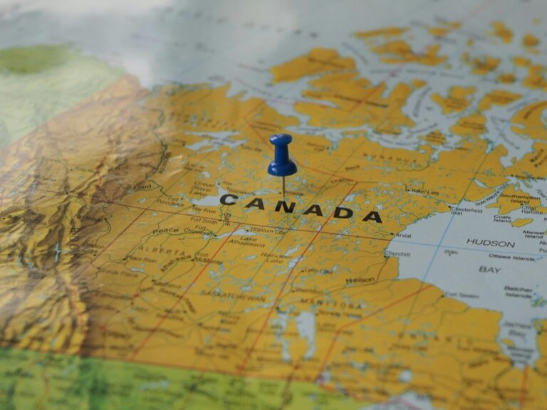
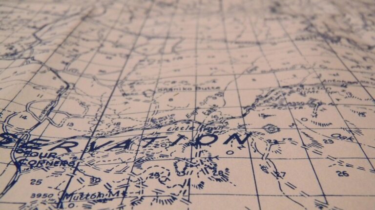
Terrain typography demands strategic placement that follows natural landforms while maintaining readability. Position labels along mountain ranges using curved paths that mirror topographic contours. For elevated features like peaks hills or ridges place text slightly offset above the highest point using tools like QGIS’s “Rule-based Labeling” or ArcGIS’s “Maplex Label Engine.” Adjust font weight and size based on elevation significance with thicker weights for major ranges and thinner for foothills.
Blending Typography With Water Bodies
Water feature labeling requires specific techniques to enhance map flow and readability. Curve text gently along rivers following the natural meandering path with consistent letter spacing. For lakes and oceans use horizontally aligned text in a lighter weight or italic style to suggest fluid movement. Position coastal labels parallel to shorelines with appropriate contrast against the blue background. Tools like Adobe Illustrator’s “Type on a Path” tool or MAPublisher’s “Water Feature Labeling” enable precise water typography placement.
Playing With Color and Typography
Color and typography work together to create visually appealing and effective map designs that enhance readability while maintaining aesthetic appeal.
Using Color Psychology in Map Labels
Color choices in map typography trigger specific emotional responses and improve information hierarchy. Use warm reds and oranges for primary city labels to draw immediate attention. Apply cool blues and greens to water features and natural landmarks creating a sense of calm and familiarity. Reserve purple and gold for points of interest or historical sites to convey importance. Tools like ColorBrewer 2.0 help create colorblind-friendly palettes that work harmoniously with your typography while ensuring accessibility standards are met. Match label colors to thematic elements for intuitive category recognition.
Contrast Techniques for Text Visibility
Create clear text visibility by maintaining a minimum contrast ratio of 4.5:1 between text and background colors. Apply white halos or dark shadows to labels over complex terrain features. Use reversed-out text (white) on darker backgrounds for maximum readability. Implement subtle transparency in label backgrounds to preserve underlying map details while ensuring text remains legible. Tools like Adobe Photoshop’s “Blend If” sliders or QGIS’s “Buffer” settings help achieve optimal contrast levels. Test visibility across different zoom levels and screen resolutions to ensure consistent readability.
Experience comfortable viewing with reduced blue light emissions and accurate colors thanks to Dell's ComfortView Plus. Enjoy smooth visuals with a 100Hz refresh rate and versatile connectivity with dual HDMI ports.
Exploring Dynamic Typography Solutions
Modern mapping demands flexible typographic solutions that adapt to various devices and user interactions while maintaining clarity and functionality.
Responsive Text for Digital Maps
Dynamic typography in digital maps requires text elements that automatically adjust to different screen sizes and zoom levels. Use CSS units like vw (viewport width) and vh (viewport height) to create fluid typography that scales proportionally. Implement breakpoints with media queries to ensure text remains legible across devices from mobile phones to desktop displays. Tools like Mapbox GL JS offer built-in responsive label sizing through text-size expressions while ArcGIS API provides dynamic label classes for seamless scaling.
Interactive Typography Elements
Transform static map labels into interactive elements using hover states mouse events and touch gestures. Implement click-to-zoom functionality on city names reveal additional information through tooltip overlays or trigger dynamic content panels. Use JavaScript libraries like Leaflet.js to create expandable labels that display metadata pop-ups or D3.js for animated typography transitions. Include interactive legend filters that highlight related text elements and enable users to toggle label visibility based on feature categories.
Adding Artistic Typography Effects
Transform your map’s visual appeal with advanced typographic techniques that balance aesthetics with functionality.
Custom Letter Styling for Map Elements
Create unique letter treatments by modifying individual characters to match geographic features. Use Adobe Illustrator’s “Create Outlines” to convert text into editable shapes allowing custom distortions texture overlays or gradient fills. Apply effects like roughened edges for coastlines or flowing curves for river names. Tools like Photoshop’s Layer Styles enable drop shadows bevels or pattern overlays that enhance depth while maintaining readability.
Decorative Text Treatments
Enhance map typography with strategic decorative elements that complement your design theme. Apply subtle textures like paper or stone effects using displacement maps in design software. Add watercolor bleeds controlled noise or vintage distressing for historical maps. Use Illustrator’s Appearance panel to stack multiple effects including outer glows strokes or opacity variations. Keep decorative treatments subtle enough to preserve text legibility while adding visual interest.
Optimizing Typography for Different Map Scales
Effective map typography requires careful consideration of scale-dependent text adjustments to maintain readability and visual hierarchy across various zoom levels and viewing distances.
Adjusting Text for Various Zoom Levels
Scale-dependent text sizing ensures optimal legibility at every zoom level. Set minimum text sizes of 8pt for detailed views and maximum sizes of 24pt for overview scales. Use dynamic label rules in GIS software like ArcGIS Pro’s “Scale Range” or QGIS’s “Scale-Based Visibility” to automatically adjust font sizes. Create scale thresholds where labels appear or disappear based on zoom level:
- 1:1000 – Show building names & street numbers
- 1:5000 – Display street names & local landmarks
- 1:25000 – Show major features & regional labels
- 1:100000 – Display only primary geographic names
- Set label weights to prioritize important features
- Create buffer zones around primary labels
- Stack multi-line labels vertically
- Use abbreviations for secondary features
- Implement leader lines for offset labels
- Group similar features under area labels
Conclusion: Creating Typography-Forward Map Designs
Typography stands as a powerful tool in modern map design that goes far beyond basic labeling. By mastering creative typographic techniques you’ll transform your maps into compelling visual narratives that engage and inform your audience.
Remember that successful map typography balances artistic expression with functionality. Whether you’re working on digital or print maps your typographic choices should enhance geographic accuracy while maintaining visual appeal across different scales and formats.
Take these creative approaches and make them your own. With the right combination of typefaces colors and placement techniques you’ll create maps that not only convey information effectively but also leave a lasting impression on your viewers.


