11 Minimalistic Map Design Concepts That Create Visual Impact
Minimalistic map design transforms complex geographical information into elegant visual solutions that captivate and guide users effortlessly. By stripping away unnecessary elements and focusing on essential details you’ll discover how simple shapes colors and typography can create powerful map experiences that resonate with modern aesthetics.
Whether you’re a designer cartographer or digital artist understanding the principles of minimalistic map design will help you create stunning visuals that communicate clearly while maintaining visual harmony. From choosing the right color palette to mastering negative space these fundamental concepts will elevate your map designs to new heights of sophistication and usability.
Disclosure: As an Amazon Associate, this site earns from qualifying purchases. Thank you!
Understanding The Basic Principles Of Minimalistic Map Design
Creating effective minimalist maps requires mastering fundamental design principles that emphasize clarity and purpose.
P.S. check out Udemy’s GIS, Mapping & Remote Sensing courses on sale here…
Core Elements Of Minimalism
- Negative Space – Use white space strategically to create breathing room between map elements and highlight key features
- Limited Color Palette – Select 2-3 core colors to maintain visual harmony while ensuring readability
- Simple Shapes – Rely on basic geometric forms to represent geographic features like circles for cities or straight lines for borders
- Clean Typography – Choose a single sans-serif font family with maximum 2 weights for labels and titles
- Essential Information – Include only critical data points that serve the map’s primary purpose
- Consistent Style – Maintain uniform design elements throughout the map including icons symbols and line weights
- Primary Elements – Emphasize the most important features through larger sizes bolder colors or prominent placement
- Secondary Details – Use subtle variations in opacity size or color to display supporting information
- Layer Organization – Arrange map elements in distinct levels with the most crucial data on top
- Scale Variation – Adjust feature sizes proportionally to show relative importance
- Contrast Management – Create clear visual distinctions between different map elements using size color or weight
- Focal Points – Guide viewer attention through strategic placement of key map components
Selecting Essential Map Elements
Creating an effective minimalist map requires careful selection of elements that serve a clear purpose while maintaining visual clarity.
Critical Geographic Features
Start with identifying the most vital geographic elements that serve your map’s core purpose. Focus on including:
- Primary boundaries like coastlines borders or district limits
- Major landforms that provide crucial context (mountains rivers lakes)
- Key infrastructure elements such as main roads highways or transit lines
- Essential landmarks that aid in orientation
- Scale indicators or grid references for distance perception
Keep only features that directly support your map’s intended use and remove decorative or secondary elements that don’t contribute to the primary message.
Typography And Label Placement
Choose typography and position labels to maximize readability while maintaining visual harmony:
- Select sans-serif fonts for clearer digital display
- Use no more than 2-3 font styles across the entire map
- Align labels consistently with their features
- Place text in areas with good contrast
- Scale font sizes hierarchically (larger for primary features smaller for details)
- Space labels evenly to avoid clustering
- Remove labels for non-essential features
Keep text minimal and prioritize labels that directly support navigation or identification of key locations.
Mastering Color In Minimalist Maps
Color plays a crucial role in minimalist map design by guiding the viewer’s attention and conveying information effectively while maintaining visual simplicity.
Working With Limited Color Palettes
Select 2-3 core colors that align with your map’s purpose and brand identity. Start with a neutral base color like light gray or beige for background elements. Add one primary color for key features such as roads or borders and a secondary accent color for highlights or points of interest. Consider using color variations through opacity adjustments rather than introducing new hues. Popular minimalist combinations include:
- Navy blue with light gray
- Forest green with beige
- Deep purple with white
- Charcoal with pale yellow
- Rust orange with cream
- Light features on dark backgrounds
- Dark elements on light backgrounds
- Mid-tone features with strong contrast
- Complementary colors for emphasis
- Graduated shades for data visualization
Implementing White Space Effectively
White space serves as a crucial design element in minimalistic map design creating visual hierarchy and improving readability.
Strategic Use Of Negative Space
Negative space acts as a powerful tool to guide viewer attention and create visual breathing room in your map design. Position key map elements with adequate spacing to prevent visual clutter and enhance focus on essential information. Create purposeful gaps between geographic features roads landmarks and labels using consistent spacing rules. This deliberate use of empty space helps viewers quickly scan and understand the map’s core message while maintaining a clean aesthetic that characterizes minimalist design.
Balancing Information Density
Strike the right balance between content and white space by grouping related elements and establishing clear visual hierarchies. Divide your map into distinct zones using white space as natural barriers between different information layers. Maintain a 60/40 ratio of content to white space ensuring that essential geographic data remains easily digestible. Consider using variable spacing where dense urban areas receive tighter spacing while rural regions get more generous white space to reflect their natural spatial relationships.
Simplifying Complex Data Visualization
Reducing Visual Clutter
Start your data simplification process by removing non-essential map elements such as decorative borders gridlines and redundant labels. Use selective transparency to fade secondary features like minor roads or terrain details that don’t directly support your map’s purpose. Implement feature generalization techniques to simplify complex shapes such as coastlines or political boundaries while maintaining geographic accuracy. Group similar data points into clusters when dealing with dense information sets to prevent overlapping markers and improve readability.
Focusing On Key Information
Prioritize your data hierarchy by highlighting 2-3 primary elements that drive your map’s narrative. Create distinct visual categories using size weight or color variations to differentiate between primary secondary and tertiary information. Apply the “less is more” principle by limiting your dataset to essential metrics that support your core message. Consider using inset maps or sequential views for complex datasets rather than overwhelming a single visualization with too much detail.
Choosing The Right Typography
Typography plays a crucial role in minimalistic map design by enhancing readability while maintaining visual harmony.
Font Selection For Clarity
Select sans-serif fonts like Helvetica Neue Open Sans or Roboto for optimal legibility at various zoom levels. Limit your typeface selection to 1-2 font families to maintain consistency across your map design. Sans-serif fonts work particularly well for small text sizes and digital displays due to their clean lines and balanced letterforms. Choose fonts with distinct characteristics for different map elements such as road labels water features and points of interest while ensuring they complement each other visually.
Text Scaling And Hierarchy
Establish a clear typographic hierarchy using 3-4 distinct size levels for different map elements. Set primary labels like city names at 12-14pt secondary elements at 10pt and tertiary information at 8pt. Apply consistent spacing between letters (tracking) adjusting by -10 to +20 units based on font size. Create visual emphasis through weight variations rather than size changes using regular weights for standard labels and bold weights for important features. Maintain a size ratio of 1:1.5 between consecutive hierarchy levels to ensure clear differentiation.
Incorporating Modern Design Trends
Modern map design continues to evolve with technological advancements and changing user expectations, integrating seamlessly with digital platforms while maintaining minimalistic principles.
Digital Interface Integration
Interactive elements transform minimalist maps into dynamic user experiences through smart design choices. Implement hover states to reveal additional information without cluttering the base design. Add subtle animations for zoom transitions and layer toggles to enhance usability. Consider incorporating gesture controls for touch devices and keyboard shortcuts for desktop users. Use SVG formats for scalable icons and map elements that maintain crispness across all screen resolutions.
Responsive Design Elements
Design maps that adapt fluidly across different screen sizes and orientations. Create flexible grid systems that automatically adjust map element spacing and scale. Use viewport-based sizing for typography and symbols to maintain proportions across devices. Implement breakpoints that reorganize map controls and legends for optimal viewing on mobile screens. Consider progressive loading techniques to maintain performance while preserving essential map features at different zoom levels.
Optimizing User Experience
Enhancing user experience in minimalistic map design requires careful attention to navigation clarity and interactive functionality while maintaining visual simplicity.
Intuitive Navigation Systems
Create clear visual hierarchies through consistent design patterns that guide users naturally through the map interface. Implement familiar zoom controls positioned in the top-right corner and a scale bar at the bottom-left for immediate reference. Use recognizable icons like magnifying glasses for search functions and compass roses for orientation. Include a collapsible legend that reveals additional information only when needed while maintaining the map’s clean aesthetic.
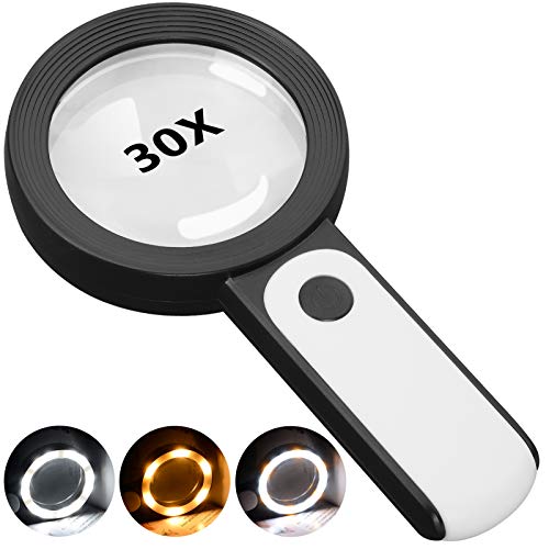
This 30X magnifying glass helps users with low vision easily read small text. Featuring a large 3.15" lens and 18 LEDs with adjustable cool, warm, and mixed light modes, it reduces eye strain and improves reading in any lighting.
Interactive Elements
Design responsive hover states that reveal contextual information without cluttering the base map. Add subtle animations for smooth transitions between zoom levels and pan operations. Implement smart tooltips that display relevant data points click targets of at least 44×44 pixels for optimal touch interaction. Include gesture controls like pinch-to-zoom and two-finger rotation that feel natural on both desktop and mobile devices while preserving the minimalist interface.
Testing And Refining Map Designs
User Feedback Integration
Start testing your minimalist map designs with diverse user groups early in the development process. Gather feedback through structured usability tests beta testing sessions and online surveys. Focus on collecting data about navigation ease readability of labels and overall user experience. Track specific metrics like time-to-task completion error rates and user satisfaction scores. Implement A/B testing to compare different design variations and determine which elements resonate most effectively with your target audience.
Iterative Design Process
Apply systematic refinements based on quantitative and qualitative feedback data. Start with major layout adjustments then progress to fine-tuning individual elements like typography color contrast and spacing. Test each iteration with fresh user groups to validate improvements and identify new optimization opportunities. Document changes track performance metrics and maintain version control throughout the refinement cycle. Use prototyping tools to quickly implement and evaluate design modifications before finalizing changes in your production environment.
Moving Forward With Minimalist Map Design
Minimalist map design stands as a powerful approach to create clear engaging and purposeful cartographic experiences. By embracing simplicity you’ll create maps that not only look sophisticated but also effectively communicate their intended message.
Remember that successful minimalist maps strike the perfect balance between aesthetics and functionality. Focus on essential elements thoughtful color choices and strategic use of white space to guide your viewers through geographic information effortlessly.
As design trends evolve your minimalist maps should adapt while maintaining their core principle: simplicity with purpose. Keep testing refining and innovating to create maps that resonate with your audience and stand the test of time.


