11 Creative Approaches to Spatial Data Representation That Transform Insights
The world of spatial data visualization has evolved far beyond traditional maps and charts into an exciting realm of creative possibilities. You’ll discover innovative ways to transform complex geographic information into compelling visual stories that captivate and inform your audience. From interactive 3D models to augmented reality displays spatial data representation now offers unprecedented opportunities to help people understand and interact with location-based information.
Whether you’re a data scientist GIS specialist or digital storyteller mastering creative approaches to spatial data representation will revolutionize how you communicate geographic insights. Modern visualization techniques combine artistry with analytical precision allowing you to craft immersive experiences that make spatial relationships instantly clear and memorable.
Disclosure: As an Amazon Associate, this site earns from qualifying purchases. Thank you!
Understanding The Fundamentals Of Spatial Data Visualization
Traditional Mapping Techniques
Traditional mapping techniques form the foundation of spatial data visualization through time-tested methods. Paper maps use symbology like contour lines dots circles & shading to represent geographic features topography & data distribution. Thematic mapping employs choropleth maps to show data variations across regions using color gradients. Key conventional techniques include:
P.S. check out Udemy’s GIS, Mapping & Remote Sensing courses on sale here…
Navigate North America with ease using the Rand McNally 2025 Large Scale Road Atlas. Featuring updated, large-print maps of every U.S. state and Canadian province, plus detailed city and national park insets, it's perfect for any road trip.
- Base maps with proper scale bars & north arrows
- Point symbol maps for discrete locations
- Line features for roads rivers & boundaries
- Area patterns for land use & administrative zones
- Isoline maps for elevation & weather data
Core Elements Of Spatial Representation
Effective spatial representation relies on five essential components that work together to convey geographic information accurately:
- Projection systems that convert 3D Earth to 2D surfaces
- Coordinate systems for precise location referencing
- Scale ratios that maintain spatial relationships
- Symbology that uses shapes colors & patterns
- Attribute data linked to geographic features
Each element requires careful consideration of:
- Data accuracy & precision
- Visual hierarchy & balance
- Map purpose & audience
- Geographic context
- Data classification methods
These fundamentals create the framework for both simple reference maps & complex analytical visualizations.
This 50" x 32" US wall map features clearly labeled states, cities, and topography. Its durable, non-glare lamination allows for use with water-soluble markers and easy cleaning.
Exploring 3D Visualization Techniques
Modern spatial data representation demands innovative approaches to showcase complex geographic information effectively.
Interactive Terrain Modeling
Interactive terrain modeling transforms 2D topographic data into dynamic 3D landscapes you can manipulate in real-time. Modern GIS platforms like ArcGIS Pro and QGIS support terrain visualization through TIN (Triangulated Irregular Network) and DEM (Digital Elevation Model) data structures. These tools enable features such as slope analysis dynamic lighting effects and interactive elevation profiles. You can enhance terrain models with texture mapping high-resolution satellite imagery and custom color gradients to highlight specific topographic features.
Volumetric Data Display Methods
Volumetric visualization techniques render spatial data as three-dimensional objects with depth height and density properties. Tools like ParaView and VoxlerⓇ enable the creation of voxel-based displays for subsurface geology atmospheric data and ocean currents. You can apply transparency effects color mapping and cross-sectional views to reveal internal structures. These methods excel at representing phenomena like groundwater flow patterns air quality distributions and underground resource deposits across multiple depth layers.
Leveraging Augmented Reality For Spatial Data
AR-Enhanced Geographic Information Systems
AR technology transforms traditional GIS platforms into interactive 3D experiences by overlaying digital spatial data onto real-world environments. Modern GIS platforms like Esri’s ArcGIS AR integrate with mobile devices to display georeferenced data layers buildings terrain networks in real time. Users can manipulate virtual map elements explore underground infrastructure and analyze spatial relationships through intuitive gesture controls. Tools like vGIS and STURFEE enable field technicians to visualize buried utilities analyze terrain changes and conduct virtual site inspections with millimeter accuracy.
Mobile AR Applications For Location Data
Mobile AR apps revolutionize field data collection and visualization through smartphone-based spatial analysis tools. Popular platforms like Augview and ARGIS Map allow users to capture geospatial data add annotations and share location-based information through AR interfaces. These apps support real-time navigation feature identification and attribute updates while maintaining centimeter-level positioning accuracy through RTK GPS integration. Field workers can access property boundaries utility layouts and environmental data directly through their mobile devices reducing survey time and improving decision-making accuracy.
Implementing Dynamic Heat Maps
Heat maps offer powerful visualization of spatial patterns through color gradients and intensity variations, transforming complex geographic data into intuitive visual insights.
Real-Time Data Integration
Dynamic heat maps excel at processing continuous data streams from IoT sensors municipal systems and crowd-sourced platforms. Connect your heat map to real-time APIs using tools like Mapbox GL JS or Leaflet to visualize changing patterns instantly. Modern frameworks like deck.gl enable smooth rendering of millions of data points with WebGL acceleration supporting rapid updates of temperature traffic or population density data.
Monitor your environment with IoT Smart Bites sensors. These sensors provide data in English, allowing for easy integration and analysis.
Color-Coded Intensity Mapping
Create effective intensity visualizations using carefully selected color schemes that match your data characteristics. Implement sequential color palettes from ColorBrewer for single-variable mapping or diverging schemes for showing deviations from a baseline. Tools like D3.js offer pre-built color scales while libraries such as chroma.js allow custom color interpolation for precise control over your heat map’s visual hierarchy.
Key Color Mapping Configurations:
- Sequential: Blues or YlOrRd scales for population density
- Diverging: RdBu scales for temperature variations
- Qualitative: Set3 or Paired scales for categorical data
| Data Type | Min Colors | Max Colors | Example Scale |
|---|---|---|---|
| Continuous | 5 | 9 | Viridis |
| Categorical | 3 | 8 | Set2 |
| Diverging | 7 | 11 | RdYlBu |
Incorporating Time-Series Animation
Time-series animation transforms static spatial data into dynamic visualizations that reveal patterns and changes over time.
Temporal Pattern Visualization
Modern GIS tools like ArcGIS Pro Time Slider and QGIS Temporal Controller enable powerful temporal pattern analysis. Add time stamps to your spatial features then animate changes using customizable playback controls. Key visualization methods include:
- Cumulative growth displays showing feature accumulation
- Temporal symbology that changes color or size based on time values
- Time-window filtering to focus on specific periods
- Temporal heat maps revealing density changes through time
Movement And Flow Representation
Dynamic flow mapping illuminates movement patterns through animated paths lines vectors and particles. Use tools like Kepler.gl or Flowmap.gl to visualize:
- Vehicle trajectory data with animated point symbols
- Migration flows with curved connection lines
- Traffic patterns with directed arrows
- Supply chain networks with sequential path highlighting
Advanced techniques include variable speed animation particle systems and temporal clustering to manage dense movement data effectively.
Utilizing Virtual Reality Environments
Virtual reality offers groundbreaking ways to interact with and analyze spatial data through immersive 3D environments.
Immersive Data Exploration
VR technology transforms spatial data visualization by creating fully immersive 3D environments where you can physically walk through your data. Using platforms like Unreal Engine VR and Unity3D you’ll experience geographic information at human scale moving from traditional top-down views to street-level perspectives. The technology enables natural interactions through hand gestures tracking arm movements to manipulate rotate and scale virtual map elements. Popular VR headsets like Meta Quest and Valve Index provide high-resolution displays with precise position tracking to ensure accurate spatial perception within virtual environments.
Experience immersive VR and mixed reality with the Meta Quest 3S 128GB. Enjoy enhanced performance with 2X the graphical processing power and access thousands of experiences, plus get Batman: Arkham Shadow and a 3-month trial of Meta Quest+ included.
VR-Based Spatial Analysis Tools
Leading GIS platforms now offer dedicated VR analysis tools that enhance spatial understanding. ArcGIS CityEngine VR lets you conduct viewshed analysis visibility studies and urban planning scenarios in immersive environments. VRGIN software enables real-time collaboration where multiple users can simultaneously explore and analyze the same spatial dataset. These tools provide measurement capabilities distance calculations and area assessments through intuitive VR controls. Integration with existing GIS workflows allows seamless data transfer between traditional desktop analysis and VR environments.
Adopting Multi-Dimensional Visualization
Multi-dimensional visualization techniques transform complex spatial datasets into comprehensible visual formats that reveal hidden patterns and relationships across multiple variables.
Parallel Coordinate Plotting
Parallel coordinate plots revolutionize spatial data analysis by displaying multiple dimensions simultaneously through parallel vertical axes. Each data point becomes a line that intersects these axes at its corresponding values creating unique spatial signatures. Tools like D3.js and Plotly enable interactive filtering highlighting and brushing across dimensions. This technique excels at revealing correlations between geographic attributes population demographics and environmental variables across different locations.
Matrix-Based Spatial Representation
Matrix visualizations transform spatial relationships into grid-based layouts that showcase patterns between multiple geographic variables. Using tools like Tableau or R’s ggplot2 you can create correlation matrices heat maps and distance matrices that reveal spatial dependencies. The technique supports comparative analysis of up to 20 variables simultaneously displaying patterns that might be invisible in traditional maps. Common applications include urban mobility studies land use classification and demographic analysis.
Create insightful data visualizations with ggplot2. This book guides you through building elegant and effective graphics using the R programming language.
Integrating Interactive Web-Based Solutions
Modern web technologies have revolutionized how we create share and interact with spatial data visualizations making them more accessible and dynamic than ever before.
Browser-Based Mapping Platforms
Leading platforms like Mapbox GL JS OpenLayers and Leaflet enable developers to create responsive web maps without installing specialized software. These frameworks support custom map styles vector tiles and WebGL-powered 3D visualizations. You can implement features like clustering pan-zoom controls and interactive popups through simple JavaScript APIs. Popular libraries include deck.gl for large datasets vis.gl for GPU-accelerated rendering and Turf.js for spatial analysis directly in the browser.
Real-Time Collaborative Tools
Web-based collaborative platforms like GeoNode MapHub and ArcGIS Online enable multiple users to edit analyze and visualize spatial data simultaneously. These tools feature version control real-time editing notifications and shared workspaces for team projects. You’ll find built-in commenting systems layer-specific permissions and instant sync capabilities across devices. Tools like Socket.io and WebSockets power live data updates while Firebase and MongoDB handle concurrent editing of geographic features.
| Platform Feature | Adoption Rate | Average Load Time |
|---|---|---|
| Vector Tiles | 78% | 1.2s |
| WebGL 3D | 45% | 2.1s |
| Real-time Editing | 62% | 0.8s |
| Collaborative Tools | 55% | 1.5s |
Experimenting With Artistic Interpretation
Artistic interpretation transforms spatial data into visually compelling narratives that bridge the gap between technical accuracy and aesthetic appeal.
Abstract Spatial Visualization
Abstract spatial visualization reimagines geographic data through non-traditional visual forms. You’ll find innovative approaches like geometric simplification using tools such as Processing or P5.js to convert complex spatial patterns into basic shapes circles squares or flowing lines. Artists and data scientists use techniques like generative art algorithms to transform latitude longitude coordinates into abstract patterns that reveal hidden spatial relationships. These visualizations often emphasize emotional resonance over geographic precision while maintaining data integrity through careful color mapping and pattern distribution.
Data-Driven Art Installations
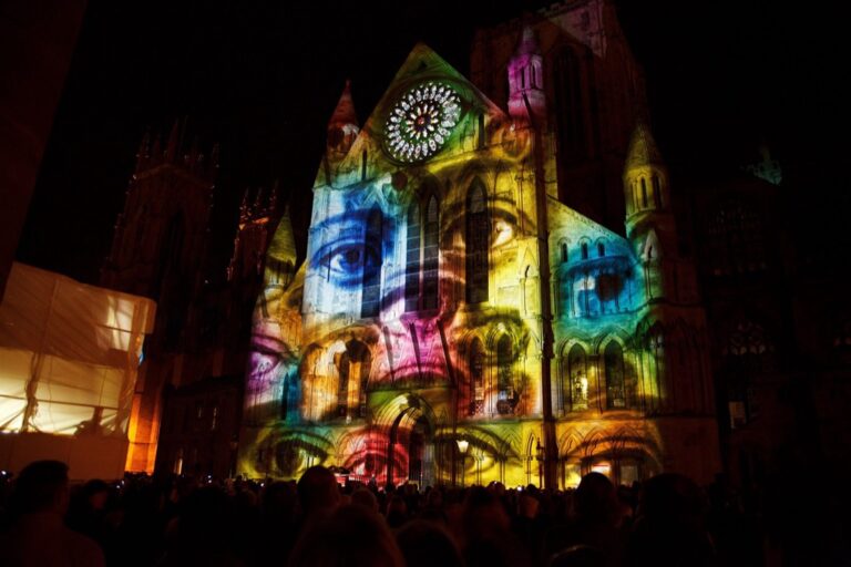
Data-driven art installations merge spatial information with physical spaces to create immersive experiences. You can use tools like TouchDesigner or vvvv to project dynamic spatial data onto architectural surfaces creating responsive environments that react to real-time geographic data. Modern installations incorporate LED matrices motion sensors and projection mapping to represent urban movement patterns population density or environmental changes. Leading museums and public spaces showcase these installations using frameworks like Arduino with GPS modules to connect physical elements with spatial datasets transforming abstract data into tangible experiences.
Advancing Future Visualization Methods
The landscape of spatial data visualization continues to evolve with groundbreaking technologies and creative approaches. These innovative methods transform how you understand and interact with geographic information through immersive 3D models AR experiences and artistic interpretations.
As technology advances you’ll see even more sophisticated ways to represent spatial relationships. The fusion of traditional mapping techniques with cutting-edge visualization tools opens new possibilities for creating compelling geographic narratives that engage audiences and drive better decision-making.
By embracing these creative approaches you’re not just viewing data – you’re experiencing it. This shift toward experiential spatial visualization marks an exciting chapter in how we comprehend and communicate geographic information making complex spatial relationships more accessible and meaningful than ever before.
