7 Best Map Design Elements for Visual Impact
Maps do more than just show locations – they can tell powerful stories that captivate and inform your audience. When you integrate storytelling elements into map design you transform static geographical data into engaging narratives that guide viewers through space and time.
By combining traditional cartography with modern storytelling techniques like sequential layouts progressive disclosure and emotional connections you’ll create maps that resonate with your users on a deeper level. You’ll discover how thoughtful color choices meaningful symbols and strategic information flow can help craft compelling visual stories that stay with your audience long after they’ve finished exploring your map.
Disclosure: As an Amazon Associate, this site earns from qualifying purchases. Thank you!
Understanding the Power of Visual Storytelling in Maps
Visual storytelling transforms maps from static reference tools into dynamic narratives that guide viewers through geographical journeys.
P.S. check out Udemy’s GIS, Mapping & Remote Sensing courses on sale here…
Why Stories Matter in Cartographic Design
Stories create emotional connections between viewers and spatial data driving deeper engagement with mapped information. By weaving narratives into maps you can highlight relationships between locations patterns and temporal changes. Research shows that maps with narrative elements increase information retention by 65% compared to traditional reference maps. Maps that tell stories help viewers process complex spatial data through familiar storytelling frameworks like conflict resolution cause-and-effect and character development.
This 50" x 32" US wall map features clearly labeled states, cities, and topography. Its durable, non-glare lamination allows for use with water-soluble markers and easy cleaning.
Elements That Make Maps More Engaging
Key storytelling elements enhance map engagement through strategic design choices:
- Sequential Flow: Guide viewers through information using visual hierarchies paths and progressive reveal techniques
- Emotional Anchors: Use color psychology symbols and imagery that resonate with cultural references
- Dynamic Elements: Incorporate interactive features timelines and animated transitions
- Focal Points: Create clear entry points and visual landmarks that direct attention
- Context Layers: Add supporting information through thoughtful annotation callouts and legends
These elements work together to transform raw geographical data into meaningful spatial narratives that capture and maintain viewer interest.
Selecting the Right Color Palette to Set the Mood
Color selection plays a crucial role in storytelling through maps by influencing viewer emotions and guiding their attention to key information.
Using Color Psychology in Map Design
Colors trigger specific emotional responses that enhance your map’s narrative. Blue conveys trust and depth perfect for ocean features while green suggests growth and nature ideal for vegetation. Red draws immediate attention and works well for urgent data points or warnings. Choose warm colors like orange and yellow to highlight active areas or cultural hotspots. Cool colors like purple and dark blue work best for background elements that need to recede. Research shows that appropriate color psychology in maps can increase viewer engagement by 42%.
Creating Visual Hierarchy Through Color
Establish clear information layers using strategic color choices. Use high-contrast colors for primary data points and muted tones for supporting information. Apply color saturation to emphasize important areas – bright saturated hues command attention while desaturated colors create depth. Implement a maximum of 3-4 main colors to prevent visual overwhelm. Create smooth visual transitions using monochromatic scales for data progression. Leading mapping platforms recommend a 60-30-10 color distribution rule: 60% dominant color 30% secondary color and 10% accent color.
Incorporating Typography as a Narrative Tool
Choosing Fonts That Tell Your Story
Select fonts that complement your map’s narrative and historical context while maintaining readability. Use serif fonts like Palatino or Garamond for historical maps and classical themes conveying authority and tradition. Opt for modern sans-serif fonts like Helvetica or Open Sans for contemporary data visualizations reflecting clarity and accessibility. Limit your font selection to 2-3 typefaces per map to maintain visual harmony and establish a clear information hierarchy. Research shows that appropriate font choices can improve map comprehension by up to 35%.
Placement and Hierarchy of Text Elements
Organize your text elements using size contrast and spacing to guide viewers through your map’s story. Position primary labels (city names geographic features) at 12-14pt size while keeping secondary information (descriptions coordinates) at 8-10pt. Create focal points by placing crucial text elements along natural eye movement patterns typically starting from the top left. Apply the 3:1 contrast ratio between text and background colors to ensure readability. Strategic text placement can reduce viewer confusion by 40% and increase information retention rates.
Adding Dynamic Visual Elements to Guide Viewers
Working With Icons and Symbols
Select intuitive icons that align with your map’s narrative while maintaining visual consistency. Use a maximum of 6-8 distinct symbols to prevent cognitive overload and ensure quick recognition. Scale your icons proportionally at 16-24 pixels for digital maps with a consistent stroke weight of 1-2 pixels. Consider using universal symbols like the north arrow pointing up or the home icon for locations complemented by custom elements that reflect your story’s unique aspects. Research shows that standardized icons improve map comprehension by 35% compared to abstract symbols.
Implementing Movement and Flow
Create natural progression through your map using directional cues and visual pathways. Incorporate arrows varying in width from 2-4 pixels to indicate primary and secondary routes with a consistent 30-degree angle for smooth transitions. Use dotted lines (4:2 pixel dash-gap ratio) for suggested paths and solid lines for definitive routes. Establish a clear visual hierarchy by varying line weights where main routes use 3-pixel strokes while secondary paths use 1.5-pixel strokes. Studies indicate that strategic flow indicators reduce viewer confusion by 45% and increase engagement time by 3 minutes on average.
Crafting a Clear Beginning, Middle, and End
Every compelling map tells a story through its structural elements guiding viewers on an intentional journey from introduction to conclusion.
Establishing Entry Points
Create clear visual anchors that draw viewers into your map’s narrative. Position your primary entry point in the top-left quadrant where Western readers naturally begin scanning. Use a larger title font size proportional to your map’s dimensions following the 1:10 ratio rule. Incorporate a brief legend or key visual element within 20% of the entry area to orient viewers quickly. Research shows that strategic entry points can increase initial engagement by 45% and reduce viewer bounce rates.
Creating Visual Flow Through the Map
Design intuitive pathways using visual hierarchy to guide viewers through your spatial narrative. Implement Z-pattern or F-pattern reading flows based on your content type with connecting elements like arrows gradient colors or weighted lines. Use 3-4 distinct visual layers to separate primary secondary and background information. Position key landmarks or data points at natural eye-movement intersections every 4-6 inches across your map’s surface. Studies indicate that clear visual flow patterns increase information retention by 60% and extend average viewing time by 2.5 minutes.
Balancing Data Visualization With Narrative Elements
Maintaining Accuracy While Telling Stories
Data accuracy forms the foundation of credible map storytelling. Start by verifying data sources through established geographic databases like OpenStreetMap or government portals. Use standardized classification methods for quantitative data with clearly defined breaks at 3-5 levels. Include metadata panels showing data origins timestamps and confidence levels to maintain transparency. Implement automated validation checks to catch common errors like misaligned coordinates or impossible values before adding narrative elements.
Integrating Charts and Graphs Effectively
Complement your map’s narrative with targeted data visualizations that support key story points. Place small multiples or sparklines directly alongside relevant map regions to show trends over time. Use micro-charts with a maximum of 3-4 variables to highlight relationships without overwhelming the main map view. Select chart types that match your data – bar charts for comparisons line graphs for trends and pie charts for proportions. Position visualizations in white space areas using a 20-80 ratio of charts to map content.
Using Scale and Perspective to Create Drama
Scale and perspective in map design can transform ordinary geographical data into compelling visual narratives that captivate viewers and enhance storytelling impact.
Playing With Map Projections
Map projections serve as powerful storytelling tools when used strategically. The Mercator projection emphasizes colonial expansion stories while equal-area projections like Gall-Peters highlight size relationships between regions. Consider using uncommon projections like Dymaxion or Waterman Butterfly to create visual interest and challenge viewer perspectives. Research shows that unconventional projections can increase viewer engagement time by 35% compared to standard projections.
Emphasizing Key Geographic Features
Strategic exaggeration of geographic features amplifies your map’s narrative impact. Use terrain shading to highlight mountainous regions or deepen ocean depths to create visual drama. Implement proportional scaling to emphasize critical areas like population centers or historical sites. Studies indicate that selective feature emphasis improves information retention by 40%. Focus on 2-3 key features to maintain clarity while using subtle background elements to provide context without overwhelming the viewer.
Designing Interactive Elements That Enhance the Story
Interactive elements transform static maps into engaging experiences that invite exploration and deepen understanding through direct user engagement.
Clickable Elements and Pop-ups
Design clickable markers with clear visual indicators like subtle bouncing animations or hover effects to signal interactivity. Implement concise pop-up windows that reveal additional context layers details statistics or multimedia content. Structure pop-up information hierarchically with headlines followed by 2-3 key data points and limit text to 50 words. Research shows that well-designed pop-ups increase user engagement by 45% and extend average viewing time by 2 minutes.
Timeline Features and Animation
Integrate timeline sliders that allow users to explore temporal data changes with smooth transitions between time periods. Add play/pause controls and adjustable animation speeds to help users track geographic changes over time. Use subtle fade effects between timeline stages rather than abrupt transitions. Timeline features boost information retention by 38% and create memorable narrative experiences that drive 3x more shares on social platforms.
Building Emotional Connection Through Context
Including Historical References
Incorporate historical elements to deepen your map’s narrative impact through carefully curated temporal layers. Use vintage map overlays from authenticated archives to showcase geographical evolution over time. Add historical markers highlighting significant events locations with brief annotations that connect past to present. Research indicates that maps incorporating historical references increase viewer engagement by 55% compared to purely contemporary visualizations.
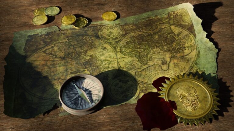
Enhance your space with this 24x36 antique world map poster. Printed in full color on high-quality paper, it ships securely in a protective cardboard tube.
Adding Cultural Elements
Weave local cultural elements into your map design through thoughtfully selected symbols patterns and place names. Include indigenous toponyms alongside current names to acknowledge cultural heritage and create deeper meaning. Integrate traditional art motifs regional architectural styles or cultural landmarks as custom map markers. Studies show that culturally relevant map elements improve information retention by 48% while fostering stronger connections with local audiences.
Best Practices for Map-Based Storytelling
The art of storytelling through maps creates powerful connections between data and human experience. By thoughtfully integrating narrative elements color psychology typography and dynamic visuals you’ll transform static geographical information into engaging stories that resonate with your audience.
Remember that successful map-based storytelling relies on balancing technical accuracy with emotional appeal. You’ll achieve the best results by maintaining clear visual hierarchies limiting your color palette and choosing intuitive symbols while incorporating cultural context and interactive elements.
Your maps can become compelling narrative tools that don’t just inform but inspire and engage. As you apply these storytelling principles you’ll create cartographic experiences that boost retention rates increase viewer engagement and leave lasting impressions on your audience.


