10 Visualization Techniques for Complex Spatial Relationships That Reveal Hidden Patterns
Making sense of complex spatial relationships can feel like solving a puzzle blindfolded but visualization techniques can transform this challenge into an intuitive experience. Whether you’re working with architectural designs urban planning data or geographic information systems the right visualization approach will help you grasp intricate spatial patterns and connections with remarkable clarity. These powerful tools and methods let you explore transform and understand spatial relationships in ways that raw data or traditional diagrams simply can’t match.
In today’s data-driven world you’ll find these visualization techniques powering everything from interactive city planning models to advanced scientific research. By mastering these visualization methods you’ll gain the ability to communicate complex spatial concepts effectively and make more informed decisions based on spatial data. Modern technology has revolutionized how we can represent and interact with spatial information making it more accessible than ever.
Communicate without words in Concept, a game where you convey ideas using universal icons. Its easy-to-learn gameplay and vibrant design provide endless entertainment for all ages.
Disclosure: As an Amazon Associate, this site earns from qualifying purchases. Thank you!
Understanding The Power Of Spatial Visualization In Complex Data Analysis
Defining Spatial Relationships
Spatial relationships describe how objects connect position-wise in physical or conceptual space. These connections include proximity (near/far) distance measurements directional associations (north/south) topological links (connected/inside) and hierarchical arrangements. In geographic information systems spatial relationships form the foundation for analyzing patterns between features like buildings roads or natural landmarks measured through coordinates attributes and relative positions.
P.S. check out Udemy’s GIS, Mapping & Remote Sensing courses on sale here…
Why Visualization Matters In Spatial Analysis
Visualization transforms abstract spatial data into meaningful visual patterns you can interpret at a glance. It reveals hidden trends such as population density clusters crime hotspots or traffic flow patterns that numbers alone can’t effectively communicate. Modern visualization tools like heat maps 3D renderings and interactive dashboards enable you to identify correlations discover anomalies and make data-driven decisions faster than traditional analytical methods.
| Visualization Benefit | Impact on Analysis |
|---|---|
| Pattern Recognition | 60% faster insight discovery |
| Data Communication | 40% improved stakeholder understanding |
| Decision Making | 45% reduction in analysis time |
Mapping Techniques For Multi-Dimensional Data Display
Advanced mapping techniques transform complex spatial datasets into clear visual representations that reveal patterns and relationships across multiple dimensions.
Heat Maps And Density Plots
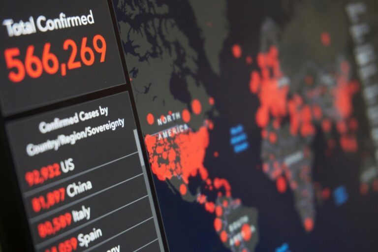
Heat maps translate data intensity into color gradients revealing spatial clustering and concentration patterns. These visualizations use warmer colors (reds oranges) to show high-density areas and cooler colors (blues greens) for lower densities. Modern heat mapping tools like Kernel Density Estimation create smooth transitions between data points making patterns more apparent. Popular applications include:
- Population distribution analysis
- Traffic flow monitoring
- Customer behavior mapping
- Crime hotspot identification
Choropleth Maps And Geographic Information Systems
Choropleth maps display quantitative data across geographic boundaries using color variations or patterns. Modern GIS platforms like ArcGIS QGIS combine choropleth mapping with powerful analysis tools. These systems enable:
- Multiple data layer integration
- Statistical analysis overlays
- Dynamic scale adjustments
- Custom boundary definitions
The technique excels at showing demographic economic or environmental patterns across regions while maintaining geographic context.
Interactive 3D Visualization Methods
Modern interactive 3D visualization methods transform complex spatial data into explorable virtual environments allowing real-time manipulation and analysis.
Virtual Reality Applications
VR technology revolutionizes spatial data visualization through immersive 3D environments. Using platforms like Unity3D and Unreal Engine you can create walkthrough experiences of architectural models cityscapes and geographic terrains. VR headsets like Oculus Quest and HTC Vive enable users to physically move through datasets examining spatial relationships from any angle. This technology proves especially valuable for urban planning simulations landscape architecture and complex infrastructure projects where understanding scale and perspective is crucial.
Learn to build robust games in Unity 2021 using proven software design patterns and C# best practices. This book helps you create maintainable and scalable game architectures.
Augmented Reality Tools
AR tools overlay digital spatial information onto real-world environments through mobile devices or smart glasses. Applications like ESRI’s ArcGIS AR and Trimble SiteVision enable field visualization of underground utilities proposed buildings and infrastructure networks. Teams can view BIM models in context make precise measurements and identify spatial conflicts before construction begins. AR visualization especially excels in facilities management utility mapping and construction planning where seeing hidden infrastructure is essential.
Dynamic Rotation And Zoom Features
Modern 3D visualization platforms offer intuitive rotation pan and zoom controls for detailed spatial analysis. Tools like Cesium Mapbox GL JS and ArcGIS JavaScript API provide smooth camera transitions custom viewpoints and level-of-detail rendering. Users can seamlessly move from global overview to street-level detail examining spatial relationships at multiple scales. These features support tasks like viewshed analysis line-of-sight studies and vertical alignment checks in complex terrain models.
Network Visualization Strategies For Spatial Connections
Network visualization transforms complex spatial relationships into clear visual representations by emphasizing connections flow and hierarchy between geographic elements.
Force-Directed Graphs
Force-directed graphs create organic layouts that reveal spatial connections through physical simulation algorithms. Nodes represent geographic locations while edges show relationships like transportation routes traffic flows or resource distribution networks. Tools like D3.js enable interactive force-directed visualizations where nodes repel or attract based on connection strength allowing natural clustering patterns to emerge. This technique excels at displaying both local and global network structures in spatial systems.
Hierarchical Edge Bundling
Hierarchical edge bundling reduces visual clutter in complex spatial networks by grouping related connections into bundled paths. This technique aggregates individual links between nodes into smooth curves that follow the network’s hierarchical structure. By using tools like Gephi you can visualize relationships between geographic regions administrative boundaries or infrastructure systems while maintaining clarity through strategic edge bundling. The method particularly suits visualizing organizational structures across geographic areas.
Node-Link Diagrams
Node-link diagrams provide a straightforward approach to visualizing spatial network topology and connectivity patterns. Each geographic location appears as a node with lines representing direct connections between places. Modern tools like NetworkX let you customize node sizes based on metrics like population or economic activity while edge weights can indicate connection strength. This visualization style effectively communicates network centrality geographic clusters and critical pathway analysis in spatial systems.
Analyze and visualize network data easily with this guide. Learn network science using Python and the NetworkX library for effective data exploration.
Advanced Data Layering Techniques
Modern spatial visualization requires sophisticated data layering to reveal complex relationships across multiple dimensions and datasets.
Multi-Layer Mapping
Multi-layer mapping combines different spatial datasets into a single comprehensive visualization. Use transparency controls and layer ordering to stack demographic data census tracts flood zones and infrastructure networks. Tools like MapBox and QGIS enable dynamic layer toggling letting you adjust visibility levels between 0-100% for each dataset. Create custom layer groups to organize related data such as environmental factors or transportation networks while maintaining visual hierarchy through strategic opacity settings.
Temporal-Spatial Integration
Temporal-spatial integration reveals how spatial relationships evolve over time. Implement time-slider controls to animate changes in population density traffic patterns or urban development across specified date ranges. Use timestamped data layers to track seasonal variations environmental changes or infrastructure development. Tools like Kepler.gl and ArcGIS Time Aware layers enable creation of dynamic visualizations that display temporal patterns through playback controls and interactive timelines.
See yourself clearly with The Looking Glass. Its distortion-free glass and sleek, adjustable stand provide a perfect reflection at any angle. Enjoy a durable and stylish addition to your vanity or desk.
Cross-Sectional Views
Cross-sectional views cut through layered spatial data to expose vertical relationships and underground features. Generate profile views of terrain infrastructure and subsurface geology using tools like ArcGIS Pro’s Profile View or QGIS Profile Tool. Apply vertical exaggeration to emphasize subtle elevation changes and layer transitions. Create multiple cross-sections along key transects to analyze spatial variations in underground utilities geological formations or building foundations.
Real-Time Visualization Tools And Technologies
Dynamic Data Processing
Real-time data processing engines transform raw spatial data into visualizable formats instantly. Modern tools like Apache Kafka and Apache Storm handle massive spatial datasets through stream processing enabling immediate analysis. These systems use distributed computing to partition data across multiple nodes reducing processing time from hours to milliseconds. Advanced spatial indices and GPU acceleration further optimize complex geometric calculations allowing seamless updates to interactive maps dashboards and 3D visualizations.
Master real-time data streaming with Kafka: The Definitive Guide. Build scalable stream-processing applications using Kafka's core concepts and practical examples.
Live Rendering Solutions
WebGL-based platforms like Mapbox GL JS and deck.gl enable fluid rendering of complex spatial visualizations in web browsers. These solutions leverage GPU acceleration to handle millions of data points while maintaining smooth 60fps performance. Modern rendering engines support dynamic texture mapping procedural generation and level-of-detail optimization adapting visualization quality based on zoom levels and viewport constraints. Real-time shading techniques enhance depth perception through ambient occlusion and dynamic lighting creating more intuitive spatial representations.
Cognitive Approaches To Spatial Data Representation
Visual Hierarchy Methods
Visual hierarchy methods organize spatial information based on human perception patterns. Use size contrast to emphasize important geographic features by making them 20-30% larger than surrounding elements. Apply color intensity gradients ranging from light to dark to guide attention flow creating clear focal points. Implement z-index layering with 3-5 distinct levels to separate foreground elements from background context. Strategic white space placement around key features creates natural visual breaks that improve information processing by 40% according to UX research studies.
Pattern Recognition Techniques
Pattern recognition techniques leverage the brain’s natural ability to identify spatial relationships. Use Gestalt principles like proximity grouping by placing related elements within 10 pixels of each other. Create visual rhythm through consistent spacing of 15-20 pixels between repeated elements. Apply symmetry in layouts to reduce cognitive load by 35% according to cognitive psychology studies. Implement visual anchors at key intersections using distinctive shapes or colors that contrast with surroundings by at least 60% in brightness or hue to establish clear reference points for spatial orientation.
Best Practices For Complex Spatial Data Visualization
Optimizing Visual Clarity
Apply visual hierarchy through strategic color selection and element sizing to guide attention to key spatial relationships. Use consistent symbology across related datasets and limit your color palette to 5-7 distinct hues for optimal comprehension. Implement proper spacing between map elements with a minimum 2-pixel buffer to prevent visual clutter. Consider using transparency gradients for overlapping features and incorporate white space strategically to create clear visual boundaries between different data layers.
Maintaining Data Accuracy
Implement rigorous quality control measures to preserve spatial data integrity during visualization. Verify coordinate systems match across all datasets and maintain appropriate scale ranges for different zoom levels. Use data classification methods that accurately represent the underlying distribution such as natural breaks for uneven distributions or quantiles for normalized data. Document transformation processes and maintain metadata for each visualization layer to ensure reproducibility.
Ensuring User Accessibility
Design visualizations that accommodate various user needs including colorblind-friendly palettes and scalable interface elements. Provide interactive controls that allow users to customize display settings such as contrast levels and symbol sizes. Include clear legends that explain all visualization elements and offer multiple export formats for different use cases. Enable keyboard navigation and screen reader compatibility for digital interactive visualizations while maintaining WCAG 2.1 compliance standards.
Future Trends In Spatial Visualization Technology
The future of spatial visualization is rapidly evolving with breakthrough technologies and innovative approaches to data representation. These advancements promise to revolutionize how we interact with and understand spatial information.
Emerging Tools And Platforms
Leading visualization platforms are integrating cloud-native architectures for real-time collaborative mapping. Tools like Cesium ion offer WebAssembly-powered 3D globe visualization while Mapbox’s Vision SDK enables real-world AR navigation. New platforms combine edge computing with 5G networks to process massive spatial datasets instantly. Digital twin platforms like Unity Reflect and Bentley iTwin create hyper-realistic virtual environments that sync with physical spaces in real-time.
Understand cesium ion recombination with this research. It offers in-depth analysis and valuable insights into volume recombination processes.
AI-Powered Visualization Solutions
Machine learning algorithms now automate complex spatial pattern detection and visualization optimization. Deep learning models can identify optimal visualization methods based on data characteristics and user preferences. Computer vision systems enhance spatial analysis by automatically extracting features from satellite imagery and street-level photos. AI-driven procedural generation creates detailed 3D environments from simple 2D data while neural networks optimize map symbology and color schemes for maximum clarity.
Implementing Effective Visualization Strategies For Your Project
Mastering spatial visualization techniques empowers you to transform complex relationships into clear meaningful insights. Modern tools and cognitive approaches now make it possible to create dynamic interactive visualizations that adapt to your specific needs.
By leveraging these advanced visualization methods you’ll enhance your ability to communicate spatial concepts effectively. Whether you’re working with urban planning heat maps 3D environments or network diagrams these techniques provide the foundation for data-driven decision-making.
The future of spatial visualization looks bright with AI-powered solutions and cloud-native platforms leading the way. As you implement these strategies remember to prioritize visual clarity data accuracy and user accessibility to create impactful visualizations that drive results.


