11 Minimalistic Cartography Secrets: Transform Maps into Visual Poetry
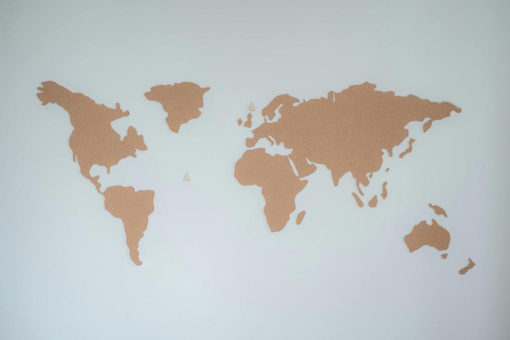
In a world cluttered with complex visual information minimalist cartography stands out as a masterclass in elegant simplicity. These stripped-down maps transform geographic data into clean purposeful designs that communicate essential information without overwhelming the viewer.
You’ll discover how skilled cartographers use negative space color restraint and geometric precision to create maps that aren’t just functional tools but works of art in their own right. The minimalist approach to mapmaking has gained significant traction in recent years especially in urban planning digital interfaces and artistic installations where clarity meets aesthetic appeal.
Disclosure: As an Amazon Associate, this site earns from qualifying purchases. Thank you!
The Evolution of Minimalistic Map Design Through History
The journey of minimalist cartography reflects humanity’s ongoing quest to simplify complex geographic information into its most essential elements.
P.S. check out Udemy’s GIS, Mapping & Remote Sensing courses on sale here…
Early Examples of Stripped-Down Cartography
The origins of minimalistic mapping trace back to ancient Polynesian stick charts which used only shells and twigs to represent ocean swells and island positions. During the 15th century Chinese cartographers created the Kangnido map featuring stark black lines and minimal text to represent Asia’s coastlines. European medieval T-O maps stripped geography down to three basic continents divided by waterways creating an elegantly simple world view. These early examples demonstrate how cartographers historically achieved clarity through reduction.
Modern Influences on Simple Map Aesthetics
The Modernist movement of the 1920s dramatically shaped minimalist cartography through the influence of Bauhaus design principles and geometric abstraction. Harry Beck’s 1933 London Underground map revolutionized transit mapping by prioritizing topology over geographic accuracy. Digital mapping pioneers of the 1990s like MapQuest introduced scalable vector graphics enabling cleaner online maps. Today Google Maps’ Material Design language and Apple Maps’ iOS aesthetic continue pushing minimal mapping forward through thoughtful typography selective color palettes and refined iconography.
Core Principles of Minimalistic Cartographic Design
Minimalistic cartographic design relies on fundamental principles that emphasize clarity through reduction and thoughtful design choices.
Embracing Negative Space and Simplicity
Negative space serves as a powerful tool in minimalistic map design by creating visual hierarchy and reducing cognitive load. Focus on retaining only essential geographic elements while eliminating decorative features that don’t serve a specific purpose. Leave adequate white space around key map elements such as roads waterways or landmarks to improve readability. Strategic use of empty areas helps guide the viewer’s eye and creates natural visual flow across the map’s surface.
Working With Limited Color Palettes
Select a restrained color palette of 2-4 hues that complement each other while maintaining sufficient contrast for readability. Choose one dominant color for primary features like land masses one accent color for important elements and a neutral tone for supporting information. Consider colorblind accessibility by avoiding problematic combinations like red-green. Use color intensity variations rather than multiple different hues to show data hierarchies or geographic transitions.
Typography Choices in Minimal Maps
Select no more than two complementary font families – typically one sans-serif for labels and one serif for titles. Keep text elements consistently aligned and sized according to their importance in the visual hierarchy. Position labels strategically to minimize overlap with map features while maintaining readability at intended viewing distances. Consider using lighter font weights and increased letter spacing to enhance the minimalistic aesthetic while preserving legibility.
Essential Elements That Define Minimalist Maps
Minimalist maps rely on carefully selected design elements that maximize clarity while eliminating unnecessary details.
Geometric Shapes and Clean Lines
Geometric primitives form the foundation of minimalist cartography through precise circles squares rectangles and lines. Essential map features use simplified shapes with crisp edges to represent geographic elements like roads rivers and landmarks. Modern minimalist maps leverage basic geometric forms to create visual rhythm while maintaining geographic accuracy. This approach reduces visual noise and improves quick information processing.
Strategic Use of Scale and Proportion
Scale relationships in minimalist maps emphasize visual hierarchy through deliberate size variations. Primary routes appear wider than secondary paths while important landmarks receive proportionally larger symbols. The careful balance of element sizes guides viewers’ attention naturally across the map surface. Smart scaling decisions help distinguish between local regional and major geographic features without adding unnecessary complexity.
Thoughtful Information Hierarchy
Information hierarchy controls how viewers process map data through strategic visual weighting. Primary elements like major roads and city centers use bold visual treatments while secondary details receive subtle styling. Smart layering places the most important information on top with supporting elements underneath. This structured approach helps viewers quickly find key details while maintaining access to contextual information.
Digital Tools and Techniques for Creating Minimal Maps
Modern digital tools offer precise control and flexibility for creating minimalist maps while maintaining geographic accuracy and aesthetic appeal.
Vector-Based Design Software Options
Adobe Illustrator leads the pack for professional vector map creation with its precise path controls and extensive symbol libraries. Figma offers collaborative features ideal for team-based mapping projects while maintaining vector precision. For open-source alternatives Inkscape provides robust vector editing capabilities with specialized map-making extensions. Each tool supports SVG export ensuring your minimal maps remain crisp across different screen sizes and print formats.
Working With Layers and Composition
Start with a base layer containing essential geographic features then build complexity through strategic layer stacking. Organize layers by geographic hierarchy: landmasses first followed by water bodies administrative boundaries and labels. Use layer masks to control visibility and create clean intersections between elements. Group related features to maintain consistent styling and enable quick visibility toggles during the design process.
Achieving Balance Through Grid Systems
Implement a modular grid system to align map elements and maintain consistent spacing. Use the rule of thirds to position key geographic features and create focal points. Set up baseline grids at 8px or 10px intervals for consistent typography placement. Consider golden ratio proportions (1:1.618) when determining the relationship between primary and secondary map elements to create natural visual harmony.
Color Theory in Minimalistic Cartography
Color plays a pivotal role in minimalist map design by enhancing readability and conveying information hierarchy through thoughtful palette selection.
Monochromatic and Neutral Palettes
Monochromatic color schemes form the backbone of minimalist cartography using varying shades of a single hue. Select a base color like blue gray or warm beige then create 3-4 tints and shades for different map elements. Neutral palettes featuring whites grays and muted earth tones provide versatility across different mapping contexts. For maximum clarity use no more than 60% gray for background elements and maintain a 30% contrast ratio between adjacent features.
Using Color for Emphasis and Meaning
Strategic color application guides viewer attention to crucial map elements without compromising minimalist principles. Reserve vibrant accent colors for primary points of interest transportation routes or administrative boundaries. Follow cultural color associations like blue for water features and green for parks. Implement a maximum of two accent colors at 100% opacity while keeping supporting elements at 40-60% opacity. This creates clear visual hierarchy while maintaining the map’s minimalist aesthetic.
Typography Considerations for Minimal Map Design
Typography plays a crucial role in minimalist cartography by balancing legibility with aesthetic restraint.
Selecting Appropriate Typefaces
Choose sans-serif fonts like Helvetica Neue or Open Sans for primary map elements to ensure clarity at various scales. Limit your typeface selection to two complementary font families maximum with clear weight distinctions. Consider using geometric sans-serifs for feature labels and a more neutral sans-serif for supporting information. Important characteristics include:
- High x-height for improved readability
- Clean letterforms without decorative elements
- Consistent stroke width
- Available condensed variants for tight spaces
- Align labels parallel to linear features
- Avoid crossing or overlapping text
- Place city names slightly offset from point markers
- Use consistent spacing between similar elements
- Stack text layers from most to least important
Case Studies of Successful Minimalist Maps
Transit System Maps
The London Underground map revolutionized transit cartography with its 45-degree angles and color-coded lines in 1933. Harry Beck’s groundbreaking design prioritizes route clarity over geographic accuracy using simplified geometric shapes and limited colors. Modern adaptations like Tokyo Metro’s schematic map enhance Beck’s principles by incorporating Japanese design elements with pristine spacing. New York’s MTA map further evolves this approach by balancing geographic references with network legibility through strategic simplification of complex routes.
Digital Navigation Interfaces
Google Maps leads digital minimalism with its adaptive interface that displays only relevant information based on zoom levels. The platform uses subtle color gradients to distinguish land from water while maintaining clear hierarchy through selective feature display. Apple Maps exemplifies minimal aesthetics through paper-like textures and refined typography showing just three information layers at any zoom level. Both platforms demonstrate effective use of white space and progressive disclosure to prevent cognitive overload.
Contemporary Atlas Designs
Herb Lester Associates produces stylized city guides that blend minimalist principles with artistic flair using two-color printing. Their maps strip away nonessential elements while maintaining geographic accuracy through careful symbol selection. The Atlas of Design series by NACIS showcases modern minimalist approaches including monochromatic terrain visualization and abstract demographic mapping. These publications demonstrate how contemporary cartographers balance data representation with aesthetic restraint through thoughtful design choices.
Explore interior design principles with the Atlas of Interior Design. This comprehensive guide is written in English.
Best Practices for Creating Minimalist Maps
Simplification Without Losing Meaning
Start your simplification process by identifying essential geographic elements that serve your map’s core purpose. Remove decorative elements like detailed coastlines textures or ornate symbols in favor of clean geometric shapes. Use line weight hierarchy to distinguish between primary and secondary features such as major highways versus local streets. Focus on retaining elements that directly support navigation or spatial understanding while eliminating features that don’t contribute to the map’s primary function.
Maintaining Geographic Accuracy
Balance aesthetic minimalism with geographic precision by preserving correct spatial relationships and proportions. Use established map projections appropriate for your region and scale to minimize distortion. Maintain accurate relative distances between key landmarks even when simplifying their representation. Cross-reference your simplified design against authoritative geographic data sources like USGS topographic maps or OpenStreetMap to ensure critical spatial relationships remain intact.
Plan your next adventure with the 2025 National Geographic Road Atlas, covering the United States, Canada, and Mexico. Its durable, folded format (11 x 15 in) makes it ideal for hiking and camping trips.
Testing for Usability and Clarity
Conduct systematic user testing with diverse audiences to verify your map’s effectiveness. Test readability at multiple viewing distances and screen sizes for digital maps. Use eye-tracking studies to identify areas where viewers focus first and adjust visual hierarchy accordingly. Create A/B tests comparing different levels of simplification to find the optimal balance between minimalism and functionality. Document feedback on navigation success rates and time-to-task completion to validate your design choices.
The Future of Minimalistic Cartography
Digital Integration and Interactivity
Digital mapping platforms are revolutionizing minimalistic cartography through responsive design and real-time data integration. Interactive elements like zoom-dependent detail layers allow maps to maintain simplicity while revealing additional information on demand. Smart filters enable users to toggle between different data views while preserving the clean aesthetic. Augmented reality integration brings minimalist maps into three-dimensional space allowing users to experience simplified geographic data through mobile devices.
Emerging Design Trends
Minimalistic cartography is embracing dynamic color systems that adjust to user preferences and ambient lighting conditions. Variable typography adapts to different screen sizes and viewing distances while maintaining geometric precision. Microanimations guide user attention through subtle movement cues without cluttering the visual space. Data-driven generalization algorithms automatically simplify complex geographic features while preserving essential spatial relationships across multiple zoom levels.
Sustainability in Map Design
Digital-first minimalist maps reduce paper waste through adaptive screen displays and efficient vector graphics. Smart compression techniques minimize data storage requirements while maintaining visual quality. Energy-efficient color palettes optimize display brightness for reduced power consumption on digital devices. Open-source mapping platforms encourage resource sharing and collaborative improvement of minimalist design templates fostering a sustainable cartographic ecosystem.
Conclusion
Minimalist cartography stands as a powerful intersection of functionality and artistry. By embracing simplicity through thoughtful design choices you’ll create maps that not only guide but also inspire. The careful balance of negative space color restraint and geometric precision transforms complex geographic data into accessible visual narratives.
The evolution of minimalist mapping from ancient stick charts to modern digital interfaces shows its enduring relevance. Today’s tools and techniques empower you to create maps that maintain geographic accuracy while achieving aesthetic excellence. As we move forward digital integration and sustainable practices continue to shape the future of minimalist cartography making it more dynamic and accessible than ever.


