9 Visualization Techniques for Historical Border Changes That Reveal Hidden Patterns
Mapping historical border changes presents a fascinating challenge that combines data visualization with storytelling through time. You’ll discover how modern mapping techniques transform complex territorial shifts into clear visual narratives that help explain everything from ancient empire expansions to recent geopolitical changes.
Whether you’re a history enthusiast researcher or educator understanding these visualization methods will revolutionize how you interpret and present geographical transformations through time. Modern tools like GIS temporal mapping and interactive animations now make it possible to create compelling visualizations that bring centuries of border changes to life in ways traditional static maps never could.
Disclosure: As an Amazon Associate, this site earns from qualifying purchases. Thank you!
Understanding Historical Border Visualization Techniques
Visualizing historical border changes requires specialized techniques that balance accuracy with clarity while representing temporal shifts in territorial boundaries.
Traditional Map Overlays
Traditional map overlays use transparent layers to show border changes across different time periods. This technique employs color-coded boundaries acetate sheets or tissue paper overlays to display territorial transitions. Each layer represents a specific historical period with distinct line styles markings and shading patterns. Common elements include dotted lines for disputed territories dashed lines for temporary borders and solid lines for established boundaries. This method allows viewers to track gradual changes by comparing successive layers.
Digital Mapping Tools
Modern GIS platforms transform historical border visualization through dynamic features and precise data manipulation. Tools like QGIS TimeManager ArcGIS Pro and MapBox offer temporal sliding capabilities real-time animations and interactive layers. These applications enable you to:
- Create frame-by-frame animations of border changes
- Apply time-enabled symbology for different periods
- Generate heat maps showing territorial expansion rates
- Implement pop-up windows with historical context
- Integrate multiple data sources including historical maps satellite imagery and demographic data
The digital approach allows for seamless updates scalable visualization and enhanced data accuracy while maintaining historical authenticity.
Implementing Time-Based Animation Methods
Dynamic Timeline Sliders
Timeline sliders serve as intuitive controls for navigating historical border changes. You’ll find these interactive elements in tools like TimeMapper and Mapbox where a horizontal slider lets users scrub through different time periods. Position your slider prominently at the bottom of your visualization with clear date markers at regular intervals. Include playback controls to let viewers automatically progress through changes at their preferred speed. Tools like D3.js offer customizable slider components that support both linear and logarithmic time scales for varying temporal resolutions.
Progressive Change Indicators
Progressive indicators highlight the sequential nature of border modifications through visual cues. Apply subtle color gradients that shift from lighter to darker shades as borders evolve or use animated dash patterns that flow in the direction of territorial expansion. Tools like QGIS let you implement temporal symbolization where border lines pulse or glow to show active changes. Add small arrows or directional markers to indicate the vector of boundary shifts. Consider using opacity transitions where new borders fade in while old ones fade out to create smooth visual progressions.
Utilizing Geographic Information Systems (GIS)
GIS technology provides powerful tools for visualizing historical border changes through sophisticated data management and analysis capabilities.
Vector-Based Territory Mapping
Vector-based mapping in GIS enables precise representation of historical borders through points lines and polygons. You’ll find tools like ArcGIS Pro and QGIS offering advanced vector editing features to create accurate boundary representations. These platforms support multiple vector layers allowing you to stack different time periods while maintaining topological relationships. Key features include snapping tools for precise border alignment attribute tables for storing temporal data and style options for distinguishing between disputed temporary and permanent boundaries.
Spatial Data Analysis Tools
GIS spatial analysis tools help process and validate historical border data through automated operations. You’ll access functions like overlay analysis to identify territorial changes buffer creation to show zones of influence and topology checking to ensure border integrity. Tools such as GeoDa GRASS GIS and ArcGIS Spatial Analyst provide capabilities for calculating area changes detecting boundary shifts and performing time-series analysis. These platforms support common spatial data formats including Shapefile GeoJSON and GeoPackage enabling seamless data exchange between different mapping applications.
Become proficient in spatial data analysis with QGIS 3.x using this in-depth guide. Learn to leverage Python with QGIS 3.4 and 3.6 for geospatial development.
Used book in good condition, ready to be enjoyed. Expect possible minor wear.
Master geospatial analysis with GRASS GIS using this comprehensive guide. Learn practical techniques for managing, processing, and visualizing geographic data effectively.
Applying Color Theory in Border Visualization
Color theory plays a crucial role in effectively communicating historical border changes through maps.
Chronological Color Coding
Apply sequential color schemes to represent the chronological progression of border changes. Use lighter shades for older periods and darker tones for recent changes creating an intuitive temporal gradient. Tools like ColorBrewer help select colorblind-friendly palettes that work in both print and digital formats. For multi-century visualizations use 5-7 distinct hues to maintain clear visual separation between major historical periods.
Political Boundary Differentiation
Implement contrasting colors to distinguish between different political entities on historical maps. Use complementary colors (opposite on the color wheel) for neighboring territories to maximize visual distinction. Assign consistent colors to major powers throughout the visualization – for example blue for France red for Britain. Maintain color consistency across different time periods to help viewers track territorial changes while using pattern overlays to indicate disputed or transitional zones.
Incorporating Interactive 3D Mapping Technologies
Modern 3D mapping technologies transform historical border visualization by adding depth perception and spatial context to traditional 2D representations.
Terrain-Based Border Rendering
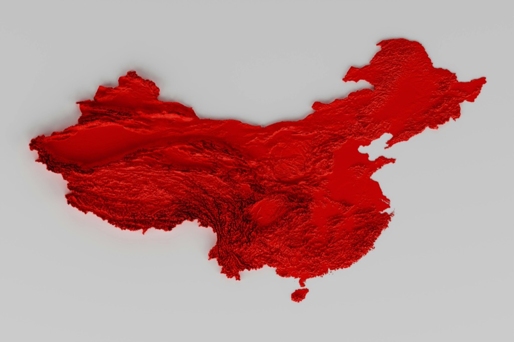
Terrain-based rendering enhances border visualization by integrating digital elevation models (DEM) with historical boundaries. Tools like Cesium and ArcGIS Scene layer terrain data at different resolutions creating realistic topographical contexts. Natural barriers like mountain ranges rivers or valleys that influenced historical borders become instantly apparent through 3D elevation profiles. Platforms such as Unreal Engine offer dynamic terrain rendering with support for different geological periods matching the historical timeline.
Multi-Layer Visualization Systems
3D visualization systems organize historical data in discrete vertical layers each representing a different time period or political entity. Tools like Unity 3D and CesiumJS enable toggle-able layer controls letting users examine border changes at various elevations. Advanced platforms such as QGIS 3D and ArcGIS Pro support dynamic layer switching with altitude-based filtering allowing seamless transitions between different historical periods. These systems integrate attribute data displaying population demographics economic zones and political influences in floating information panels.
Develop cross-platform games efficiently with C# using Unity in Action, Third Edition. Master game development principles and techniques for creating engaging experiences.
Leveraging Digital Storytelling Elements
Historical Context Integration
Interactive tooltips reveal key historical events when hovering over border changes using platforms like Mapbox GL JS or Leaflet. Create pop-up windows that display archival images chronicles political treaties or showcase demographic data shifts using D3.js overlays. Tools like StoryMapJS enable embedding of primary source documents newspaper clippings and period photographs alongside evolving boundaries to provide deeper historical context.
Narrative Map Sequences
Design sequential map views that follow a chronological narrative using ArcGIS StoryMaps or TimeMapper. Build guided tours through territorial changes by combining automated transitions with narrative text blocks that explain key historical moments. Platforms like Flourish Studio allow creation of step-by-step border change sequences with accompanying data visualizations showing population shifts trade patterns or military movements during each transition.
Learn calligraphy with the Animal Flourishes Workbook! Trace and copy 15 unique animal illustrations to develop your lettering skills.
Adopting Data-Driven Visualization Approaches
Modern data analytics transforms historical border visualization through quantitative methods and demographic insights.
Statistical Border Analysis
Leverage statistical tools to analyze border changes with precision metrics. ArcGIS Spatial Statistics and R’s spatstat package calculate territorial expansion rates change frequencies and border stability indices. Create heat maps showing border volatility using tools like QGIS Heatmap plugin to identify historically contested regions. Track metrics like:
| Metric | Description | Tool |
|---|---|---|
| Border Length | Total boundary distance over time | ArcGIS Measure |
| Territory Size | Area calculations per period | QGIS Field Calculator |
| Change Frequency | Number of shifts per century | R spatstat |
| Stability Index | Duration of unchanged borders | Python GeoPandas |
Analyze geospatial data effectively with Python. This book offers practical tools and techniques for location intelligence, enabling you to solve real-world problems.
Demographic Impact Visualization
Map population movements and demographic shifts tied to border changes using choropleth techniques. Tools like Flourish and Tableau enable dynamic population density maps that sync with border transitions. Create graduated symbol maps showing:
- Migration patterns with flow lines
- Population density changes through color gradients
- Urban growth patterns near shifting borders
- Ethnolinguistic distribution shifts
Integrate census data from historical records using QGIS Time Manager to animate demographic changes alongside territorial shifts.
Implementing Comparative Mapping Techniques
Comparative mapping techniques provide powerful methods for visualizing historical border changes through direct spatial comparison.
Side-by-Side Historical Comparisons
Create synchronized map views using tools like ArcGIS Pro or QGIS to display different time periods simultaneously. Position maps adjacently with linked navigation controls so pan and zoom actions sync across views. Use identical base maps color schemes and symbology between panels to maintain visual consistency. Tools like MapBox GL JS enable split-screen comparisons with a movable central divider highlighting direct differences between timeframes.
Before-and-After Overlay Systems
Implement swipe or curtain tools using platforms like Esri’s Story Maps or Mapbox to reveal border changes through interactive overlays. Layer historical maps with matching projections and controlled transparency settings to enable smooth transitions. Add visual indicators like animated arrows or pulsing lines to highlight key territorial shifts. Tools like TimeSlider widgets help users control the temporal view while maintaining spatial alignment between historical states.
Understanding Modern Web-Based Tools
Modern web-based tools have revolutionized how we visualize and interact with historical border changes bringing sophisticated mapping capabilities directly to browsers.
Online Interactive Platforms
Popular platforms like Mapbox Studio and Kepler.gl offer intuitive interfaces for creating dynamic border visualizations. These tools feature drag-and-drop functionality color scheme generators and built-in timeline controls. Platforms such as CARTO and MapTiler Cloud enable real-time collaboration with version control allowing multiple researchers to work simultaneously on historical mapping projects. Key features include:
- Interactive time sliders for temporal navigation
- Customizable symbology and animation controls
- Shareable embed codes for web integration
- Mobile-responsive design frameworks
- REST API endpoints for data access
- Multi-user permission systems
- Automated backup and versioning
- Cross-platform compatibility
- Custom basemap integration
Creating Effective Visual Documentation
Modern visualization techniques have revolutionized how we understand and document historical border changes. From traditional map overlays to sophisticated 3D renderings these tools offer unprecedented ways to explore territorial transformations throughout history.
By combining GIS capabilities with interactive storytelling elements you’ll create compelling visual narratives that bring historical events to life. Whether you’re using time-based animations color-coded boundaries or demographic overlays these techniques help viewers grasp complex geographical shifts with remarkable clarity.
The future of historical border visualization lies in web-based platforms that make sophisticated mapping accessible to everyone. As technology continues to evolve you’ll find even more innovative ways to document and share these fascinating territorial transformations.


