11 Artistic Data Map Techniques That Transform Visual Stories
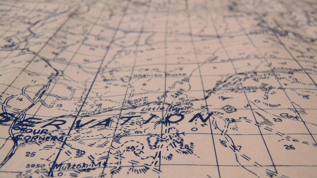
Data visualization meets artistic expression in the fascinating world of creative cartography where traditional maps transform into stunning works of art. You’ll discover how modern cartographers and artists blend statistical information with creative elements to craft visual stories that captivate viewers while conveying complex data in meaningful ways.
Whether it’s population density portrayed through intricate patterns or climate change represented in bold color gradients these artistic maps bridge the gap between raw data and human emotion making complex information more accessible and engaging than ever before.
Disclosure: As an Amazon Associate, this site earns from qualifying purchases. Thank you!
Understanding the Intersection of Art and Data Visualization
The fusion of artistic expression with data visualization creates powerful narratives that transform complex information into compelling visual stories.
P.S. check out Udemy’s GIS, Mapping & Remote Sensing courses on sale here…
The Evolution of Cartographic Design
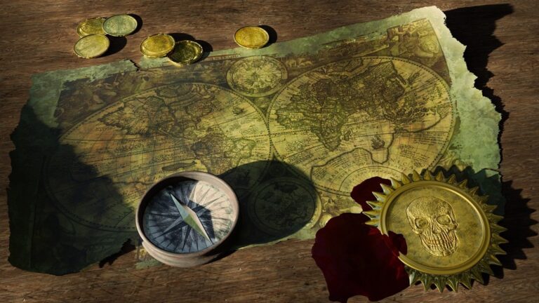
Early maps combined scientific accuracy with decorative elements like sea monsters and ornate compasses. Modern cartographic design has evolved from hand-drawn illustrations to sophisticated digital tools that blend GIS data with artistic elements. Today’s mapping software enables cartographers to layer statistical information with creative visual treatments using tools like Adobe Illustrator QGIS and Mapbox. This progression reflects a growing recognition that effective maps must balance precision with visual appeal.
Bridging Science and Creativity
Data artists now use programming languages like D3.js and Processing to create dynamic visualizations that respond to real-time data feeds. These tools enable the transformation of raw statistics into interactive artworks that reveal patterns through color shape and movement. Leading visualization artists like Stefanie Posavec and Giorgia Lupi demonstrate how personal data can become intimate visual narratives through hand-drawn elements combined with digital precision. Their work shows that artistic interpretation can make complex datasets more accessible and emotionally resonant.
Exploring Traditional Artistic Map Techniques
Hand-Drawn Cartography Methods
Hand-drawn cartography combines technical precision with artistic expression through specialized techniques developed over centuries. Cartographers use fine-tipped mapping pens to create crisp linework for coastlines rivers and terrain features. Traditional methods include cross-hatching for showing elevation changes stippling for depicting water bodies and precise lettering styles like Italic Script for place names. Artists employ watercolor washes to define land masses colored inks for political boundaries and gold leaf for decorative compass roses. These techniques require steady hands careful planning and an understanding of scale proportion and spatial relationships.
Historical Decorative Elements in Maps
Medieval and Renaissance maps showcase elaborate decorative elements that blend artistry with geographical information. Sea monsters dragons and mythological figures filled unexplored areas while ornate compass roses marked cardinal directions. Cartographers adorned their works with intricate cartouches featuring baroque frames scrollwork and heraldic symbols. Wind heads depicted as cherubs blowing across the seas added both artistic flair and navigational context. These decorative elements served dual purposes: filling empty spaces while conveying cultural beliefs maritime folklore and the mapmaker’s artistic skill through detailed illustrations and careful embellishments.
Discovering Modern Data Art Mapping Styles
Modern data artists are revolutionizing cartographic visualization by blending traditional mapping techniques with cutting-edge digital tools and artistic innovation.
Digital Mixed Media Approaches
Digital artists now combine multiple data visualization techniques in single maps using tools like Adobe Creative Suite and GIS software. You’ll find stunning examples where satellite imagery merges with vector graphics layered with 3D elements. Leading artists like Aaron Koblin create hybrid visualizations that blend real-time flight data with glowing light trails while others incorporate photo textures with elevation data to produce photorealistic terrain art. These approaches often integrate programming languages like Python or R with design software to generate unique visual interpretations of geographic data.
Abstract Data Representation Methods
Abstract mapping styles transform conventional geographic data into artistic patterns that challenge traditional cartographic rules. Artists use techniques like dot density mapping where population points become impressionist-style clusters or flow mapping that turns migration data into dynamic ribbon patterns. Notable examples include Eric Fischer’s social media maps that convert geotagged photos into light paintings and Moon Duchin’s mathematical distortions that visualize electoral districts as abstract geometric forms. These methods prioritize emotional impact and pattern recognition over geographic accuracy while maintaining data integrity.
Examining Interactive Data Map Installations
Location-Based Art Experiences
Interactive map installations transform physical spaces into immersive data experiences. The “Climate Pulse” installation at Science Museum London uses motion sensors to trigger real-time climate data visualizations as visitors move through the space. Artists like Rafael Lozano-Hemmer create responsive light projections that map crowd movements onto building facades revealing urban flow patterns. The “Living Light” installation in Seoul displays air quality data through LED panels embedded in a permanent architectural structure combining environmental monitoring with public art.
Dynamic Visualization Projects
Data-driven installations leverage real-time feeds to create evolving visual narratives. The “Wind Map” project by Hint.fm displays live wind patterns across the United States using flowing particle animations. “Tides of Migration” uses ceiling-mounted projectors to cast moving data points showing global migration patterns onto reflective floor surfaces. These installations often employ depth cameras computer vision algorithms and custom software to respond to audience interactions while maintaining data accuracy. Notable examples include “Connected Worlds” at the New York Hall of Science and “Terra Data” at ZKM Center for Art and Media.
Analyzing Color Theory in Data Map Design
Color plays a crucial role in transforming complex data into visually compelling and easily interpretable maps.
Using Color to Represent Information
Color selection in data maps requires strategic application of color theory fundamentals to convey information accurately. Start with defining clear color schemas that align with your data types: sequential colors for continuous data like temperature gradients sequential colors (light blue to dark blue) categorical colors for distinct groups (red green blue) and diverging colors for data with a neutral midpoint (red-white-blue). Consider colorblind-friendly palettes using tools like ColorBrewer 2.0 to ensure accessibility. Remember that cultural associations with colors can impact interpretation so choose hues that align with universal understanding of your data context.
Creating Visual Hierarchies Through Color
Establish clear data hierarchies through strategic color intensity and saturation levels. Use bold saturated colors to highlight critical information while applying muted tones for background or contextual elements. Layer your color choices with primary data shown in vibrant hues secondary information in lighter tints and base maps in neutral grays. Implement contrast ratios of 4.5:1 minimum between text and background colors to maintain readability. Consider using complementary colors for opposing data sets and analogous colors for related information to create intuitive visual relationships.
Incorporating Typography and Symbolism
Typography and symbolism serve as powerful tools in data-driven maps, helping to convey complex information through carefully designed visual elements.
Custom Map Symbols and Icons
Design custom symbols that reflect your data’s unique characteristics while maintaining clarity and consistency. Create scalable vector icons using programs like Adobe Illustrator or Figma to represent different data points such as population centers cultural landmarks or environmental features. Implement a unified style guide for your symbols ensuring they work at various sizes and complement your map’s overall aesthetic. Use simple geometric shapes for quantitative data and more detailed icons for qualitative information.
Text as Visual Elements
Transform typography into dynamic visual components by varying font weights sizes and styles to represent data hierarchies. Place text strategically along geographical features like rivers or boundaries using curved paths to enhance readability. Experiment with typographic density to show population concentration or data intensity creating visual patterns through careful text placement. Consider using custom fonts that reflect the cultural or historical context of your mapped region while maintaining legibility at different zoom levels.
Investigating 3D and Sculptural Map Art
Modern cartographers are pushing boundaries by transforming flat maps into three-dimensional works that invite physical interaction and deeper spatial understanding.
Relief Mapping Techniques
Relief mapping elevates traditional cartography through sophisticated 3D modeling techniques. Digital elevation models (DEM) form the foundation for creating accurate topographic representations using specialized software like Blender and ArcGIS Pro. Artists enhance these models by applying texture mapping algorithms highlighting elevation changes through strategic shadows embossing surface features. Advanced techniques include photogrammetry-based terrain modeling precise contour extrusion and multi-layered height mapping that creates stunning visual depth while maintaining geographical accuracy.
Physical Data Sculptures
Data sculptures transform statistical information into tangible 3D objects that viewers can explore from multiple angles. Artists craft these installations using materials like laser-cut acrylic stacked wood layers or 3D-printed components to represent data variables through physical depth height and texture. Notable examples include Sebastian Errazuriz’s “GDP Topographies” which renders economic data as terrain features and Matthew Picton’s paper sculptures depicting urban growth through layered city maps. These works combine precise data interpretation with material innovation creating immersive experiences that make complex datasets physically accessible.
Studying Emotional and Cultural Map Expressions
Personal Data Storytelling
Transform personal experiences into compelling map narratives using emotional data visualization techniques. Create intimate geographic stories by mapping daily routines mood patterns or significant life events. Examples include Giorgia Lupi’s “Dear Data” project which maps weekly personal activities through hand-drawn symbols and Nicholas Felton’s annual reports that visualize location-based personal metrics. Implement color gradients to represent emotional intensity and custom iconography to mark meaningful locations. Use data layers to show how personal stories intersect with broader community patterns.
Cultural Identity Through Mapping
Design maps that reflect unique cultural perspectives and traditional knowledge systems. Indigenous mapping techniques demonstrate alternative ways of representing space through storytelling and seasonal patterns. Contemporary artists like Miguel Palma create cultural identity maps by overlaying historical migration routes with modern demographic data. Integrate traditional artistic elements such as textile patterns or ceremonial symbols to represent cultural landmarks. Use community-sourced data to ensure authentic representation of local cultural narratives and sacred spaces.
Exploring Digital Tools and Technologies
Modern digital tools have revolutionized the way artists and cartographers transform data into compelling map visualizations.
Software for Artistic Data Mapping
Leading digital mapping tools combine powerful data processing with creative flexibility. QGIS offers extensive customization through Python scripting and artistic plugins while maintaining precise geospatial accuracy. Adobe Illustrator with MAPublisher enables intricate vector styling for map elements with data-driven features. For 3D visualization Blender’s GIS add-on transforms terrain data into sculptural landscapes. Mapbox Studio provides programmatic styling with dynamic data integration through GL JS expressions.
Emerging Visualization Platforms
Web-based platforms are pushing creative mapping boundaries with innovative features. Observable brings collaborative data art creation through interactive notebooks and real-time visualization. Deck.gl enables GPU-accelerated rendering of massive datasets with custom visual effects. Flourish offers template-based storytelling with animated transitions between map states. Kepler.gl combines intuitive interfaces with advanced visualization capabilities like 3D hexbins and arc layers for movement data.
Implementing Artistic Data Maps in Practice
Transform raw data into compelling visual narratives by following established methodologies and learning from successful implementations.
Case Studies of Successful Projects
The “Wind Map” project by Hint.fm revolutionized weather data visualization by creating flowing particle animations that show wind patterns across the US in real-time. Eric Fischer’s “Locals & Tourists” maps use geotagged photos to reveal city usage patterns through distinctive color coding. The “Atlas of Emotions” by Stamen Design masterfully combines psychological data with geographic representation creating an interactive exploration of human feelings through map-like interfaces.
- Choose data visualization methods that match your narrative goals while maintaining accuracy
- Create a consistent visual language using 2-3 primary colors for data representation
- Design custom symbols that scale effectively across different zoom levels
- Test your maps with diverse audiences to ensure clarity
- Document your methodology including data sources projection systems & artistic choices
- Implement responsive design principles for digital maps
- Balance artistic expression with data integrity through careful color selection & symbol placement
These guidelines help create visually striking maps that effectively communicate complex datasets while maintaining scientific rigor.
Looking Forward: The Future of Artistic Data Maps
The fusion of data visualization and artistic expression continues to push the boundaries of how we understand and interact with geographical information. As technology evolves you’ll see even more innovative approaches to representing complex datasets through creative cartography.
These artistic interpretations of data maps don’t just make information more accessible – they create emotional connections that help you better understand and remember the stories behind the numbers. Whether through interactive installations digital innovations or hand-drawn visualizations artists and cartographers are revolutionizing how you experience data.
The next frontier of creative mapping promises even more exciting possibilities as new tools and techniques emerge. You’ll witness the continued evolution of this dynamic field where art data and geography converge to create meaningful visual experiences that inform inspire and engage.


