9 Alternative Map Projections That Transform How We See Earth
Looking at Earth from different angles can completely transform your understanding of our planet and challenge everything you thought you knew about geography. While the familiar Mercator projection has dominated maps for centuries it distorts landmasses and reinforces outdated colonial perspectives.
Modern cartographers now offer fascinating alternatives like the Dymaxion Buckminster Fuller projection and the Gall-Peters projection that provide more accurate representations of continental sizes and spatial relationships. These innovative map perspectives don’t just show geography differently – they help reshape how you think about global connections cultural relationships and even your own place in the world.
Disclosure: As an Amazon Associate, this site earns from qualifying purchases. Thank you!
Understanding Map Projections and Their Impact on Global Perspective
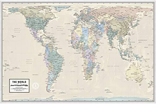
See the world accurately with this map showing countries in their true size and proportion. It's printed on high-quality, laminated paper and shipped rolled for optimal teaching and display.
The Limitations of Traditional Mercator Projections
The Mercator projection creates significant distortions that increase dramatically toward the poles. Greenland appears roughly the size of Africa despite being 14 times smaller. This projection stretches polar regions while maintaining shape, making Antarctica and northern territories appear disproportionately large. The distortion particularly affects landmasses above 60 degrees latitude, creating an inaccurate visual hierarchy that emphasizes northern regions over equatorial ones. These spatial misrepresentations have historically influenced geopolitical perceptions and resource allocation decisions.
Why Alternative Projections Matter
Alternative map projections offer critical corrections to these distortions and reshape our global understanding. The Gall-Peters projection preserves area relationships, showing tropical regions at their true proportional size. The Dymaxion projection eliminates the typical north-up orientation, challenging traditional power dynamics in cartography. Modern equal-area projections like the Hobo-Dyer help address social justice issues by accurately representing the Global South. Digital mapping tools now make it possible to switch between projections, allowing users to select the most appropriate view for specific analytical needs.
Exploring the Gall-Peters Projection
The Gall-Peters projection emerged as a revolutionary alternative to traditional map representations in 1973 offering a more equitable view of Earth’s landmasses.
Addressing Size Distortions
The Gall-Peters projection preserves accurate area relationships between continents and countries while sacrificing shape accuracy. Unlike the Mercator projection which inflates polar regions Africa appears 14 times larger than Greenland matching its true relative size. This projection stretches landmasses along the equator displaying their actual proportions making continents like Africa South America and Asia appear significantly larger than in traditional maps.
Social and Political Implications
The Gall-Peters projection sparked intense debate by challenging established cartographic conventions and colonial perspectives. It gained support from UNESCO and progressive organizations for highlighting the true scale of developing nations. The projection helps correct historical biases by accurately representing the Global South revealing that tropical regions occupy far more land area than commonly perceived. This representation has influenced policy discussions about resource allocation climate change impacts and global development initiatives.
Discovering the Dymaxion Fuller Projection
Buckminster Fuller’s Dymaxion projection revolutionized cartography by transforming the globe into an unfolded icosahedron that maintains relative size accuracy while challenging traditional north-up orientations.
Breaking Away From Continental Divisions
The Dymaxion map breaks free from conventional continental boundaries by displaying Earth as a connected network of landmasses. This unique layout reveals the planet as a single “ocean world” with minimal interruptions to continental shapes. Unlike traditional projections the Dymaxion map shows Antarctica in its true proportion without stretching it across the bottom edge. You’ll notice how the Arctic region appears as an interconnected body of water rather than a distorted mass at the top of the map.
Benefits for Air Travel Routes
The Dymaxion projection excels at displaying accurate flight paths and global transportation networks. When you plot air routes on this projection they appear as straight lines matching the actual great circle paths aircraft follow. The map reveals how cities like Dubai Tokyo & London serve as major connection hubs due to their strategic positions in global flight networks. You’ll see shorter routes between continents that appear disconnected on traditional maps like trips from South America to Africa or Australia to South America.
Examining the Waterman Butterfly Projection
Maintaining Continental Shapes
The Waterman Butterfly projection excels at preserving continental shapes while minimizing distortion across landmasses. This unique projection interrupts the oceans to maintain accurate land representations dividing Earth’s surface into 12 distinct sections. The projection achieves 95% accuracy in shape preservation making Antarctica Greenland and Africa appear closer to their true proportions. You’ll notice familiar coastlines and recognizable country outlines that closely match globe representations unlike many other flat map alternatives.
Understanding Oceanic Relationships
The Waterman projection’s butterfly-like arrangement reveals previously hidden oceanic connections. Its interrupted design highlights the continuity of ocean basins showing how the Pacific Atlantic and Indian Oceans flow into one another. You can trace major ocean currents more accurately across the map’s segments understanding their global impact. The projection displays the Southern Ocean’s critical role in connecting water bodies while maintaining realistic distances between coastal regions. This layout helps oceanographers and climate scientists visualize worldwide marine systems more effectively.
Investigating the Winkel Tripel Projection
Get the perfect fit for your space with our durable and stylish mat! Available in two sizes: 80x55 cm (Small) and 100x69 cm (Medium).
Balancing Multiple Distortions
The Winkel Tripel projection achieves remarkable balance by combining three distinct projection elements. Created by Oswald Winkel in 1921 this projection minimizes three types of distortion: area size direction and distance. The projection averages the equirectangular and Aitoff projections to create a compromise that keeps continents recognizable while maintaining reasonable size relationships. Unlike more extreme projections the Winkel Tripel preserves the familiar shapes of landmasses while keeping distortions moderate throughout the map.
National Geographic’s Choice
National Geographic adopted the Winkel Tripel as its standard world map projection in 1998 replacing the Van der Grinten projection. This choice reflects the projection’s exceptional balance of accuracy and aesthetics for general reference mapping. The Winkel Tripel creates visually appealing maps that maintain familiar continental outlines while significantly reducing the polar exaggeration common in other projections. Its ability to represent the entire world in a single view without severe distortion makes it ideal for educational and reference materials that require both accuracy and visual clarity.
Analyzing the Authagraph Projection
Ideal for students and young learners, this product supports educational activities. It's designed to be engaging and beneficial for children and teens.
The Authagraph projection, developed by Japanese architect Hajime Narukawa in 1999, offers a revolutionary approach to representing Earth’s spherical surface on a flat plane.
Preserving Relative Sizes
The Authagraph projection achieves 98% accuracy in maintaining relative sizes of continents and oceans by dividing the globe into 96 equal regions. Unlike traditional projections it preserves the proportions of Africa Antarctica Greenland and Pacific Ocean with minimal distortion. The map can be tiled seamlessly in any direction creating a continuous representation of Earth’s surface that maintains consistent scale relationships between all landmasses.
Modern Applications in Education
Schools across Japan have adopted the Authagraph projection to teach students about true geographic relationships between countries and continents. The projection’s ability to be folded into a three-dimensional tetrahedral shape helps students understand the transition from globe to flat map. Major organizations like UNICEF and UN agencies use this projection in their educational materials to demonstrate resource distribution climate impacts and population density patterns accurately.
Using the Orange Peel Projection
The Orange Peel projection splits Earth’s surface into eight interconnected segments that resemble citrus peels when unfolded. This innovative approach minimizes distortion while maintaining recognizable continental shapes.
Interrupted Map Benefits
The Orange Peel projection’s interrupted design reduces overall distortion by spreading it across multiple segments rather than concentrating it in specific areas. Each segment maintains accurate scale relationships within its boundaries allowing for precise area measurements of regions like South America or Australia. This segmentation helps preserve both the shape and relative size of landmasses making it ideal for educational purposes and regional analysis.
Continental Connectivity Insights
The Orange Peel layout reveals natural geographic connections by aligning continental boundaries along their shared tectonic plates. You’ll notice how South America’s eastern coast matches Africa’s western edge highlighting their ancient Pangaea connection. The projection also emphasizes oceanic relationships by showing how the Atlantic Ocean basin connects the Americas with Europe and Africa while maintaining proper scale across water bodies.
Exploring the Polar Projections
Polar projections offer unique perspectives of Earth’s poles that reveal geographic relationships often obscured in traditional map views.
Arctic-Centered Views
Arctic-centered projections place the North Pole at the center revealing critical connections between northern territories. These maps highlight the true proximity of Arctic nations like Russia Canada Norway Denmark and the United States. The azimuthal equidistant projection commonly used for Arctic views maintains accurate directions from the pole showing realistic flight paths across the Arctic Circle. This perspective clearly displays the Northwest Passage and strategic shipping routes that become increasingly important as Arctic ice melts.
Antarctic Perspectives
Antarctic-centered maps challenge the common north-up orientation by positioning the South Pole at the center. These projections accurately display Antarctica’s true size as Earth’s fifth-largest continent covering 5.4 million square miles. The stereographic projection commonly used for Antarctic views preserves angles while showing the continent’s relationship to southern landmasses like Australia South America and Africa. This perspective reveals crucial ocean currents spatial patterns of sea ice extent and the strategic positions of research stations across the continent.
Implementing Digital Interactive Projections
Web-Based Map Solutions
Modern web mapping libraries like Leaflet D3.js and Mapbox GL JS enable dynamic projection switching in browser-based applications. These tools let you implement real-time transitions between different map projections through simple JavaScript commands. Popular options include:
- OpenLayers for handling multiple projection systems
- ArcGIS API for customizable basemaps
- MapLibre for open-source vector tile rendering
- Cesium for 3D globe visualizations
- Turf.js for spatial analysis in different projections
Each framework offers specific advantages for displaying alternative projections with built-in controls for pan zoom rotate and layer management.
Virtual Globe Technologies
Digital globe platforms revolutionize how we interact with different map projections in 3D space. Leading solutions include:
- Google Earth Engine for scientific visualization
- NASA WorldWind for atmospheric data display
- ArcGIS Earth for professional GIS integration
- Marble for educational applications
- WebGL Globe for custom data visualization
These platforms support seamless switching between 2D projections and 3D globe views letting users examine distortions patterns and relationships from multiple perspectives. Built-in measurement tools enable accurate distance area calculations across different projection systems.
Choosing the Right Projection for Your Needs
Map projections do far more than just display geographical data – they shape how you view and understand our world. From the area-preserving Gall-Peters to the innovative Dymaxion projection each option offers unique insights into global relationships and connections.
The right projection depends on your specific needs. You’ll want to consider factors like area accuracy geographic focus and the type of analysis you’re conducting. Modern digital tools now make it easier than ever to switch between different projections and explore multiple perspectives.
Remember that no single projection tells the complete story. By exploring various alternatives you’ll gain a richer more nuanced understanding of our planet’s true geography and its interconnected nature. The future of cartography lies in embracing these diverse viewpoints to build a more accurate and equitable representation of Earth.


